November 8, 2013
Categories:
Architecture, Corporate, Education, Government
Logo Design for Seoul Museum
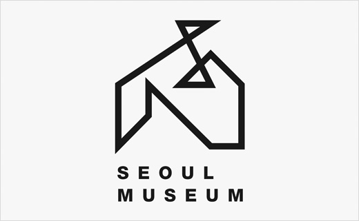
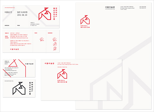
The logo design for the Seoul Museum was inspired by its spatial characteristics. Taking the architecture of the museum’s building as a starting point, eleven squares were initially designed.
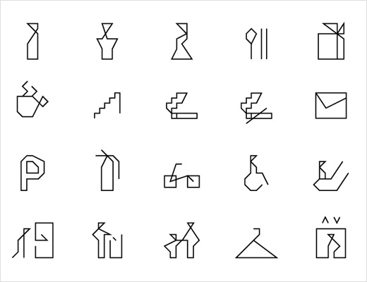
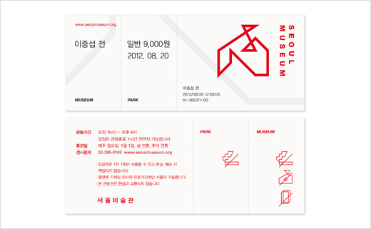
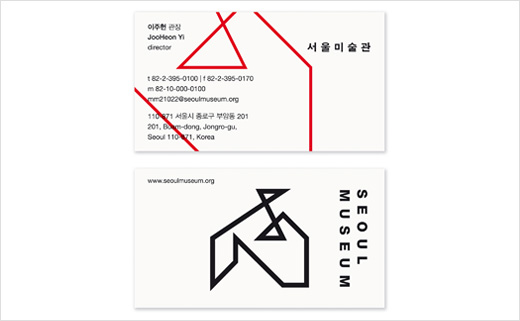
Based on this, the logo was developed as the result of designing various forms by connecting the corners of each square. Through its abstraction, the logo merges with the museum’s name placed below it, forming a distinctive and coherent corporate design.
Creative trio Lee Joong Koo, Yu Hee Jung, and Seo Ji Yeon, of Seoul-based agency d note, designed the identity. The project has been chosen as a winner in the Red Dot Award: Communication Design 2013 contest.

d note
www.d-note.co.kr


