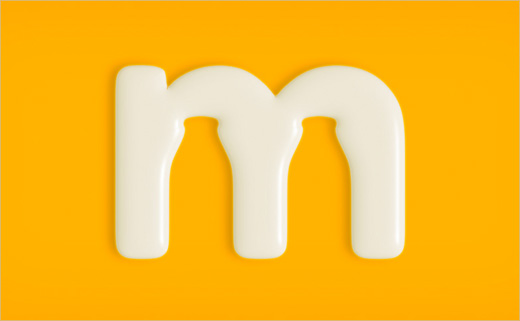
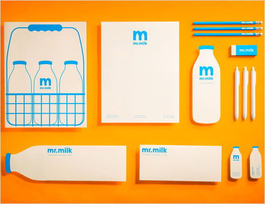
Logo and Identity Design for ‘Mr. Milk’
San Franciscan graphic designer Justin Ross Tolentino came up with this conceptual identity design while a student at California State University, East Bay.
The brief for the college assignment was to create an identity for a ‘job of yesteryear’. Justin subsequently chose to base his project on a milkman.
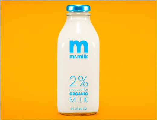
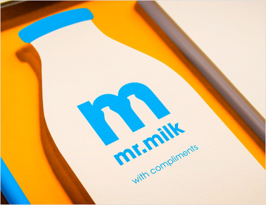
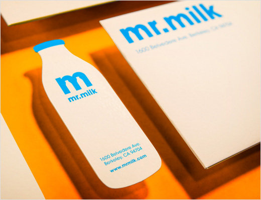
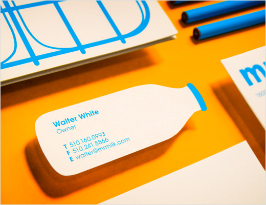
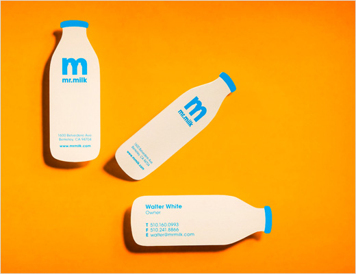
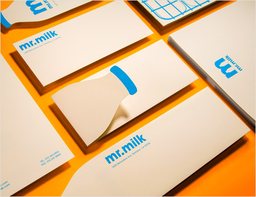
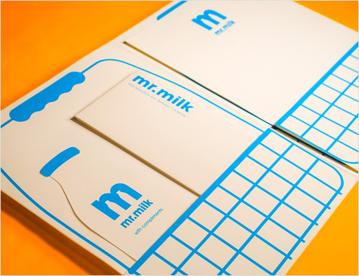
“My personal goal for the project was to create a timeless logo that could have easily been used in the 1950s as it could today. To merge the past and the present I paired the classic milk bottle silhouette with a clean sans serif. To give it some pop and contrast I decided to use cyan blue because I usually drink 2% milk,” explains Justin.
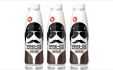
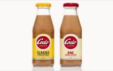
The designer points out that the blue colour could be interchanged to reflect the different varieties of milk commonly sold in the US, for example, red for whole milk, yellow for low fat, and brown for chocolate.
Justin Ross Tolentino
www.juroto.com


