Lexmark Launches New Brand and Logo
Technology company Lexmark has revealed a new corporate brand and logo. Having originally been spun out of tech giant IBM, the US company started life as a printer manufacturer back in 1991.
Lexmark says its rebranding represents its transition to a business “well beyond its hardware heritage”.
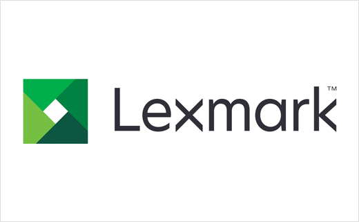
“The new Lexmark logo evokes the clarity, value and durability of the traditional Lexmark diamond, evolving to an aperture, which represents the broader offering – a portal to insight, a means of focus. The green palette is fresh, vibrant and approachable, representing Lexmark’s strength, focus on sustainability and growth as well as our commitment to earning ‘customers for life.’ The new typeface lends a modern, clean look and features angles that precisely reflect the aperture,” said a company spokesman.
The logo is also accompanied by a new tagline, “Open the possibilities”.


Source: Lexmark


