LD Products Reveals New Logo and Package Design
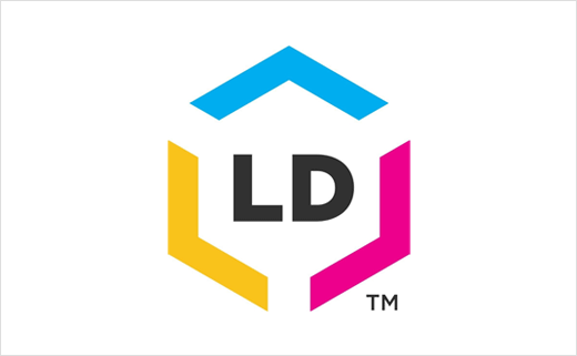
LD Products, said to be one of the largest online retailers of ink cartridges, toner and office supplies in the USA, has introduced a new company logo and package design.
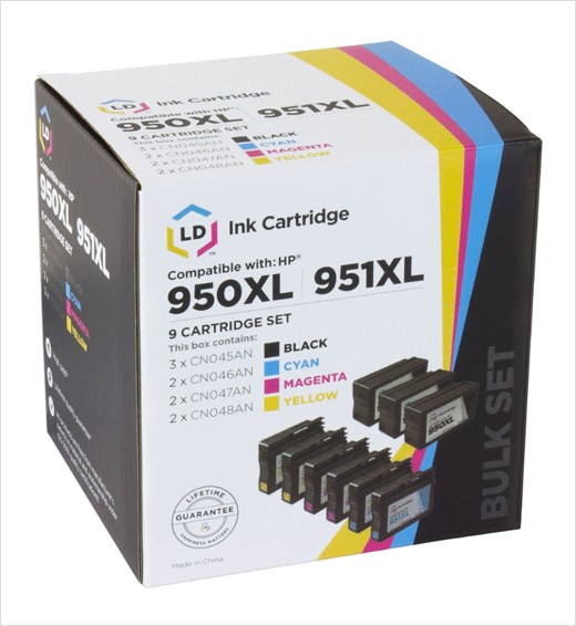
The new look was first announced at a company meeting earlier this year before making its way onto packaging and the company’s website in recent months. A website redesign that fully incorporates the new logo is expected to follow early next year.
“After sixteen years with the same logo, it was time for a fresh look,” says Aaron Leon, CEO and founder of LD Products. “We knew we wanted a simpler, more contemporary design that exemplified the continued growth of the business.”
LD Products’ in-house design team say they found inspiration in well-known brands like Apple and Nike, eventually settling on a logo centred around what they call “four pillars”: Heritage, Product, Expansion and Focus.
“This was a complex project that required translating our history into something modern and exciting,” says Fred Machuca, creative director of LD Products.
Source: LD Products


