KontrolFreek Unveils New Logo as Part of Branding Refresh
KontrolFreek has unveiled a new brand identity designed to mark its upcoming 10-year anniversary.
The rebrand, which encompasses a new logo, visual mark and updated colour palette, “creates a visual representation of the strong and growing community of gaming enthusiasts and KontrolFreek evangelists”, according to the Atlanta-headquartered company which is best known for making joypad controller accessories, namely “Performance Thumbsticks”, that are claimed to improve comfort, accuracy and performance when playing games.
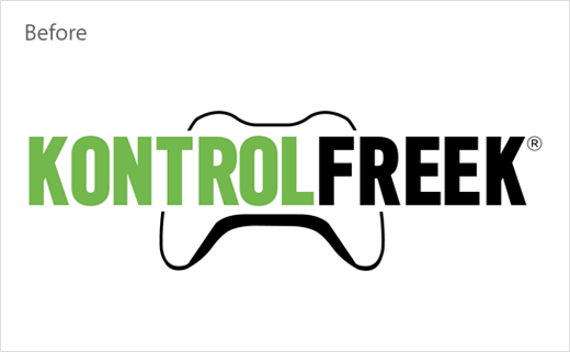
And these round-shaped thumbsticks are said to have served as the basis for the circular form of the all-new KontrolFreek icon, while the mouth is claimed to have been inspired by the company’s “Gaming Cables” product line. As a nod to the company’s legacy, the brand’s outgoing controller-shaped logo is also present in the visor of the new logo mark.
KontrolFreek’s colour palette, meanwhile, has been updated to be more “video game console-neutral”. However, while the new primary brand colour is a stone-like purple, the previous green has been retained – albeit updated to “a more vibrant and energetic tone”.
“Our new branding puts a face to FreekNation, allowing us to better connect with our active and passionate community and, more importantly, help them better identify with one another,” says Ashish Mistry, CEO of KontrolFreek. “By incorporating our legacy controller shape into the new logo design, we maintain continuity while advancing the company beyond our core thumbstick product.”

Source: KontrolFreek


