Koe Organic Kombucha Debuts New Logo and Packaging
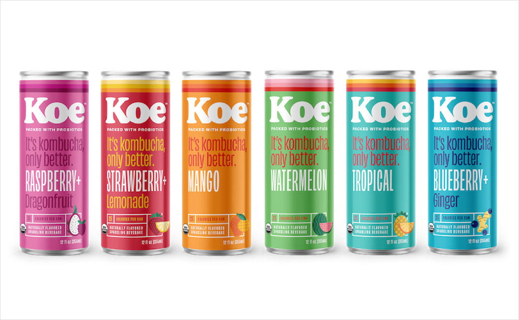
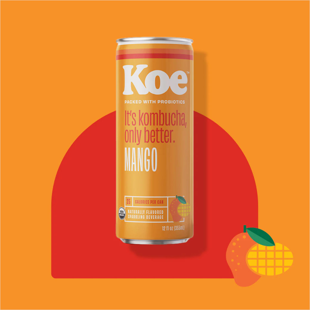
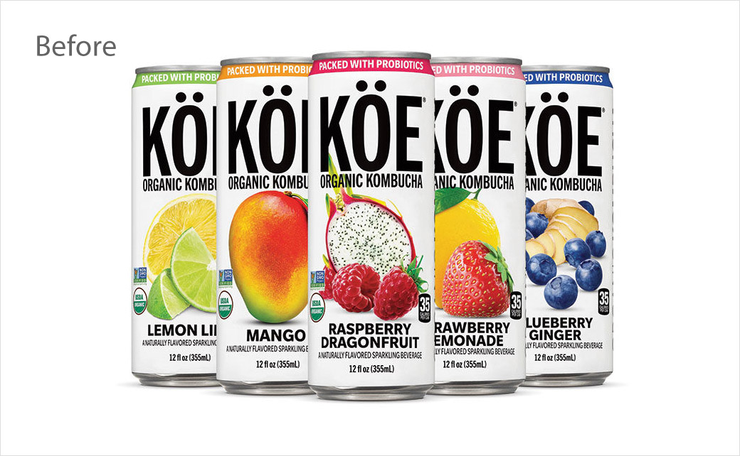
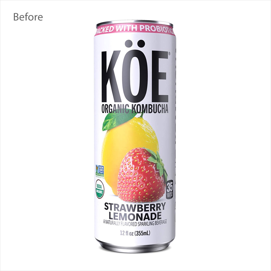
Koe Organic Kombucha has introduced a new logo and packaging design that has reportedly been inspired by the American brand’s Californian heritage.
Made with organic fruit juice, live probiotics, and sparkling water to deliver “gut-healthy benefits” minus any “funky or sour taste”, Koe currently comprises a range of six flavours, each of which sells in grocery stores throughout the USA in a 12 oz. slim can.
The new rebrand also comes alongside a refreshed recipe that is now claimed to offer more than 200% of the recommended daily dosage of vitamin C.
“Koe’s new look embraces evolving trends in fashion, art, and pop culture, with a colourful background and distinctive retro ‘sunset stripes’ that nod to the brand’s California roots,” says the company, which was fist launched back in 2018 under the ownership of Los Angeles-based health-conscious beverage firm, Stratus Group Beverage.
“We can’t wait for everyone to see our inviting new look,” further expounds Louisa Lawless, chief strategy officer for Koe. “Koe is kombucha for the masses and we make it easier to make a healthier choice without suffering through the sour, vinegar-y flavor most people associate with kombucha. I like to say Koe is ‘sessionable,’ meaning it’s deliciously sippable any time of day, sometimes more than once a day!”
Adding: “We embrace vibrancy in all facets of life and our juicy kombucha supports this. As our cans say, ‘It’s kombucha, only better’ – and we are firm believers in Koe’s better flavour, better ingredients, better packaging, and better benefits.”
Source: Koe


