Kodak Goes Back to the 1970s for New Logo Design
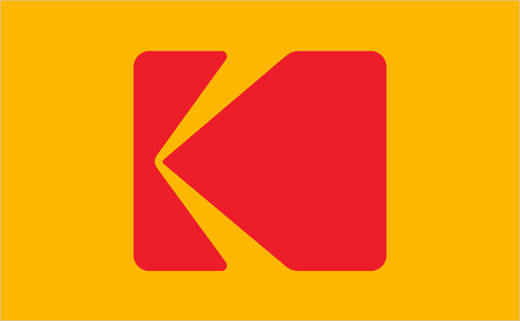
Kodak has refreshed its corporate logo for the first time in 10 years. Created by New York-based studio Work-Order, the new design returns to the 1970s for inspiration.
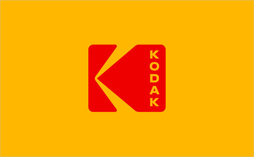
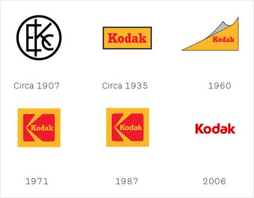
The updated mark is based on the American brand’s first-ever formal “symbol”, namely, a red ‘K’ set against a yellow backdrop, which was designed back in 1971 by Paul J Oestreich. That logo remained operational for some 35 years before being replaced in 2006 by a red, sans-serif typeface with a yellow underline.
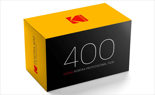
However, unlike the 1971 and 1987 versions of the logo, which featured the word “Kodak” set horizontally within the red K, the latest iteration sees the name displayed vertically in sans serif type.
“I don’t think of what we’re doing as ‘bringing back’ the iconic identity of Kodak, because in people’s hearts and minds, I don’t think it really went away. It’s simply logical to keep one of the world’s most famous brand marks at the forefront of the company’s image and identity,” says Kodak’s marketing boss, Steven Overman.
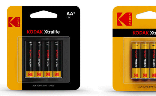
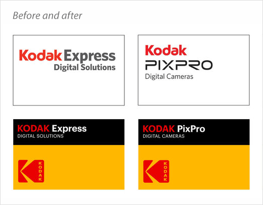
As well as reviving the K mark, the new branding also brings back the colour yellow to the company’s identity material.
“Since the early 20th Century, Kodak’s packaging and marketing materials have been blanketed in a warm yellow with red and black features. Our aim was to re-establish this strength and to never abandon the use of yellow on anything,” says Work-Order.

Source: Kodak


