JKR Rebrands Butterfly Twists
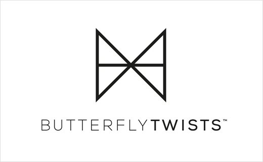
Global footwear brand Butterfly Twists has unveiled a new brand identity created by design agency Jones Knowles Ritchie (JKR).
JKR says it was approached by the Butterfly Twists team in March 2016, with a brief to update their logo and brand identity, in order to create a better connection with its audience, which is said to consist mainly of "modern millennial women".
"This audience is constantly on the move, and isn’t interested in sitting still or staying static. It was vital therefore that we created a brand identity that reflected this and appealed to those consumers," comments Sean Thomas, creative director at JKR. "The phrase 'never stick, twist' is central to the new identity and perfectly encapsulates this sense of constant movement."
With this in mind, the agency decided to create an identity that focused on the 'twist' of the brand name, rather than the butterfly, which was the central theme of the previous design.
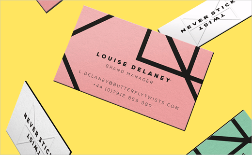
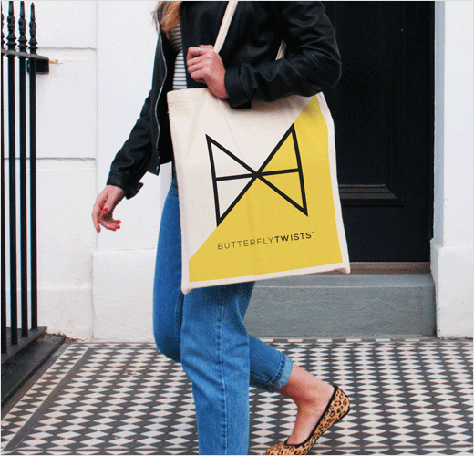
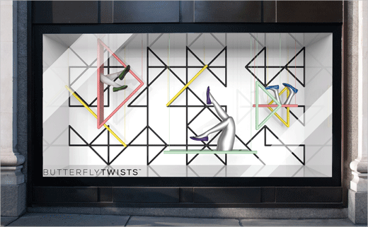
"The new brand logo is therefore an abstract, geometric butterfly design which when animated, twists and moves into a series of shapes, representing both sense of movement and the idea that Butterfly Twists offers something fresh and unexpected, a ‘twist’ on the norm," explain the designers.
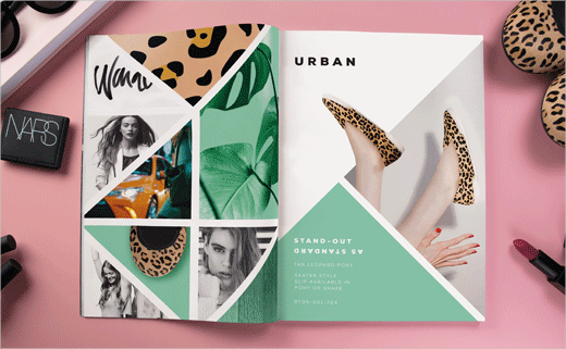
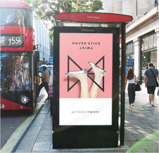
As well as the logo, JKR developed an identity for each of the brand’s individual collections, ‘Social, ‘On the Go’ and ‘Urban’. It also created a range of marketing collateral including posters, concessional stands for retail brands such as Office, and outdoor advertising.
The new identity has only just launched, and will be rolled out across multiple channels by the Butterfly Twists in-house team.

