Jaguar Reveals New Logo and Branding
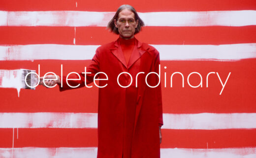
British car manufacturer Jaguar has launched a new logo as part of a complete brand reinvention.
The new identity is set to accompany the firm’s ambitious transition to a fully electric line-up, which is slated to begin in 2026.
“This is a reimagining that recaptures the essence of Jaguar, returning it to the values that once made it so loved, but making it relevant for a contemporary audience. We are creating Jaguar for the future,” says the company’s design boss, Gerry McGovern.
The revamped look incorporates a number of new design elements that are dubbed “symbols of change”.
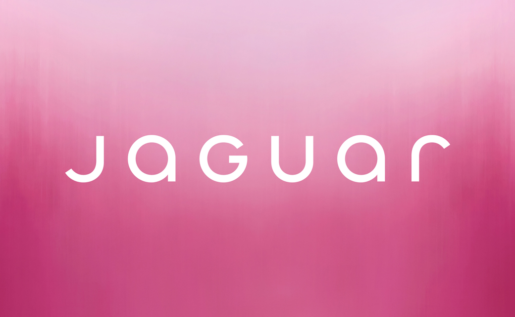
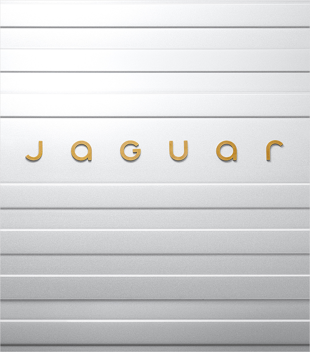
Key among these symbols is the ‘Device Mark’, which is effectively the brand’s new wordmark; featuring a bespoke font named Exuberant, it showcases the word ‘Jaguar’ in a mix of upper and lowercase characters.
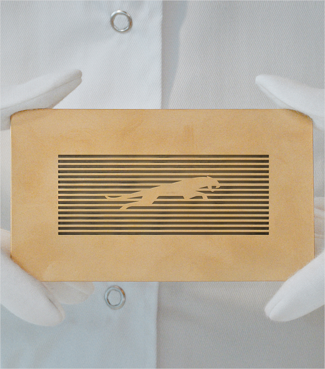
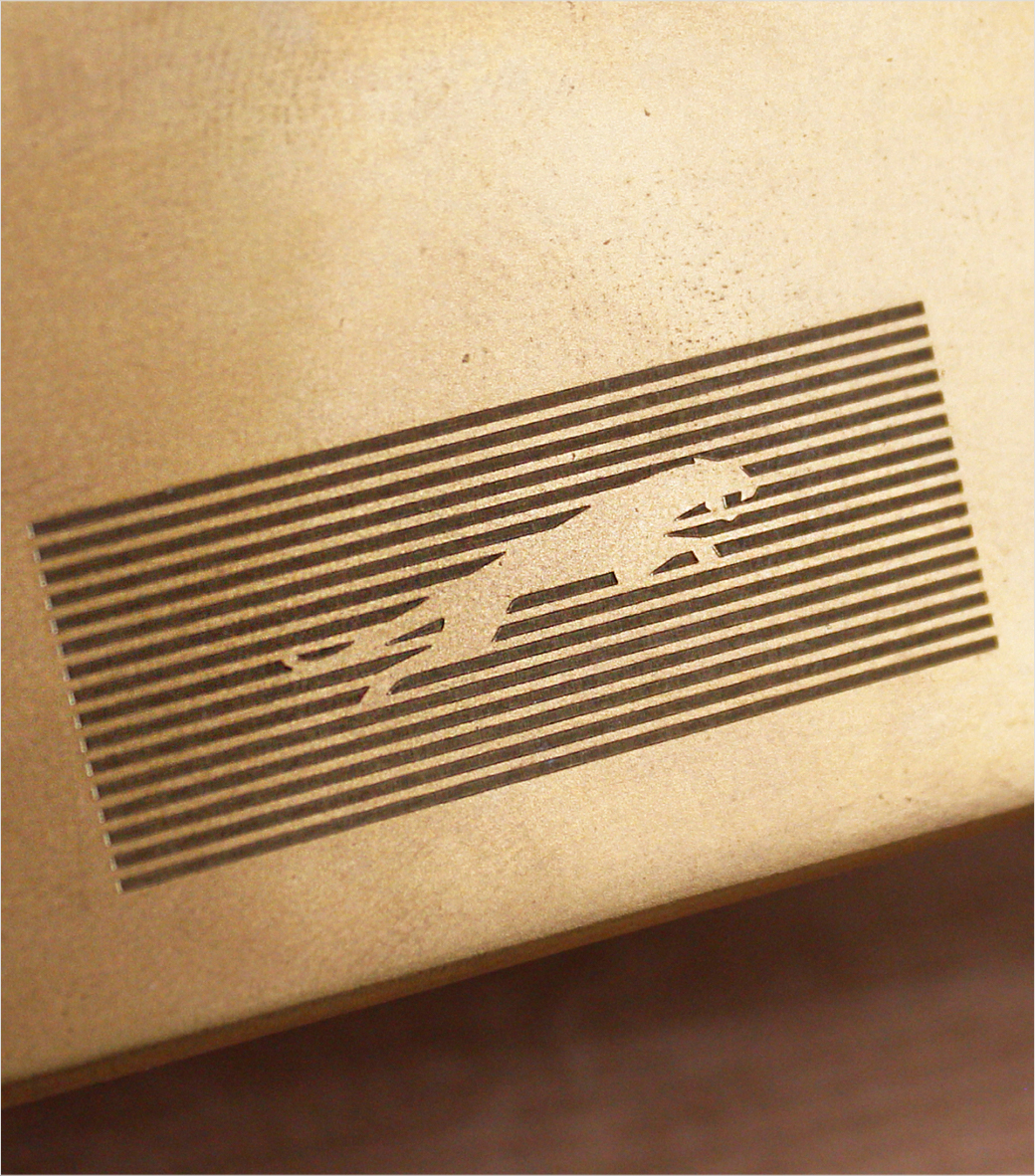
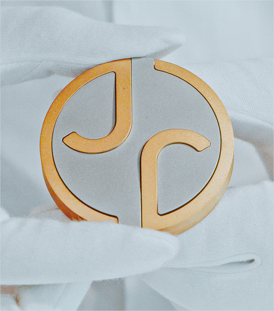
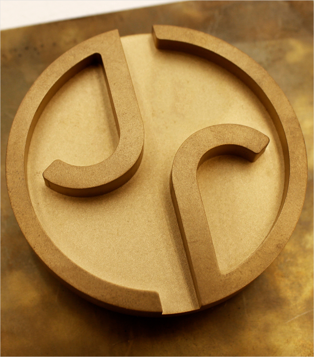
Accompanying the wordmark is a newly-designed monogram (‘Artist Mark’) that intertwines the letters ‘j’ and ‘r’, and a ‘Maker’s Mark’, which sees a reimagined version of the iconic Jaguar cat emblem – officially known as the ‘leaper’ – set prominently within a rectangular grid made up of 16 horizontal lines.
Another important aspect is a new colour palette that is aimed at conveying texture and movement.
“New Jaguar is a brand built around Exuberant Modernism. It is imaginative, bold and artistic at every touchpoint. It is unique and fearless,” exclaims McGovern.
The new visuals also come with a new tagline – “Copy Nothing” – that is said to have been inspired by the words of Jaguar’s founder, Sir William Lyons.

Source: Jaguar


