Identity for a Law Office – Reysus & Associés
Often used in legal contexts in medieval Europe, a seal is a distinctive impression assuring the authenticity of a document and used primarily to avoid its disclosure or alteration. Moreover, in French this term also refers to the seal-making device itself.
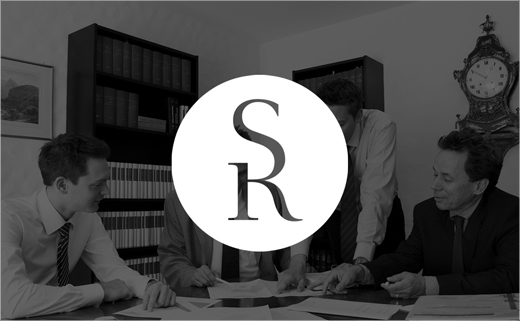
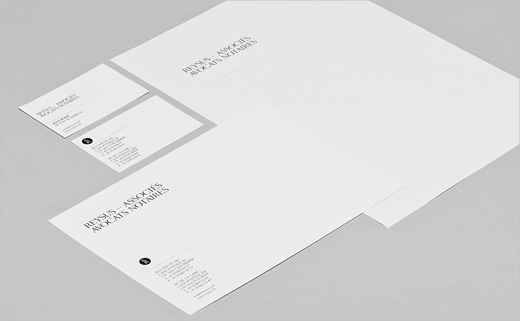
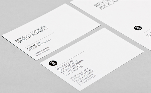
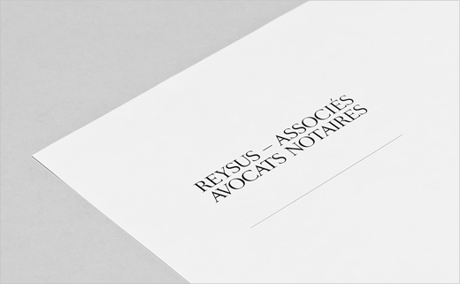
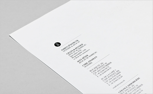
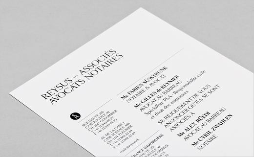
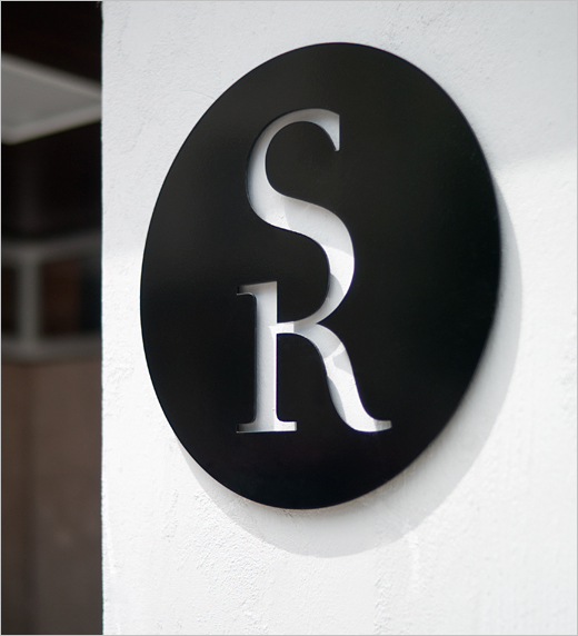
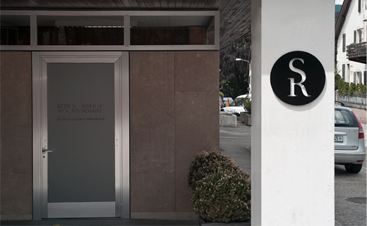
Based on this idea, this lawyer’s office logotype features the first letters of both associates’ names. The use of a classic typeface mixed with the concept of seals makes it a contemporary sign inspiring trust and reliability, two features characterizing this profession.
And what really stands out in the design is the vertical interlocking of the letters “S” and “R”. Of course, connecting and interlocking letters are nothing new in the world of logo design; but getting them to interconnect in a harmonious and balanced way is not all together easy. Swiss graphic designer Chris Gautschi, charged with the task of producing the identity, has definitely achieved the latter.
Chris Gautschi studied graphic design at l’Ecole D’Arts appliqués, La Chaux-de-Fonds, Switzerland. Passionate about typography, he uses it to nurture and grow his work. His passion is reflected with his clients through corporate identity, packaging, annual reports, brochures etc. He currently lives and works in East London in the UK.
www.chrisgautschi.ch


