ID for The McGuire Programme – ‘Beyond Stuttering’
The McGuire Programme was founded in 1994 and helps transform people who stutter into eloquent and articulate speakers.
The Programme’s most visible ambassador, and now a course instructor on the programme, is talent show singer Gareth Gates. Also a programme coach is Sean Rees, a designer at London-based brand consultancy Purpose and the man behind the identity proposal.
For the design team at Purpose, the first concern of the branding programme was to establish the essence of the brand. This involved digging down to find out what it was about the McGuire Programme that makes it unique. The answer was that it was the first programme run entirely by people who are conquering their own stutters.
The next step was to articulate the vision of the McGuire Programme. The answer was ‘to create a world where people who stutter can speak freely and be the person they want to be,’ with a mission to ‘transform lives’, and go ‘beyond stuttering’ to become the people they really want to be.
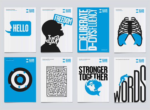
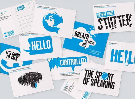
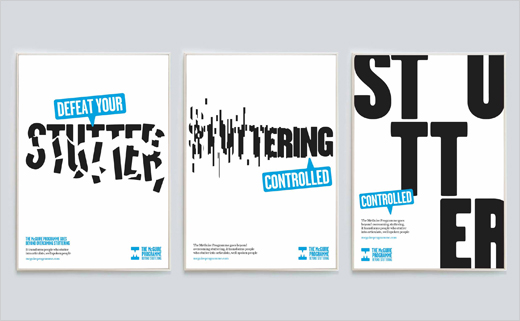
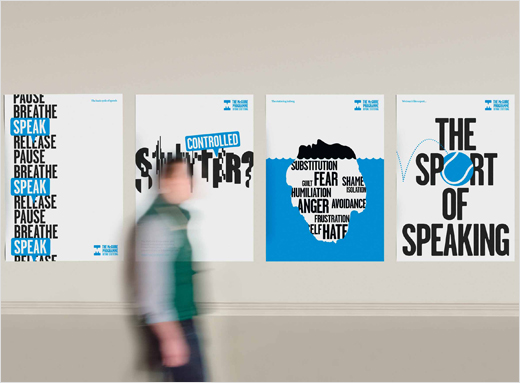
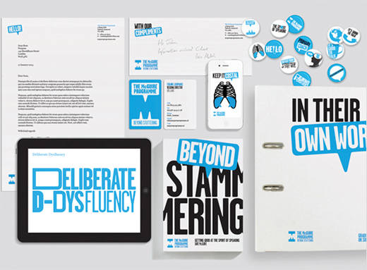
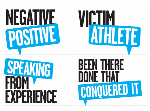
The design concept was then created to allow the organisation to articulate through a verbal and visual language the distinctive nature of the programme, and to equip central and regional offices with an easy-to-adapt library of tools to communicate this clearly, effectively and succinctly.
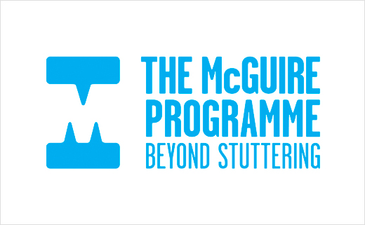
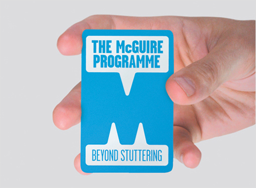
The core identity elements are two distinctive speech bubbles which come together to form an ‘M’ in the negative space. This is complemented with the programme name and strap line, featured using cyan lettering on a white background. There is a central identity and as part of the brand architecture, regional permutations to engender local ownership.
The main typeface, Garage Gothic was chosen for being bold and distinctive but friendly and approachable. Cyan was selected as the main colour for being bold, pure and single-minded as well as being cost-effective and easy to reproduce worldwide with consistency.
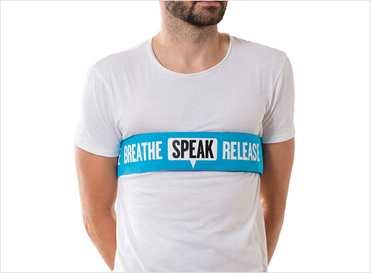
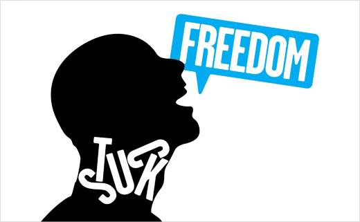
The McGuire identity speech bubble is readily adapted as a communication device that can incorporate text or graphic images. A poster campaign in the pipeline, for instance, shows a father with his daughter saying “reading bedtime stories to my little girl. That’s my beyond stuttering” and a young man saying, “I was quiet as a mouse, but since taking control of my speech you can’t shut me up!”
A simplified visual style for the graphic images lays the foundation for a growing image bank to which local McGuire designers can add. The implementation programme goes at a gradual pace, in time with the ability of the non-profit organisation to raise the funds. They are introduced as the need arises rather than in one major hit.
Dave Mcguire, Founding Director, The Mcguire Programme, said: “Since starting this programme in 1994, we’ve only had a fairly basic, homemade internet presence. Although we’ve done quite well due to the Media interest in our programme, one of our coaches, Sean Reese, thought we could do much better with the help of his branding company ‘Purpose’. He put together a plan, got a team together, and before I knew it, we were having Skype conferences involving the Directors of our Regions around the world. This, to me, was a very complicated process that was handled with amazing professionalism to produce a brand and presence that is unique and recognisable worldwide.”

Purpose
www.purpose.co.uk


