Identity Design for Digital Consultancy ‘Metronet’
Metronet is a digital marketing consultancy that delivers services such as SEO, PPC management, analytics tracking and web design to a wide range of clients.
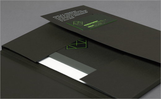
Norwegian creative agency Work in Progress was appointed by Metronet to design its logo. Lead graphic designer and Work in Progress co-founder Torgeir Hjetland took visual influence from early computer screens.
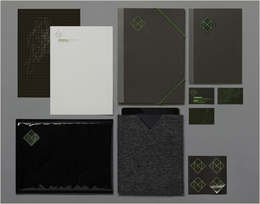
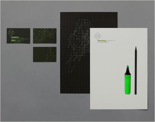
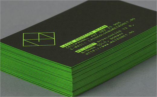
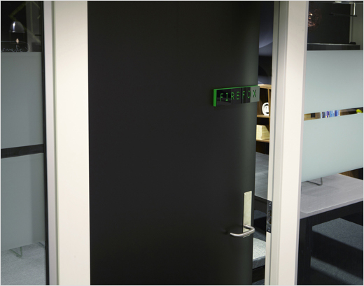
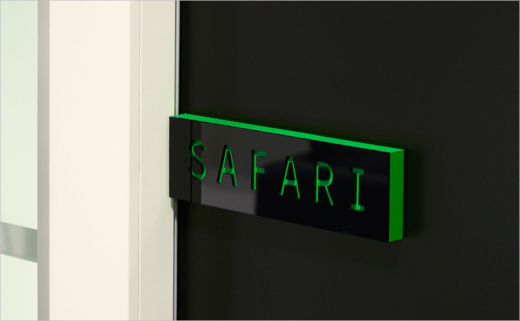
The combination of a dark grey (almost black) background and light bright green text is designed to suggest a DOS interface. For added authenticity, the type used is OCR-B, a monospace font that was developed back in 1968 to meet the criteria set by the European Computer Manufacturer’s Association.
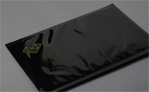
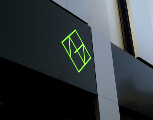
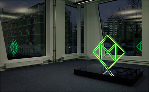
“The illustration for the identity is an abstract global system of interconnected computer networks between people,” explains Torgeir.
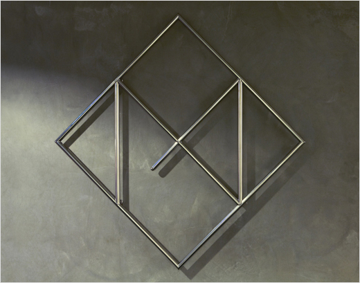
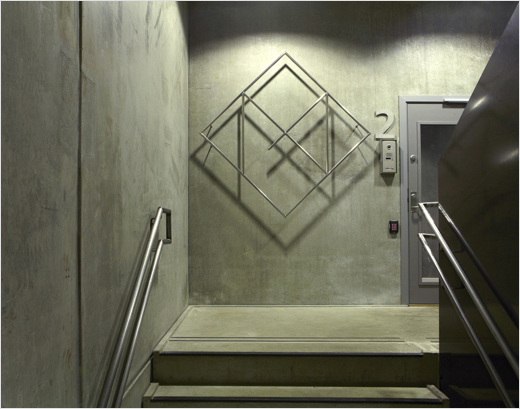
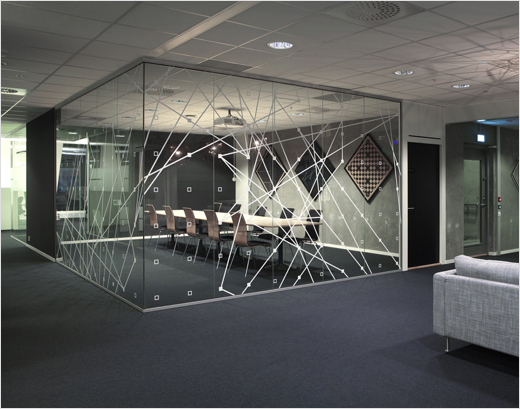
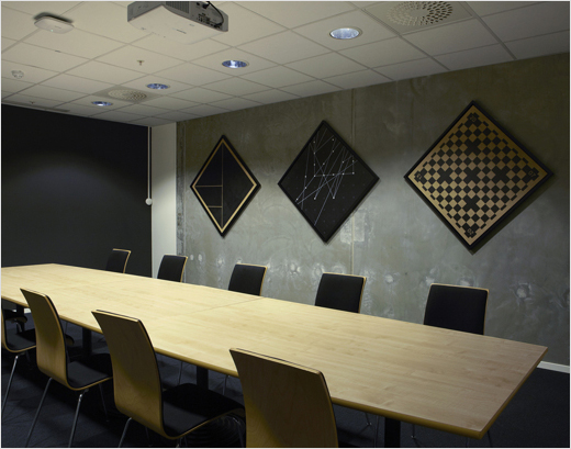
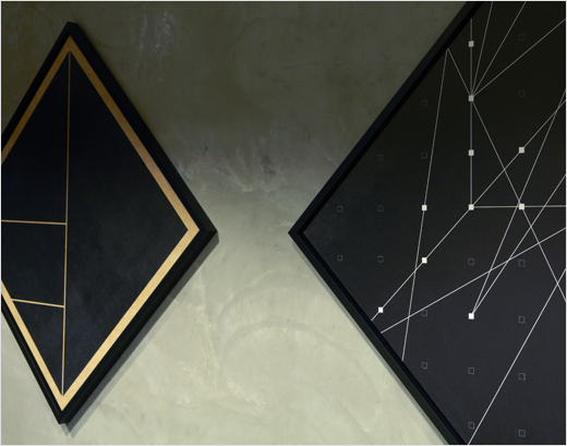
The ‘computer network’ theme continues on into and through the business’s office interiors, which were also designed by Work in Progress. A series of art images and other graphics combine to represent a further abstraction of the company’s connectivity-centric skill sets.
The overall identity design received a nomination at Visuelt, the National Norwegian Graphic Design Awards.

Torgeir Hjetland
www.workinprogress.no


