Ice Hockey Team LA Kings Reveal New Logo Design
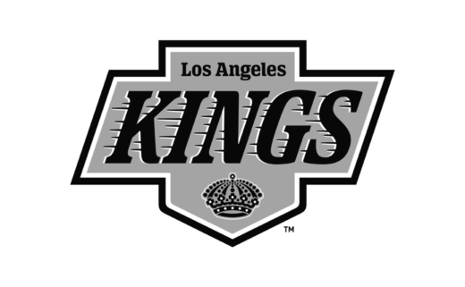
The LA Kings have revealed a brand evolution encompassing new team logos and design elements.
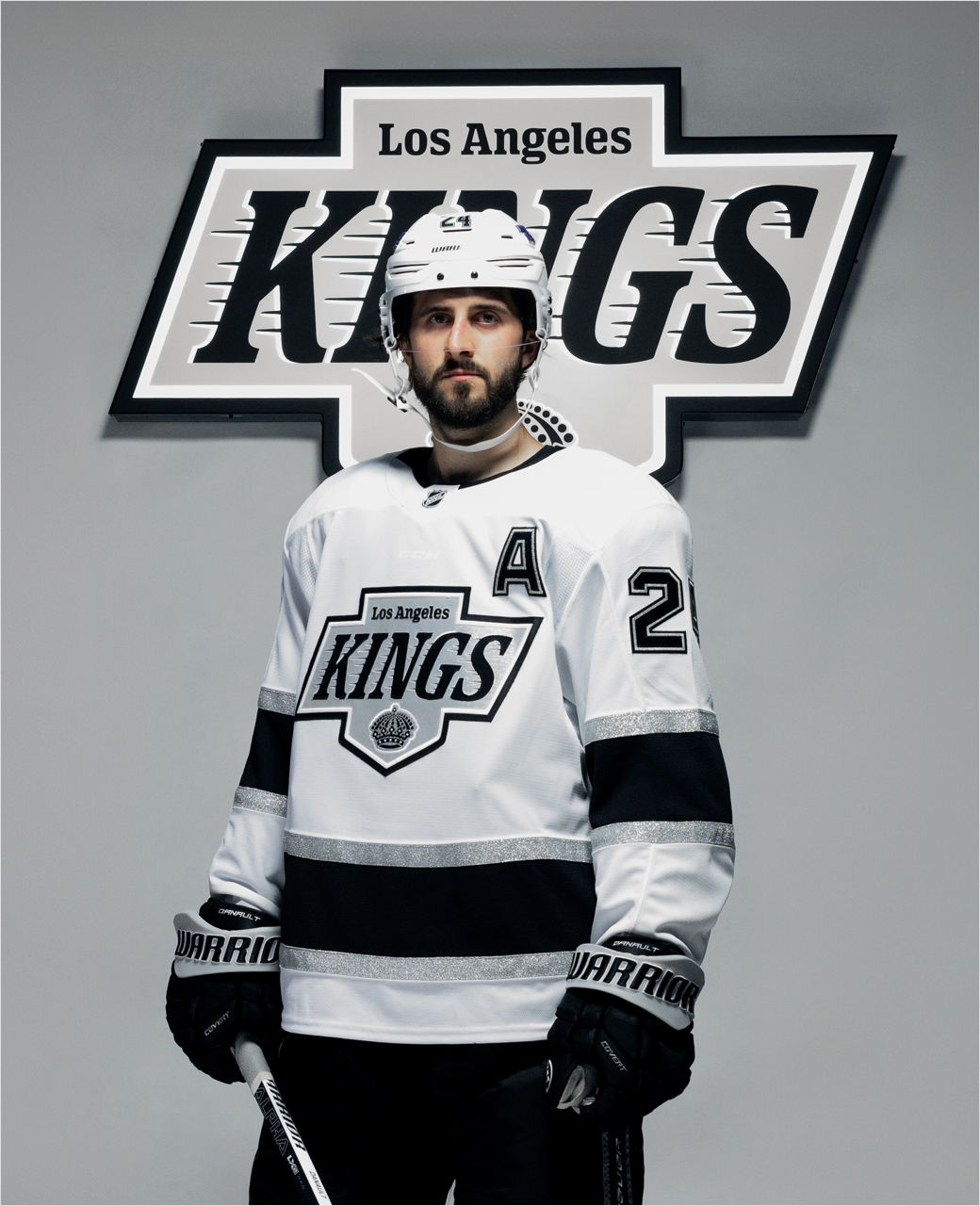
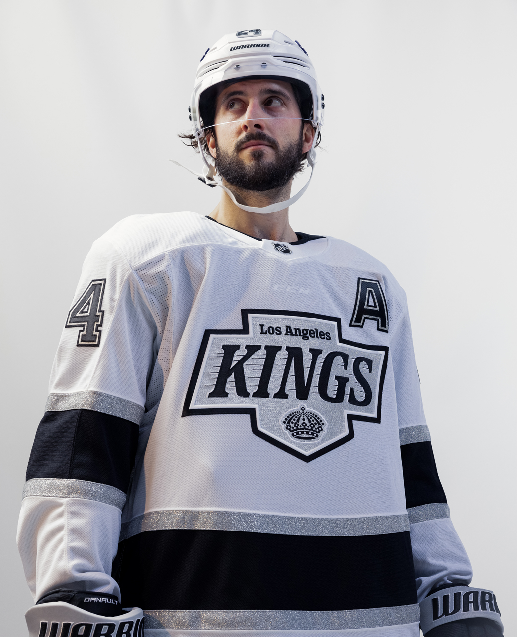
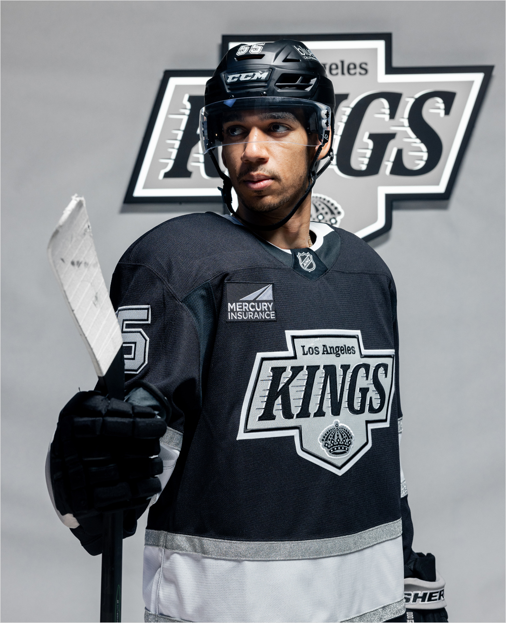
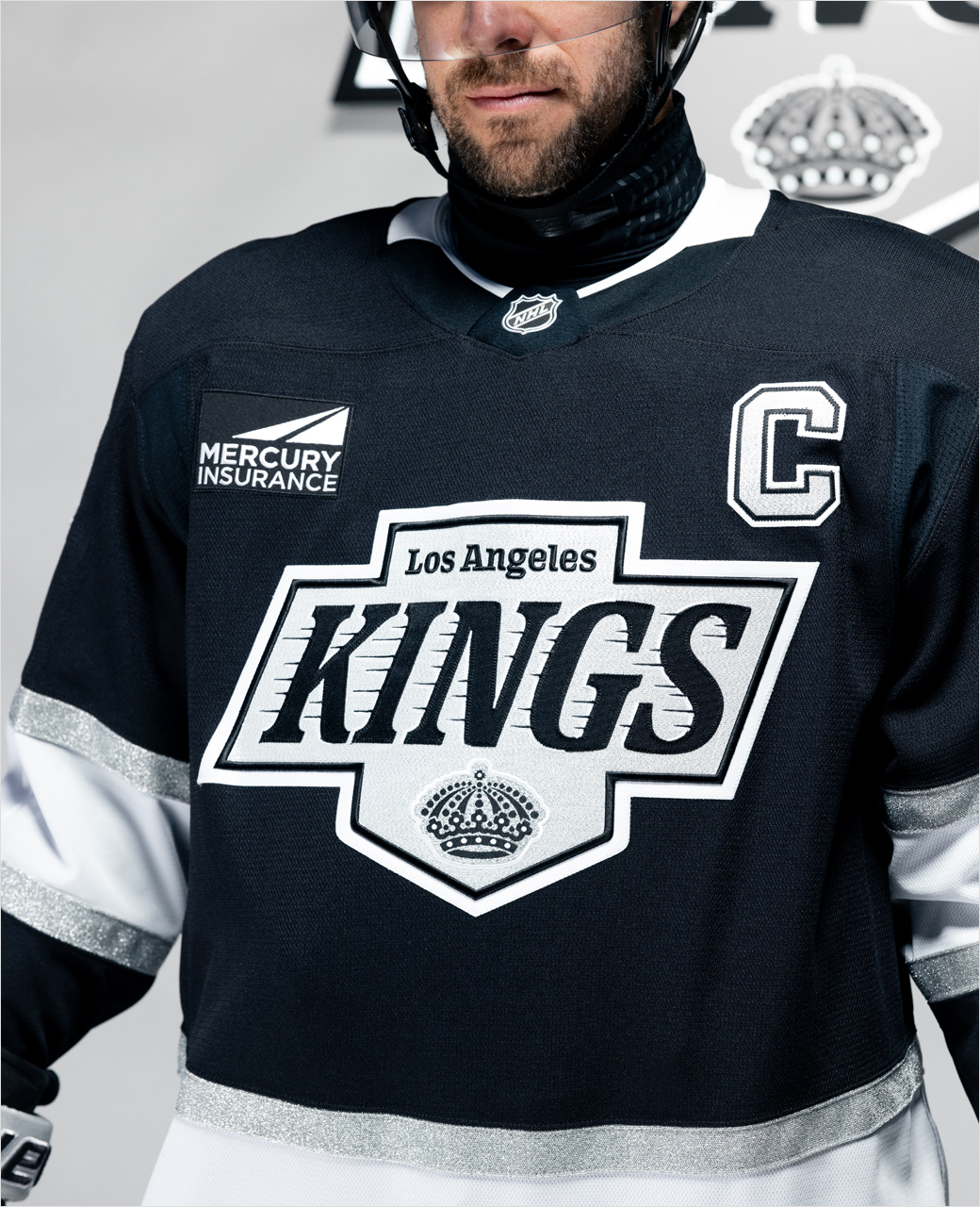
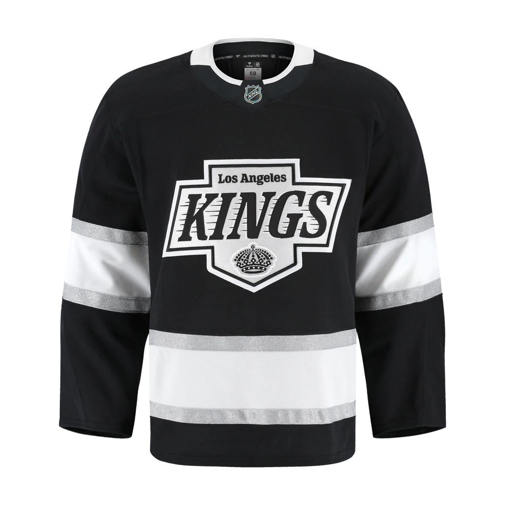
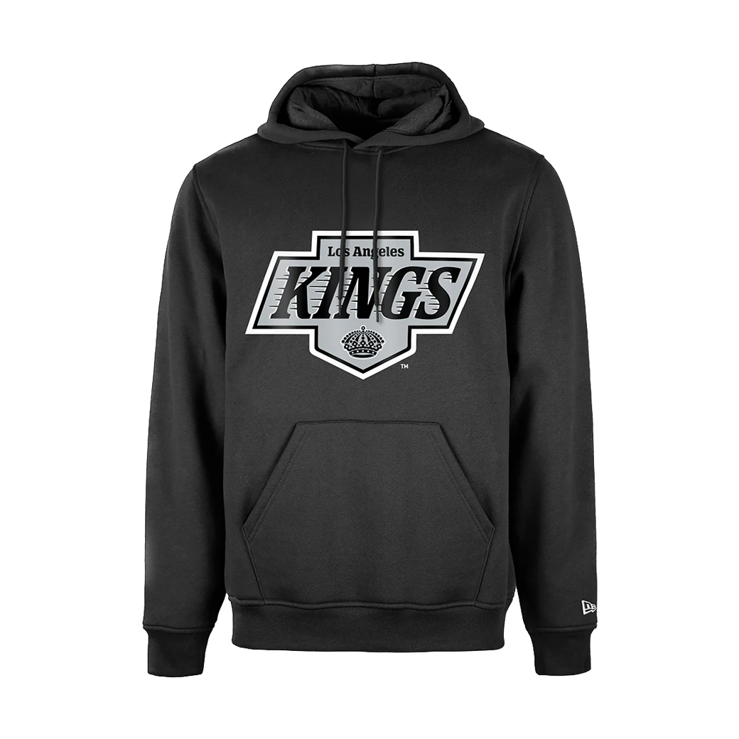
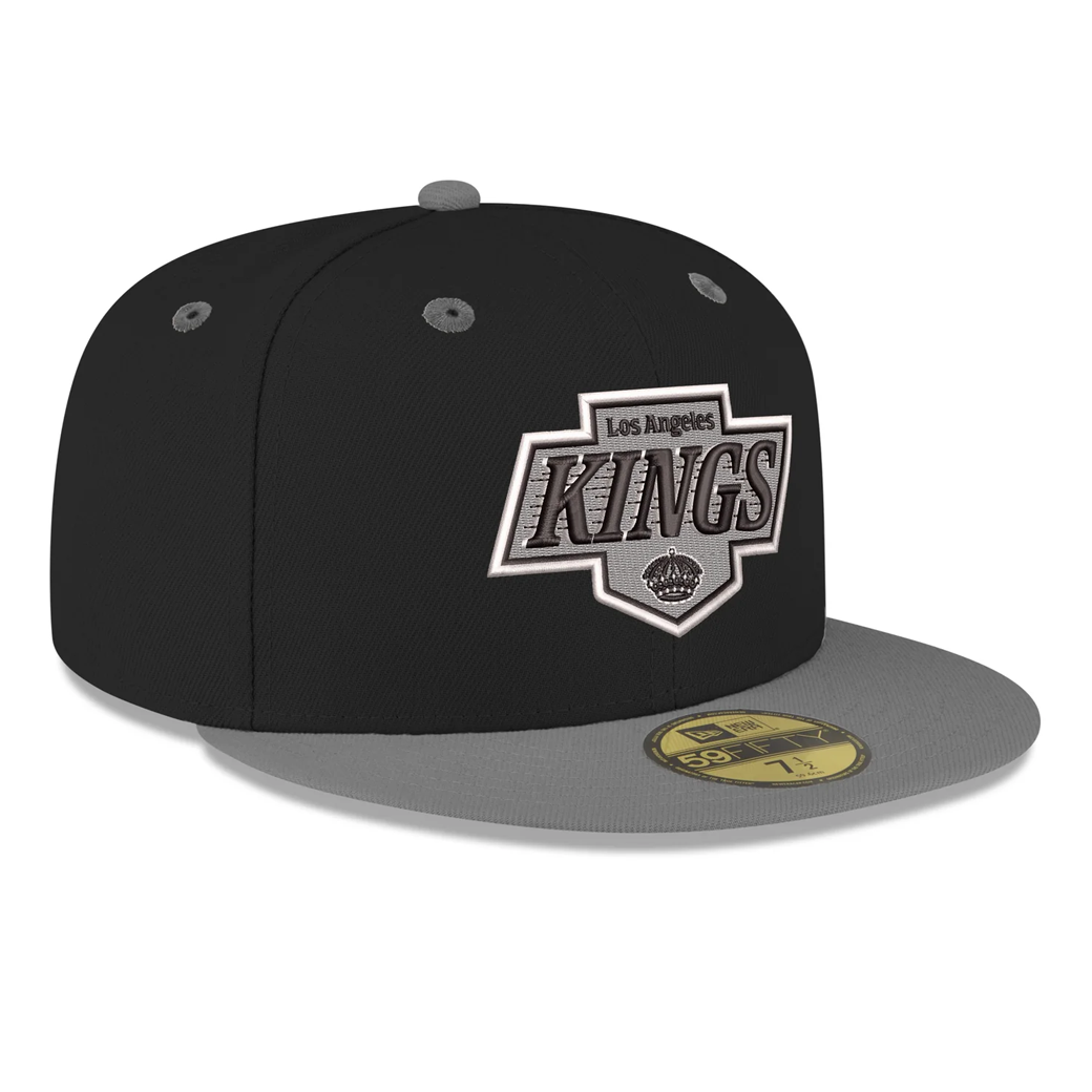
Heading the changes is the ice hockey team's new primary logo, which features elements from the club’s 90s era and original crown from the team’s inception in 1967.
The mark's overall shape has been expanded by widening the vertical section, providing space for a larger "LOS ANGELES" text and a more prominent crown.
Additionally, the horizontal portion has been heightened, allowing room for the centrepiece: The heavier-weighted "KINGS" text complete with what are dubbed 'speedlines'.
The font is also thicker and slightly less italicised, while the number of the speedlines has been reduced; their thickness, on the other hand, has increased, and each speedline has a custom length and shape.
The white drop shadow on the "KINGS" text now falls on the left side, and the font for the words "LOS ANGELES" and "KINGS" have reportedly been changed to improve legibility.
The club has also rolled out an updated colour palette, which features a new "enhanced silver" that is showcased on the club’s new jerseys.
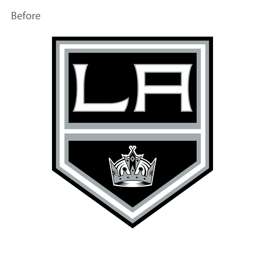
Debuting in 2008 as the featured element of an alternate jersey, the old primary logo is now officially "retired".
Source: LA Kings


