Ice Cream Chain Baskin-Robbins Reveals New Logo and Packaging Design
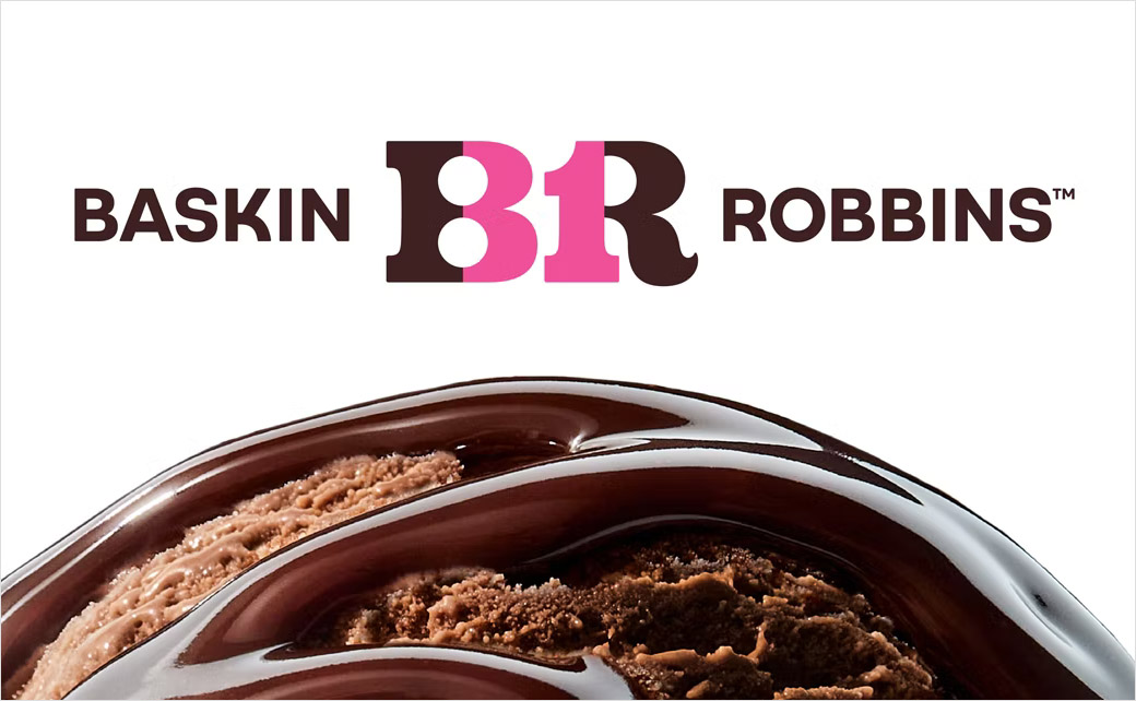
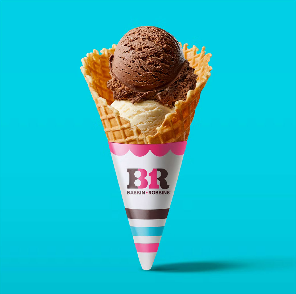
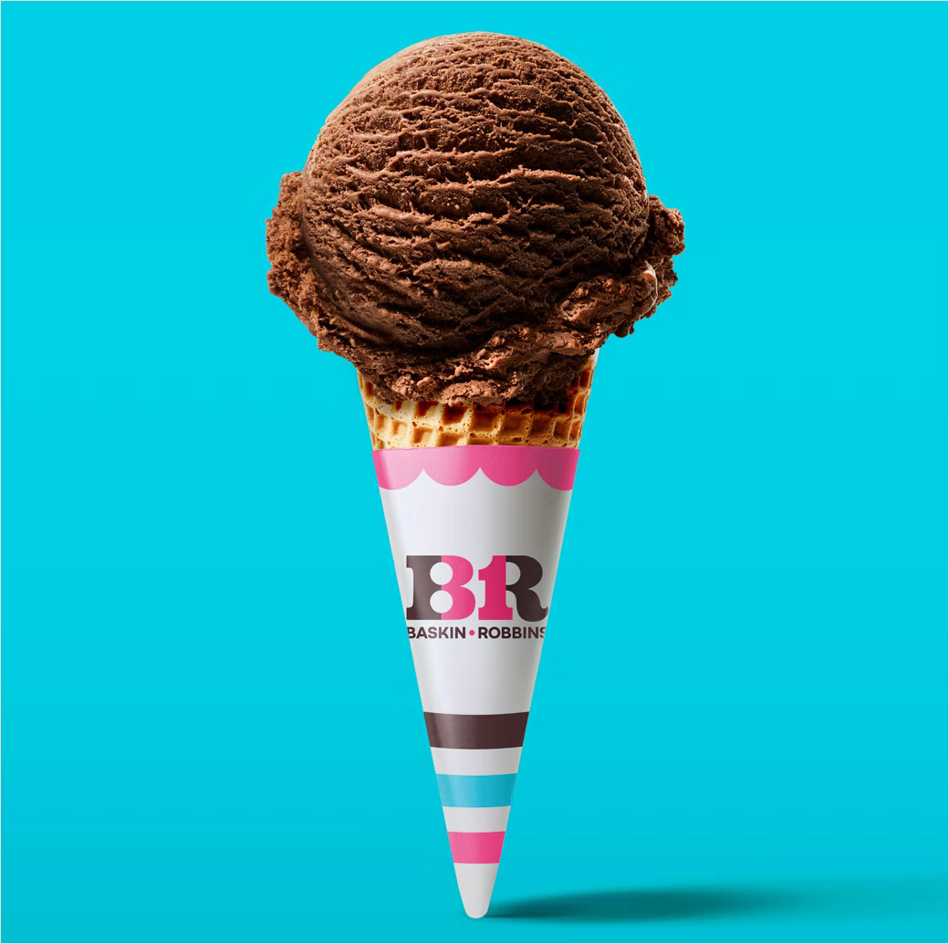
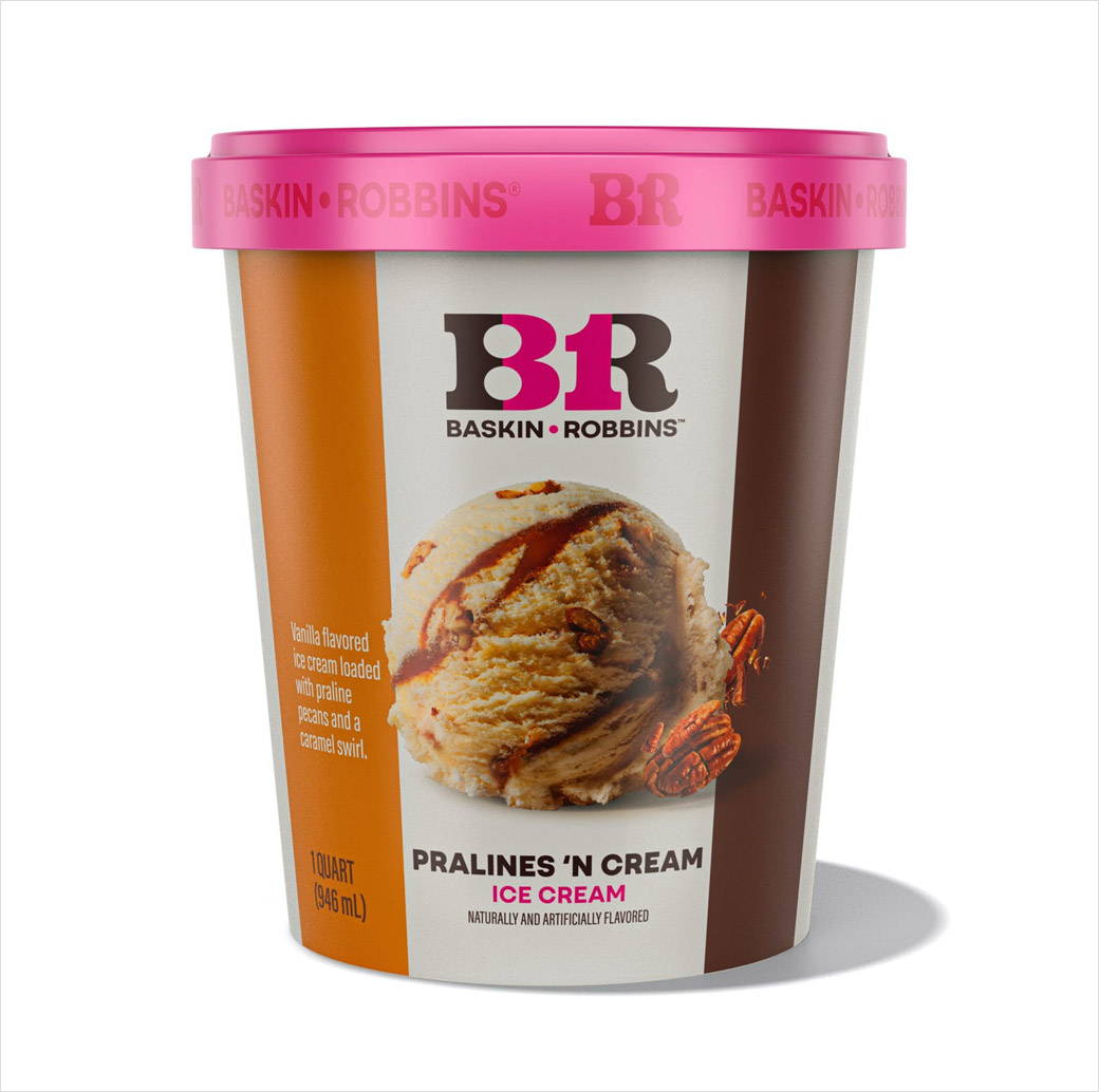
Multinational ice cream chain Baskin-Robbins has refreshed its logo, packaging, and employee uniforms as part of a major rebranding effort.
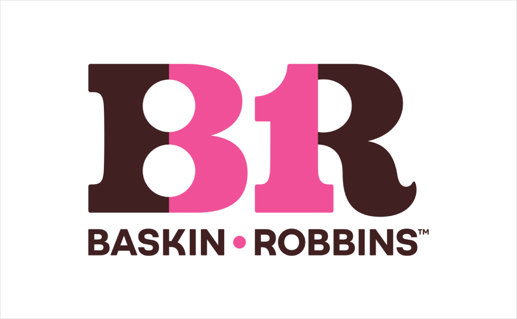
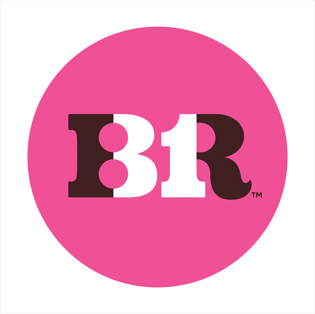
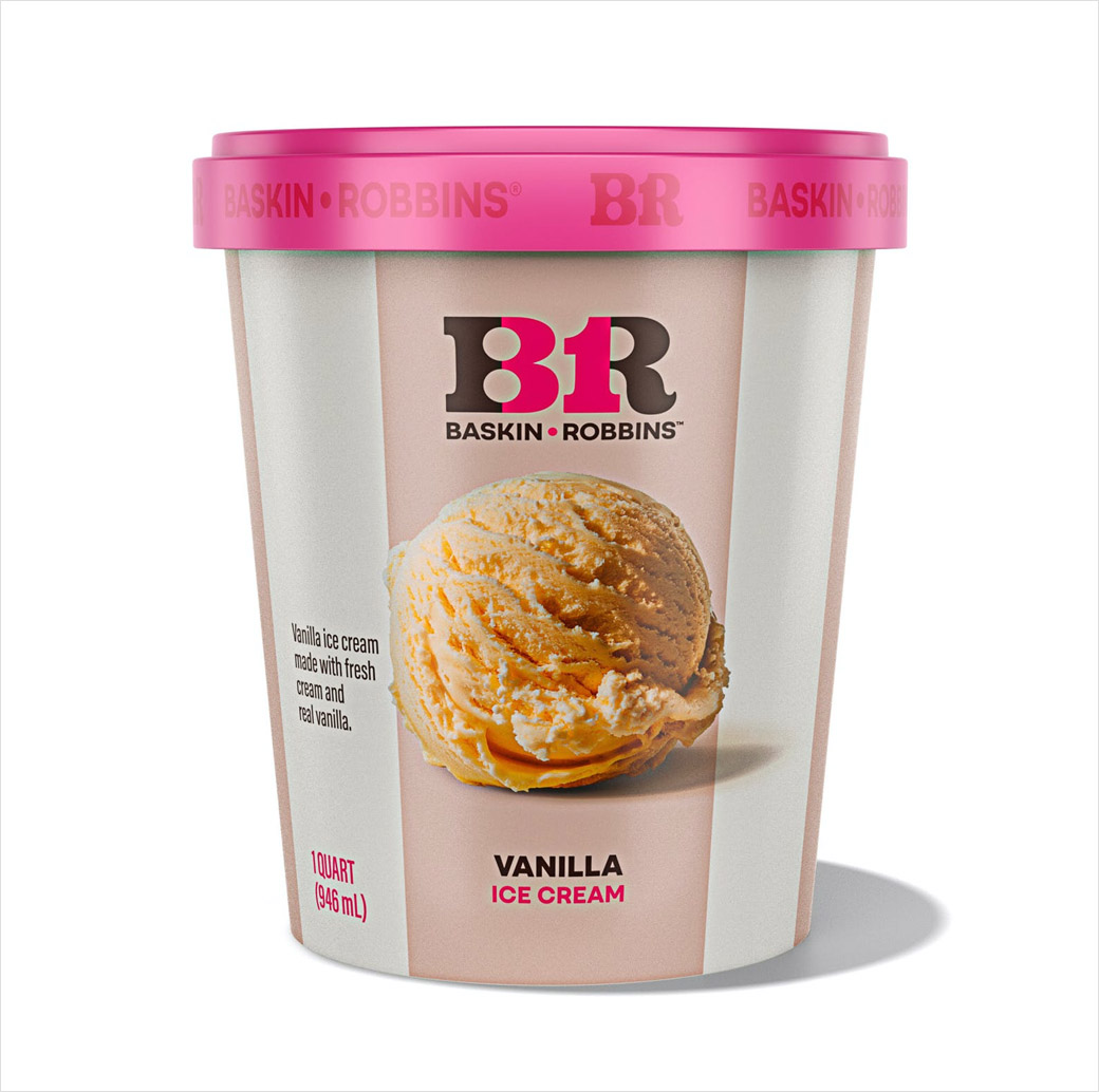
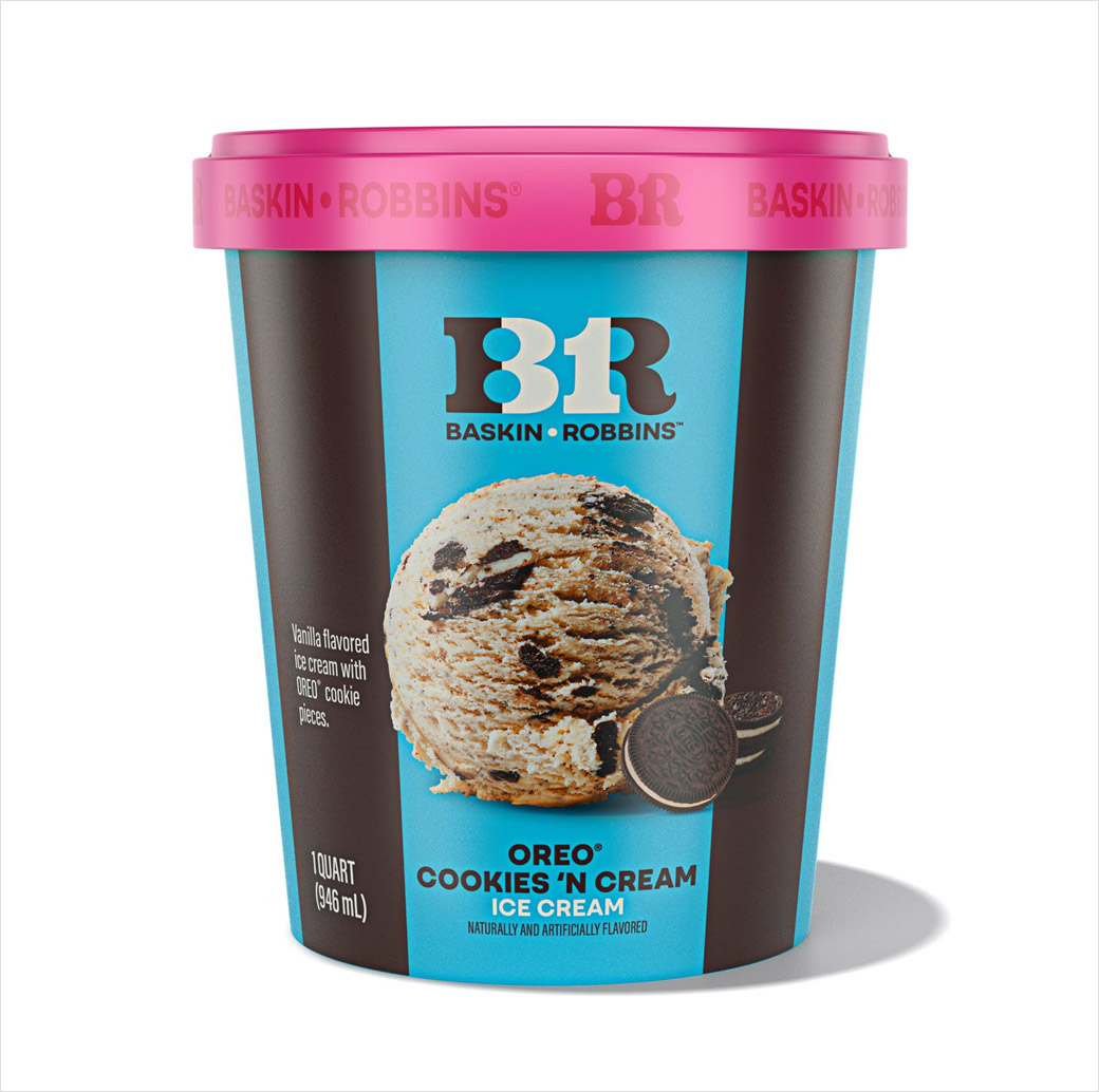
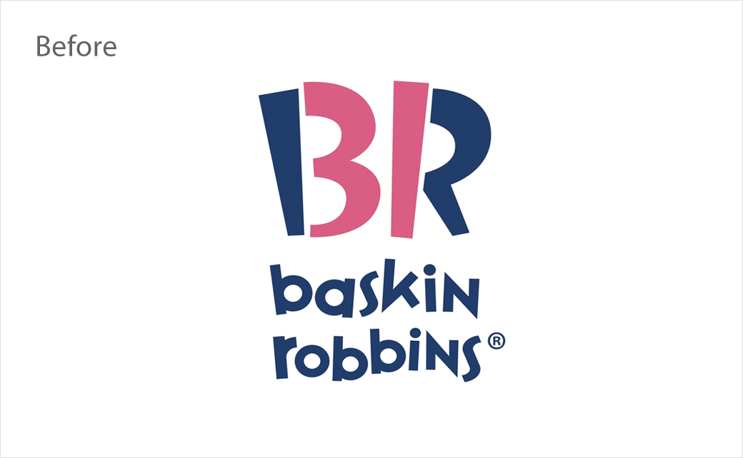
The updated logo design retains the number “31”, which represents the company’s famous “31 flavours” slogan that it first started using back in the 1950s – and which was originally based on the idea of a customer being able to choose a different flavour for every day of the month.
Further changes to the logo include the colour blue being replaced with brown and the name being set in a new font using all caps.
The latest overhaul also sees the introduction of a new tagline – “Seize the Yay” – as well as the launch of three new ice cream flavours, namely, Non-Dairy Mint Chocochunk, Ube Coconut Swirl, and Totally Unwrapped.
Additionally, to mark the rebrand, the company plans to launch a collection of ‘limited-edition’ merchandise beginning next week. The collection features clothing and other items such as bicycles and skateboards, which the company says will encourage “yay seizing moments”.
“For more than 75 years, Baskin-Robbins has been the destination for celebrating the moments that matter most. Our new look and manifesto recognise the extraordinary role ice cream has played in our customers’ lives, along with our continued commitment to innovation and creating someone’s next favourite flavour,” comments Jerid Grandinetti, vice president of marketing and culinary at Baskin-Robbins.
Founded in Glendale, California in 1945 by brothers-in-law Burt Baskin and Irv Robbins, the American business now operates 8,000 shops in over 50 countries around the world.
Source: Baskin-Robbins


