IC Design Creates Look for Andean Food Brand, ‘Mantandina’
IC Design has created the branding for Mantandina, a new UK food brand that specialises in food and drink from Peru and the Central Andes.
Andean food is said to have taken off in the UK over the last few years, particularly in London. New restaurants are constantly launching and it was predicted to be a start-up business trend for 2015.
The agency was commissioned to consult on both the naming and visual identity creation for Mantandina, initially for retail but long term to work as a café brand as well.
The designers say the identity needed to reflect the owner’s – and the products’ – Peruvian heritage.
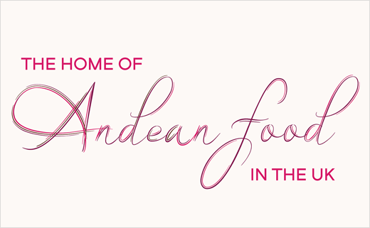
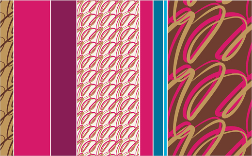
“Inspired by the name, Mantandina means blanket from the Andes. IC Design created an M icon made up of threads that weave together with a small cross stitch for added detail. As well as representing the blankets themselves, the icon also represents the products that are sold; raw ingredients that are combined together to create something very special,” explain the designers. “The colour scheme is deep and rich with a base of coffee colours to tie it together, echoing Peruvian mantas and landscapes. The icon is used to create a fluid pattern combined with coloured bars, reflecting patterns from Peruvian blankets. This is also followed through onto the typography treatment.”
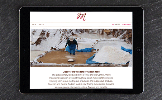
The agency’s work with Mantandina also includes development of the company’s website and printed collateral.


IC Design
www.icdesign.co.uk


