Hyundai Reveals New Logo and Identity
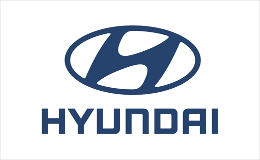
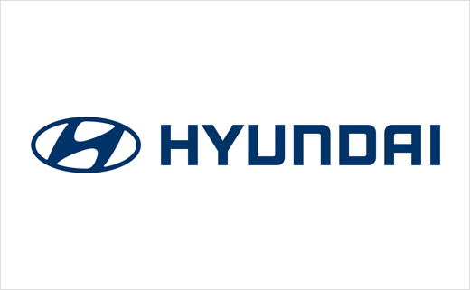
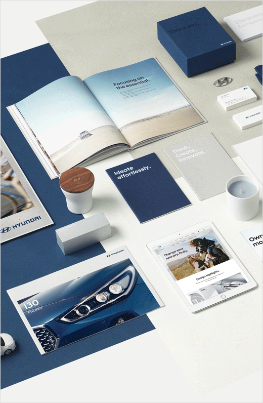
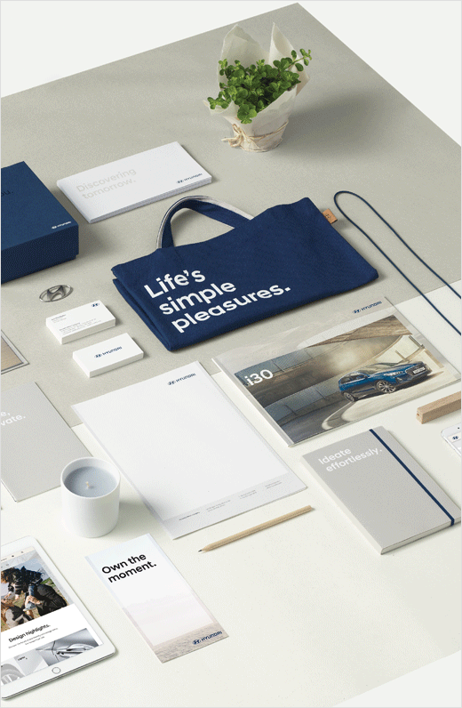
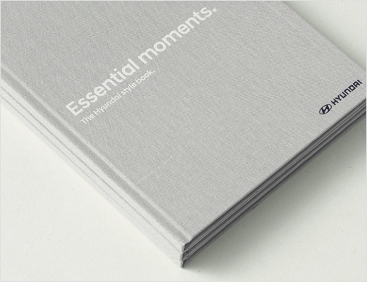
Korean car manufacturer Hyundai has revealed a refreshed logo design as part of a new-look identity kit.
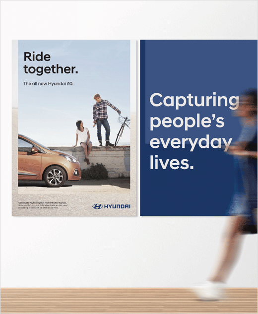
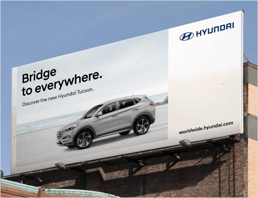
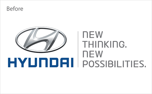
Designed by Creative Works, the company’s in-house branding agency, the updated “H” signet does away with the 3D metallic effect of the old logo and adopts a ‘flat’ look instead.
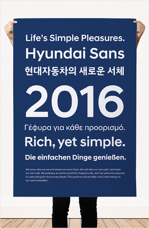
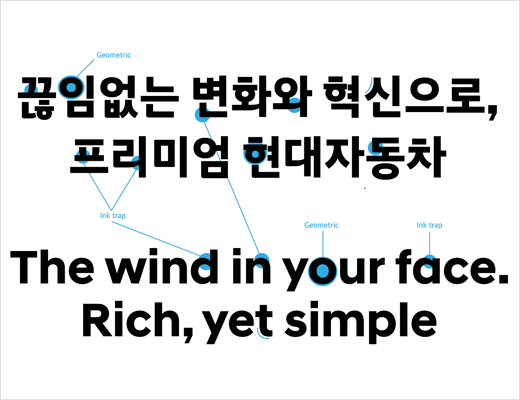
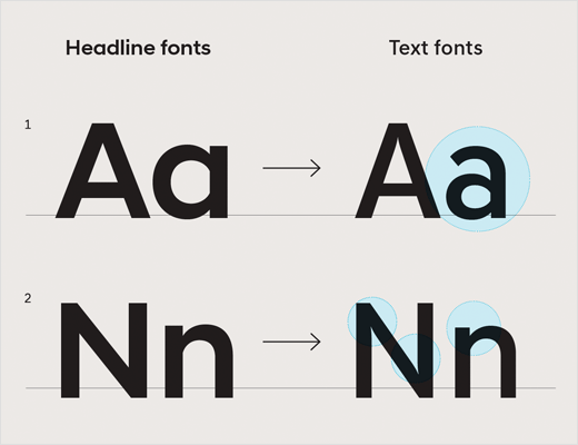
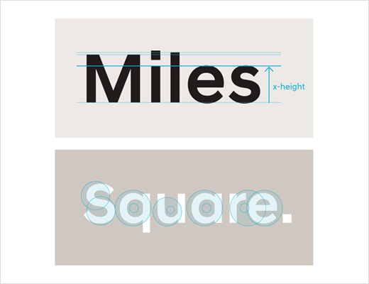
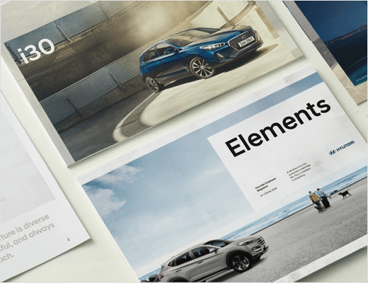
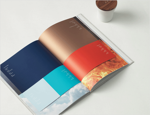
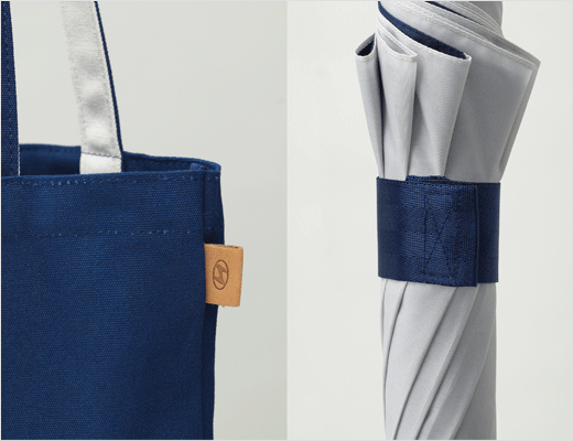
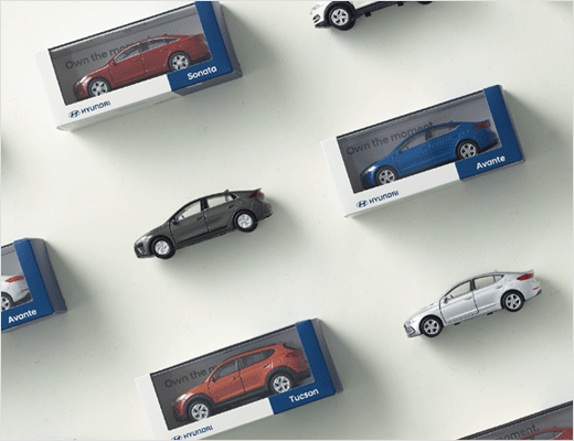
Additional details include the introduction of a bespoke typeface dubbed “Hyundai Sans”, as well as a colour palette said to have been inspired by nature.
“In 2015, Hyundai commissioned a comprehensive 18-month, global brand relaunch to repair global brand inconsistencies. Our objective was to shift the brand’s focus from product to lifestyle in a effort to deliver a consistent, global brand experience to consumers,” says the agency.
“To be distinct from our competitors, we drew inspiration from our Korean roots; natural materials such as linen and wood; our values of balance, harmony, warmth; and the four elements depicted in the Korean flag – water, earth, fire, and wind. They come together harmoniously to form the basis of our redefined brand assets,” further explain the designers.


Creative Works
www.creativeworks.kr


