HR Analytics Software ChartHop Reveals New Logo Design
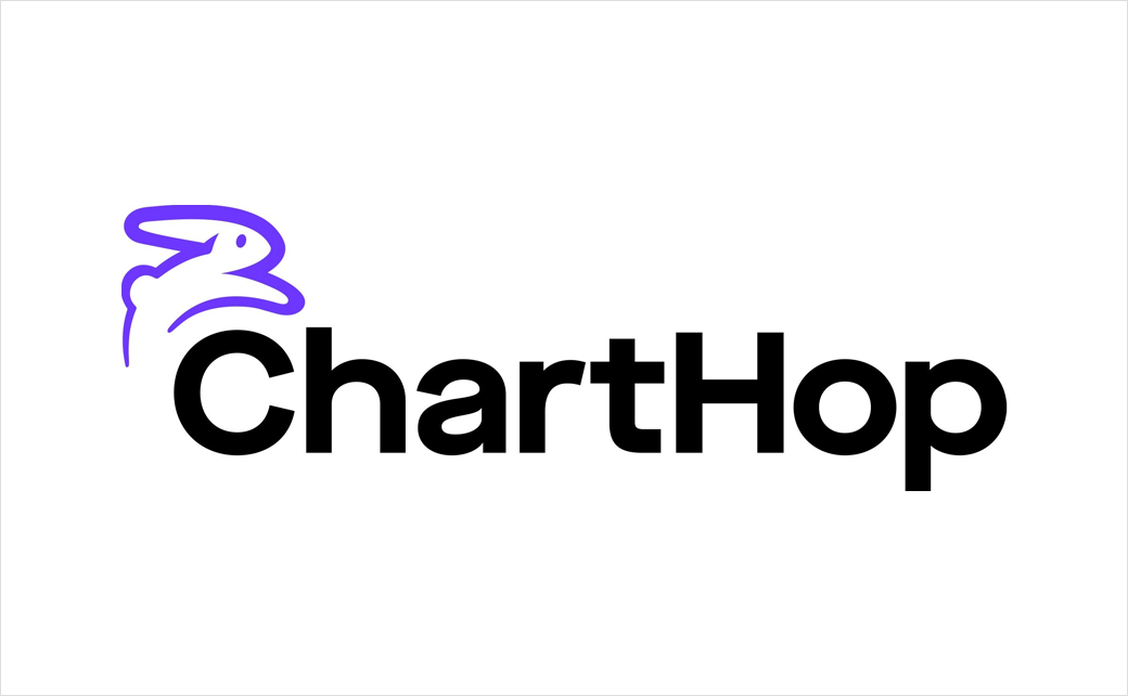
Human resources analytics software ChartHop has announced a rebrand, rolling out a new logo design, look and feel, and website.
The SaaS platform says the brand refresh symbolises its “rapid growth and maturity” as well as its “continued commitment to meeting the needs of people-first organisations”.
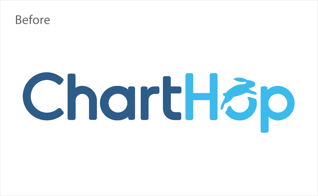
While the company has retained the usage of a rabbit icon for its core logo, the symbol has nevertheless been given a design makeover.
“We decided to keep the bunny as part of our logo. While it looks a bit different now, the bunny was part of our initial founding and we still felt attached to it as part of ChartHop’s identity. Additionally, we felt the bunny embodied the idea of approachability, and while we explored a lot of iterations on what the ChartHop bunny could look like, we landed on one that we believe feels friendly and welcoming. It even winks!” explains Diana Kucer, chief marketing officer of the two-year-old, New York City-headquartered firm.
Adding: “Next, we landed on purple as our primary colour. It felt bold and different, just like ChartHop. We’re building something different in the market and offering a new way of working, and we believe our choice of purple stands out in the sea of options. It reflects our approach to changing how HR technology is built and incorporated into the fabric of successful companies.”
The reveal of the new identity has been timed to coincide with the release of a new ‘Basic’ version of its software that is being offered for free to organisations with 150 employees or less.
“Companies can’t afford to fall behind when it comes to making people decisions,” comments Ian White, the company’s founder and CEO. “Today, businesses must prioritise their employees and company culture, and that starts with transparency. ChartHop Basic makes transparency even more accessible, so that everyone in the organisation can make more informed and strategic decisions that support organisational health.”
Source: ChartHop


