Hostelworld Unveils New Logo and Branding
Online hostel reservation company Hostelworld has revealed a rebrand that it says will target ‘spontaneous adventurers’.
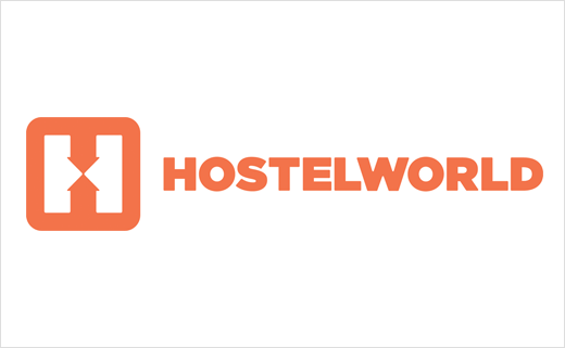
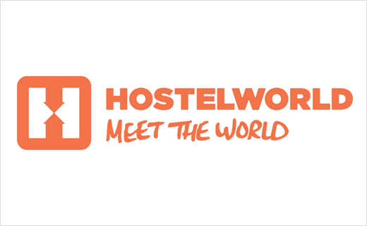
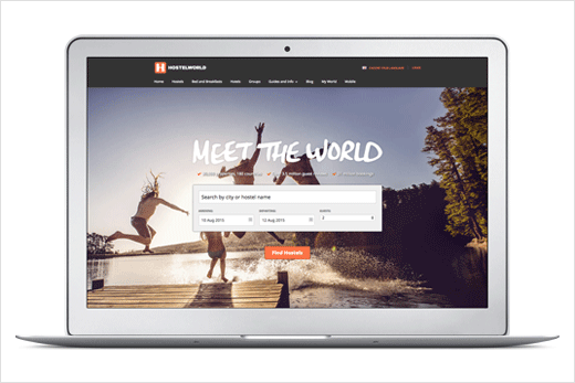
Said to have been designed to target a ‘millennial audience’, the new ‘H’ logo incorporates two arrows facing each other; these are claimed to symbolise a meeting point, with the idea being that hostels are now being seen as ‘social hubs’.
Orange, the designers say, was selected as the new colour for the brand because it provides a “psychological trigger for enthusiasm, optimism and affordability.”
Talking about contemporary hostels, Ottokar Rosenberger, current CMO at Hostelworld, says they’ve become “more stylish, more comfortable and better equipped than alternatives while still being affordable, centrally located and, crucially, communal. This is what sets hostels apart and is the basis for our new ‘Meet the World’ proposition.”
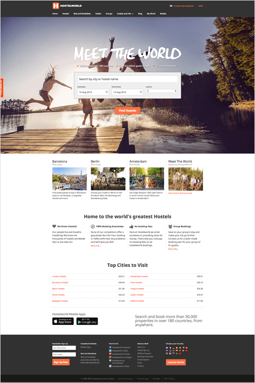
Hostelworld engaged London-based creative agency Lucky Generals to help carry out the brand refresh, which also includes a newly-designed website, social media channels, a smartphone/tablet app and an Apple Watch app.
Source: Hostelworld


