Historic ‘Quad Cinema’ Gets New Logo Design by Pentagram
Pentagram’s Paula Scher and her team have created the new brand identity for New York’s famous Quad Cinema, which has recently reopened following a major renovation.
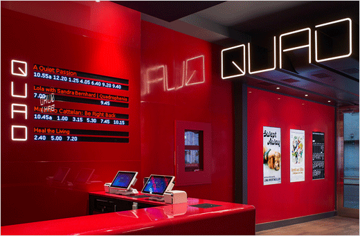
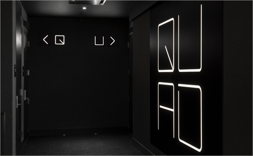
As well as designing the all-new logo, the consultancy has also developed the look and feel of the cinema, including signage, environmental graphics and digital installations for the interiors.
The Quad originally opened in 1972 and was the first cinema in Manhattan to have multiple screens under one roof—four to be exact, hence the name.
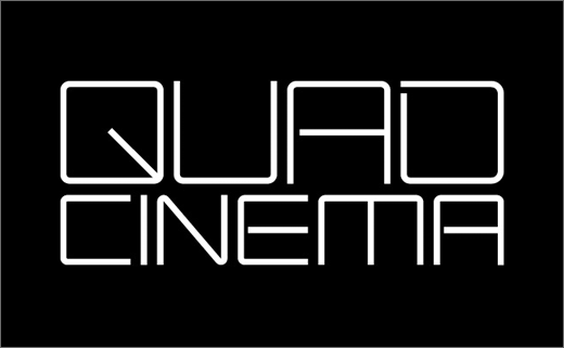
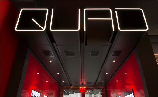
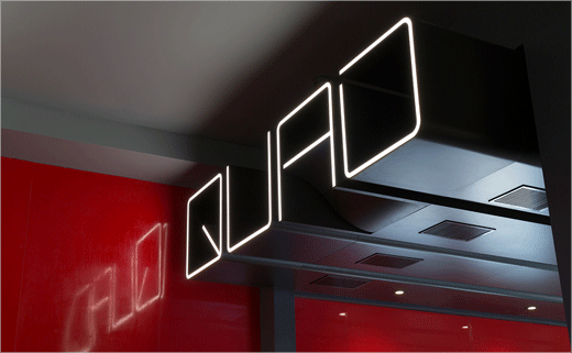
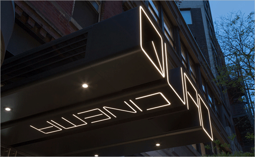
And the new Quad logotype has also been inspired by the cinema’s distinctive name. The designers have created a bespoke typeface that echoes the name in square letterforms with rounded corners; the latter, they claim, are suggestive of the shape of screens and film sprockets.
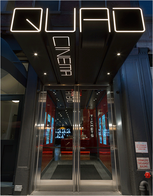
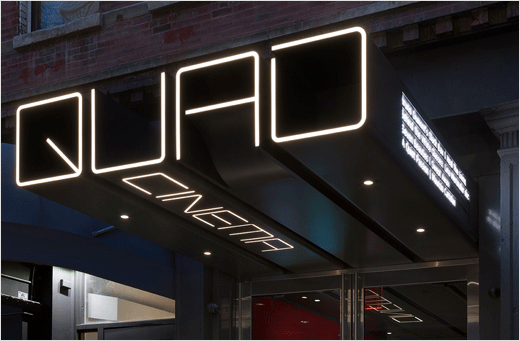
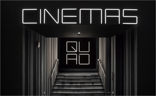
On the building’s exterior, the logo also serves as a key architectural component. Fabricated of aluminium, it projects three-dimensionally from the building’s facade onto West 13 Street, while the word “Cinema” runs along the underside of the “U”, guiding visitors inside.
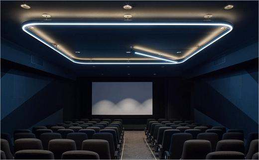
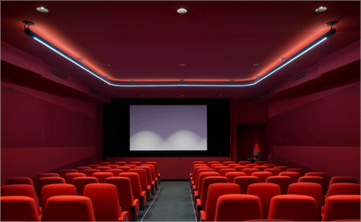
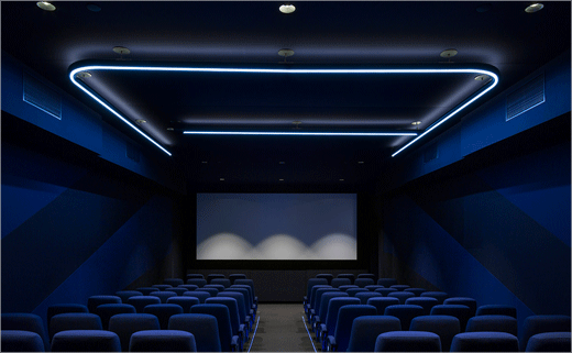
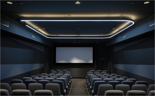
The interior also sees each letter in the name “Quad” being assigned to an individual screening room in the four-screen cinema, where it appears as large-scale LED lighting in the ceiling.
Additional details include custom icons constructed of simple shapes for applications like restroom signage, as well as the adoption of the geometric sans serif GT Walsheim for secondary type in print promotions and the Quad website.
Pentagram
www.pentagram.com


