GoDaddy Reveals New Company Logo Design
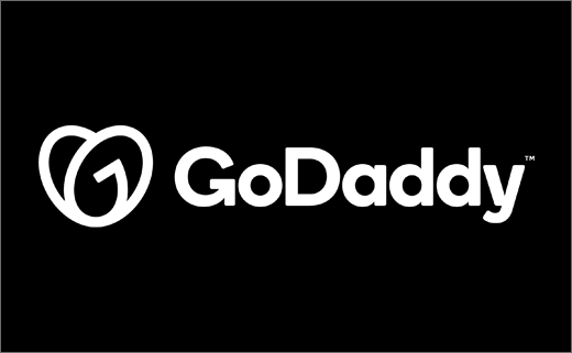
Internet domain name registrar and web hosting giant GoDaddy has revealed an all-new logo.
Dubbed “GO”, and mixing a generic, sans-serif type with a heart-shaped monogram, the new design stands in complete contrast to the American brand’s former cartoon-style logo.
“We created the GO’s swooping arcs to represent the indomitable spirit of everyday entrepreneurs. And the word ‘go’ itself is our rallying cry for folks to take the first or next step in their entrepreneurial journey,” claims GoDaddy.
“The GO says to our community that they can stand on their own two feet and go do what they love,” further explains Cameron Scott, the company’s chief brand officer. “When entrepreneurs see the GO, they know they have someone standing in their corner, championing their every step along the way, to turn their ideas into reality.”
“The GoDaddy brand stands for inclusive entrepreneurship and helping anyone who wants to change how they work and live for the better by bringing their ideas to life online,” adds marketing boss, Fara Howard.
Forming the centrepiece of the company’s first rebrand in over two decades, the new logo has been designed in collaboration with branding agencies Lippincott and Codo.
It is further accompanied by a new website as well as new advertising campaigns.


Source: GoDaddy


