Opel Unveils New Logo Design
Carmaker Opel has unveiled an updated logo design as well a new brand credo dubbed “The Future is Everyone’s”.
The brand refresh comes just a few months after the German manufacturer, which sells its cars under the Vauxhall badge in the UK, was bought out from General Motors by France’s Peugeot-Citroën group for US$2.2 billion.
“The new claim ‘The future is everyone’s’ has its source in Opel’s soul. It is a commitment, approach and an obligation – and thus a lot more than a simple product promise,” says Opel’s marketing boss, Tina Müller. “The brand is a pioneer in democratising innovations. We have always made premium technologies available to a broad audience. The new claim bridges the gap between Opel’s history and the brand’s future program.”
The new brand positioning was developed in cooperation with Hamburg-based agency, Scholz &Friends.
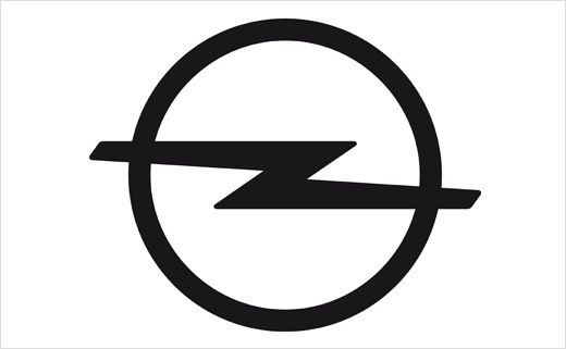
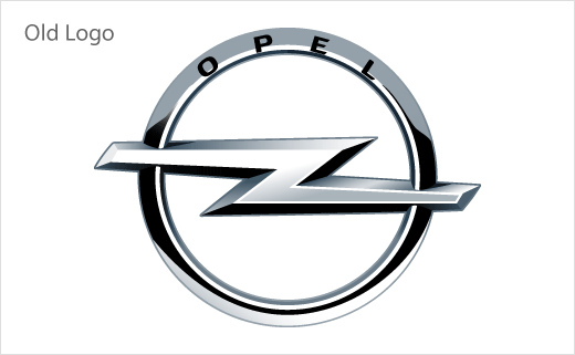
With regards to the new logo, company bosses say the guidelines for the re-design were to achieve “clarity and simplification”. As a result, all of the brand’s communication channels will, from now on, use a 2D logo instead of the previous 3D metal version.
Akin to the design used by the company in the 1970s to 1980s period, the new logo retains the basic components of all of its previous iterations – with a circle as a symbol for a wheel and the lightning flash as a sign of energy.
However, the brand’s cars are still expected to feature 3D versions, with the recently launched Insignia becoming the first serial production car to wear the new badge.
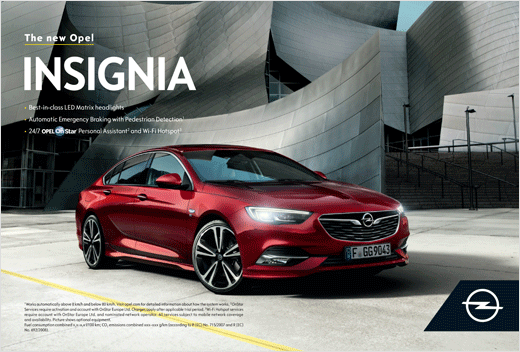
Source: Opel


