Garden and Pet Brand Pennington Reveals All-New Logo
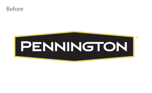
American garden and pet company, Pennington, has unveiled a new logo and brand identity.
Said to be one of the largest brands in the U.S. lawn and garden industry, the firm’s rebrand coincides with it entrance into new categories that are claimed to reflect its customers’ changing interests.
“For years, the perfectly manicured front yard with its ‘white picket fence’ has served as an ideal landscape. However, as 18 million new gardeners, most of whom are millennials, entered the category during the pandemic, Pennington has seen a change in consumer preferences,” says the 75 year-old business.
The new identity has been developed in collaboration with global branding agency Jones Knowles Ritchie (JKR).
“The new logo pays homage to the brand’s rich history with a design that’s bold, balanced, and uplifting. Illuminating rays within the logo serve to elevate and bring specific products or use-cases into focus, ultimately making the product selection easier for consumers,” explain the designers.
Adding: “The brand’s new primary colours hold the Pennington equity and differentiate it amongst competitors. Now consumers looking for the best products to help cultivate their outdoor spaces will know to look for the brand’s vibrant blue packaging featuring a bright yellow sun.”
Accompanying the new logo design is also a new brand purpose, namely, “Nurture the Roots You Put Down”.
Source: Pennington


