Formula One Reveals All-New Logo Design
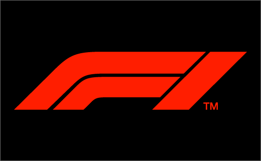
Formula One has officially revealed its new logo design. The unveiling took place this past weekend in Abu Dhabi, home of the final race of the 2017 season.
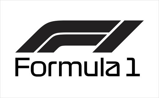
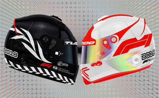
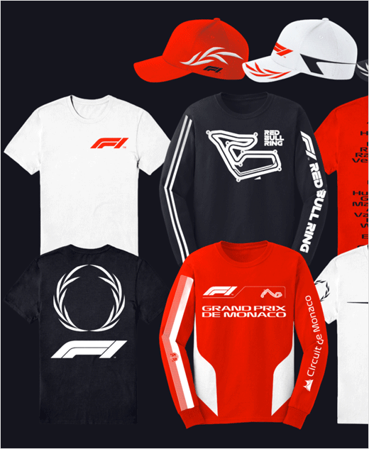
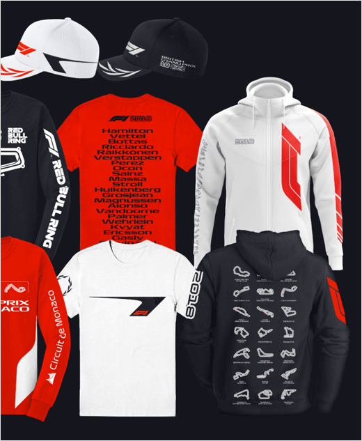
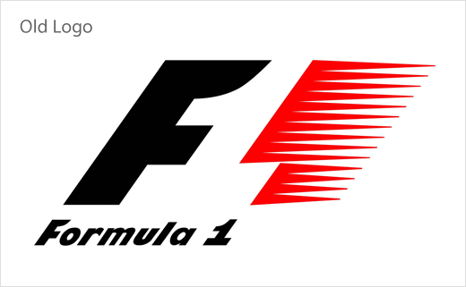
The new mark, designed by London-based agency Wieden and Kennedy, replaces F1’s famous ‘flying one’, which has served as the brand’s visual trademark since its creation in 1994 by studio Carter Wong.
“The new mark embodies the core forces of Formula 1 racing: speed, attack, and control; while its sleek, sharp interlocking components celebrate the technical prowess of Formula 1 engineering teams,” said Richard Turley, who headed the design and strategy team responsible for creating the new identity. “Its aesthetic is aspirational and leans into the future, but extends naturally from a rich heritage of motorsport graphics.”
“It takes its inspiration from the low-profile shape of the car, two cars crossing a finish line and it is incredibly bold and simple,” added Formula One’s head of marketing, Ellie Norman. “But as we apply this in today’s market and being mobile and digital led, we have much more flexibility and versatility with this logo.”
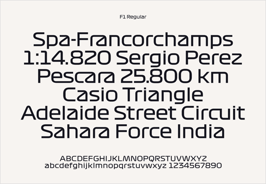
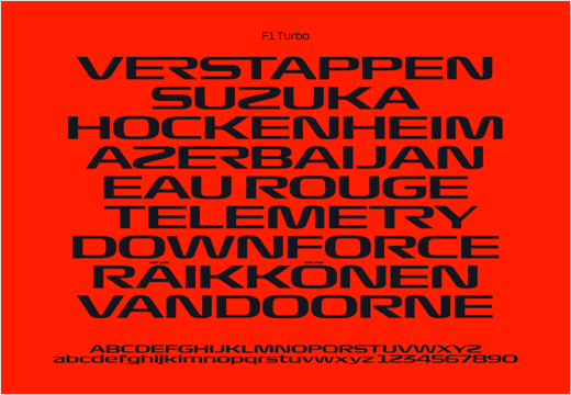
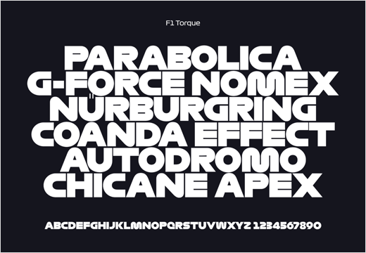
The new mark is also accompanied by a group of bespoke typefaces created by French designer, Marc Rouault. Details include a headline font dubbed “F1 Regular” as well as two display faces, namely, “F1 Turbo” and “F1 Torque”.
Wieden and Kennedy
www.wklondon.com


