Food Lion Reveals New Corporate Logo Design
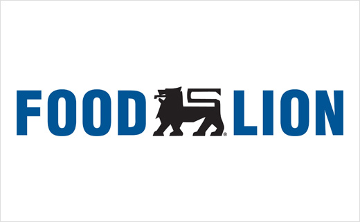
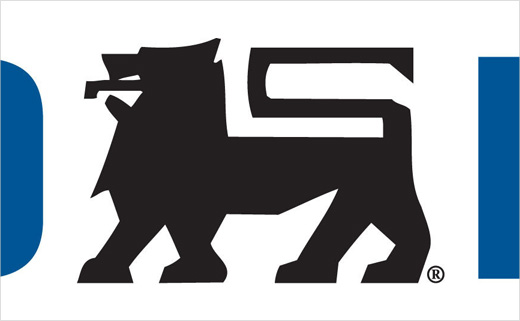
American grocery store chain Food Lion has unveiled its new logo and brand strategy.
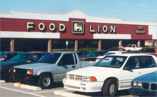
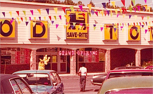
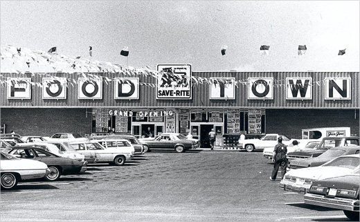
Founded as Food Town in 1957, in Salisbury, North Carolina, Food Lion currently serves more than 9 million customers each week.
The logo reveal marks the beginning of a multi-year initiative that the company says will make shopping easier for customers at the brand’s more than 1,100 stores.
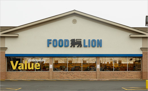
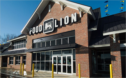
The brand’s new logo has already launched across the grocer’s 10-state footprint in television advertising, the company’s weekly ad flyer and website. The company claims the new logo provides a more modern look for customers, while preserving the history and heritage of the lion and the “Food Lion blue.”
“With our new logo, we have an opportunity to show our customers that we’re fresh, while remaining true to our legacy of low prices,” added Newlands Campbell. “Beginning later this year, we’ll also bring our customers items in our stores that are consistent with the logo on the front, as we deliver new Food Lion store brand products that will help our customers save.”
As well as a refreshed logo, other new visual elements include blue bags, in addition to traditional white bags. The new blue bags have been designed to be used specifically for cold and frozen items in order to make them more easily identifiable and make unpacking groceries easy for customers at home, especially in warmer months.
Food Lion says it will also begin to rollout transformational changes such as storewide remodels in markets over time. These stores will be among the first to display Food Lion’s new logo.
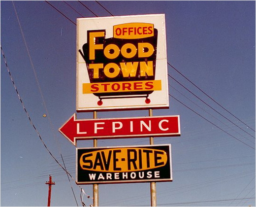
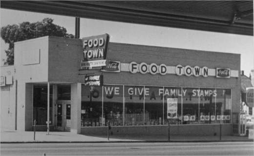
Source: Food Lion


