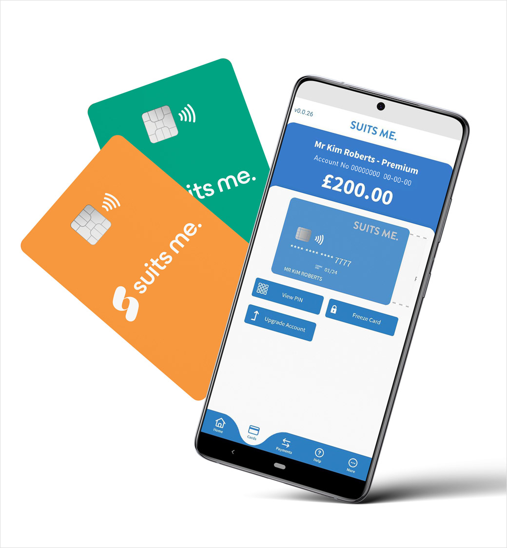
Fintech, Suits Me, Unveils New Logo and Identity
British alternative banking company, Suits Me, has refreshed its identity, unveiling a brand-new logo and website.
The new facelift is said to come on the back of continual growth that the six-year-old fintech has experienced in the last year.
Working in partnership with brand consultants, oser, Suits Me created a new concept that aims to better reflect its audience within the financial sector. In addition to this, the company wanted to incorporate its business values into the new design, which are claimed to be symbolised by graphic design elements such as the colourful ‘swooshes’ that appear within the logo and website.
“With a pop of energy and colour, the dynamic swoosh is created from elements of the new logo. It encapsulates how Suits Me is by your side to weave around your financial obligations, and support you in achieving your financial aspirations, regardless of whoever you are, and whatever your situation and lifestyle,” explains Kim Roberts, the company’s marketing and communications director.
Another aim of Suits Me’s rebranding strategy was to provide its over 150,000 account holders with an improved user experience.
One way the Cheshire-headquartered business says this has been achieved is by replacing its traditional blue colour scheme with bright, gradient colours against a fresh white background.
Suits Me’s new tagline, “the account for everyone”, also represents the fintech’s mission to break down the restrictive barriers that exclude people from mainstream financial products, especially those who may have poor or no credit history, no proof of address, or struggle to open an account with a traditional bank.
“Our customers are at the heart of what we do, and we strive to give them the best experience when it comes to navigating the world of personal finance. The rebrand is just the start of even more amazing benefits we want to give our account holders, with no additional costs attached,” says Suits Me’s CEO, Matthew Sanders.


Source: Suits Me


