Fareway Marks 80th Anniversary with New Logo Design
U.S. grocery store chain Fareway Stores has revealed an all-new logo design as part of its 80th anniversary celebrations.
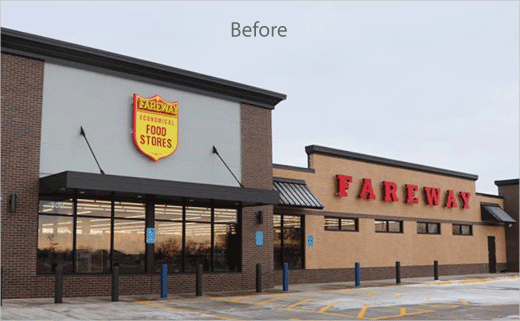
The refreshed logo, which has already started to roll-out across advertising, exterior signage, and in-store placement, prominently features Fareway, with the words meat and grocery, in solid red lettering.
Accompanying the logo is a new shield icon that will mark products that are “high in quality and value”. Over the next year, customers will also begin to see Fareway employees in new uniforms, which will be “professional, yet functional”, says the company.
“This new design focuses on what we do best – meat and grocery. Fareway is your neighbourhood grocery store that offers an unmatched meat department as part of a full-service grocery shopping experience,” comments Fareway CEO, Reynolds W. Cramer. “While this new design focuses on Fareway’s strengths, it also symbolises a fresh perspective.”
The retail brand currently operates 121 store locations in Iowa, Illinois, Minnesota, Nebraska, and South Dakota.
Source: Fareway


