Facebook Unveils New Corporate Logo as Part of Rebrand
Internet giant Facebook has revealed a new logo design, in an effort to differentiate itself as a corporation from its popular social network app that has come under fire in recent times.
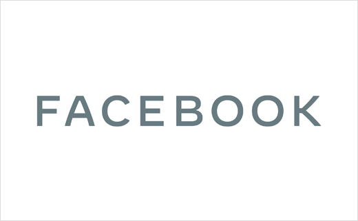
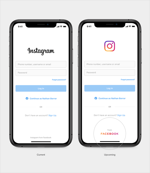
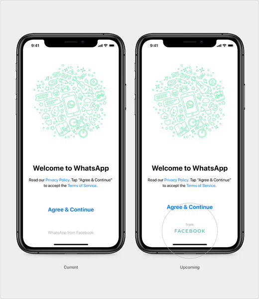
The new logotype, which Facebook marketing boss Antonio Lucio says has been “designed for clarity”, uses bespoke typography, rounded corners, open spacing and all upper-case letters to create a visual distinction between the company and app, with the latter set to keep its own branding
“We needed the wordmark to establish distinction from the Facebook app and allow for a clearer connection to the full family of technologies [Messenger, Instagram, WhatsApp, Oculus, Workplace, Portal and Calibra],” explains the California-based corporation’s in-house design team. “It’s built on a stable structure through the use of consistent stroke width, harmonised capital letters and a horizontal emphasis. The generous spacing and open letterforms allow clarity at small sizes, and the subtle softening of corners and diagonals adds a sense of optimism.”
The wordmark also condenses into a “FB” monogram in small spaces, which builds on existing equity: FB is already associated with Facebook, is the company’s stock ticker symbol and is used in domains and employee email addresses. To perform in smaller spaces across product and company touch points, the FB monogram uses a heavier weight and extended letterforms.
The colour palette, meanwhile, is described as “empathetic”, as a a result of which the wordmark will be seen “taking on the colour of its environment” instead of utilising a single fixed colour.



Source: Facebook


