Evernote Unveils New Logo Design
Mobile app Evernote has revealed a new logo design as part of an identity refresh.
Launched over a decade ago by Californian-headquartered Evernote Corporation, 225 million people worldwide are now claimed to use the software, which is designed for note taking, clipping web pages, making to-do lists, and general archiving.
The new look, created in partnership with branding agency DesignStudio, was officially unveiled yesterday by Francie Strong, Evernote’s VP of brand and communications, and Jonathan Woytek, Evernote’s executive creative director.
“Why toy with something that’s unique, recognisable, and, dare we say, iconic? Our logomark, ‘Mads’ the elephant (named after an early Evernote customer and designed by Gabe Campodonico), has represented us well, standing strong while many brands have refreshed, redesigned, or simply ceased to exist. But a logo isn’t a brand,” wrote the duo on a blog post on Medium. “The simple answer is, the brand needed to change because we’ve changed. The demands on people’s attention have changed. The ways they use our products have changed. And our brand no longer reflected the company it was built for.”
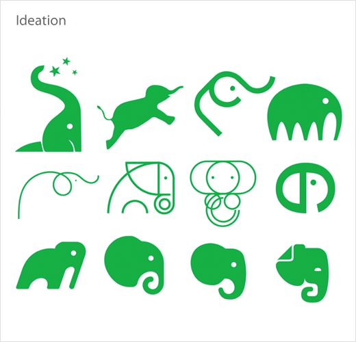
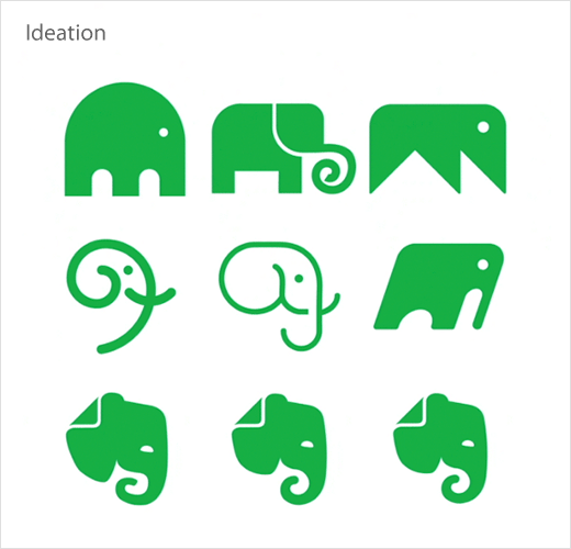
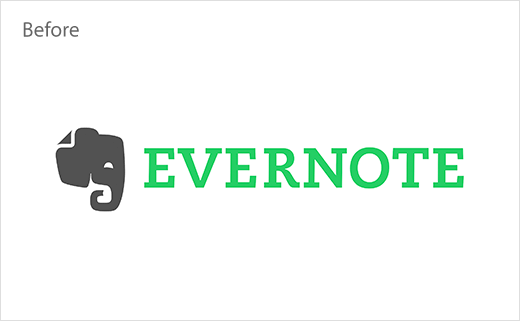
And the changes, visually at least, appear to be minor. Mads the elephant switches from grey to green in terms of colour, while its trunk looks curvier and less geometric than before. Other mildly noticeable mods include a re-shaped eye and larger fold in the ear
“We looked at losing the fold in the ear — which evokes both the dog-eared page of a book and the common icon for a document — but chose instead to honour our past by doubling down on its significance and increasing the size,” explained Strong and Woytek. “We rounded the trunk into a spiral, a symbol of progress, and added a more defined slope in the forehead to give a sense of forward momentum. We softened the eye as well, going for approachability and a sense of serenity as opposed to the previous crescent shape which had been described alternately as ‘smiling’ or ‘angry’.”
Typographic revisions, meanwhile, include the wordmark “Evernote” now being rendered in black using a modified version of a typeface called Publico. The name is further displayed in a mix of upper- and lowercase letters.
“Our old wordmark was an all-caps slab serif typeface (Caecilia) that had served us well over the years. But with the refinements made to Mads we needed something that was bold and balanced and could complement the strong, green logomark,” said Strong and Woytek.
However, the use of Publico will be restricted to the logo, with the geometric sans serif Soleil set to become the brand’s main display typeface.
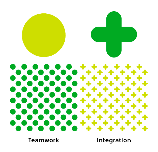
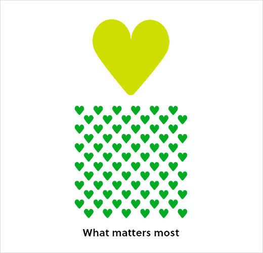
Other design details forming part of the new identity include a mix of patterns and textures that are said to have been inspired by ideas such as “teamwork” and “integrations”.








Source: Evernote


