English Language Test TOEFL Gets New Logo Design
The TOEFL (Test of English as a Foreign Language) has undergone an identity overhaul.
Touted as “the world’s most accepted and respected” standardised academic English test, it is mainly taken by students applying to universities in the UK and America.
“The new look and feel of TOEFL exemplify the brand’s role in the evolving needs of its stakeholders with innovation, authenticity, and optimism,” says Educational Testing Service (ETS), the American non-profit that owns TOEFL.
Adding: “With a new visual and verbal expression, TOEFL now reflects the modern, approachable, and inclusive brand it is”.
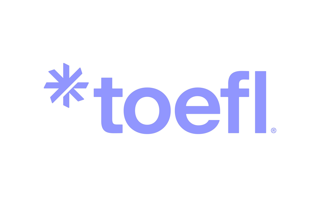
The refreshed logo design includes an asterisk as a nod to the symbol that is typically associated with notation of footnotes.
Called ‘The Source’ – and shared with the recently rebranded ETS – the stylised asterisk shape also features an upward diagonal slice pushing through it.
The latter reportedly symbolises “human progress, serving as a reminder of what ETS aims to achieve”.
An update to the brand’s violet colour – dubbed “periwinkle” – is further claimed “to highlight the brand’s innovativeness and dependability”.
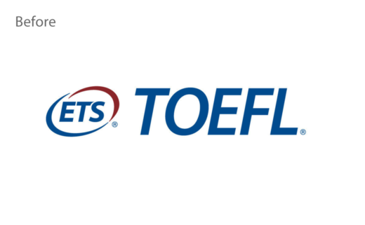
Source: ETS


