EBM Unveils New Corporate Logo by StormBrands
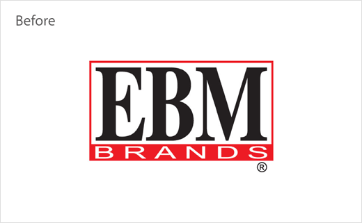
EBM, one of Pakistan’s largest domestic food manufacturers, has unveiled its first major brand refresh in over 50 years, designed by global branding agency StormBrands.
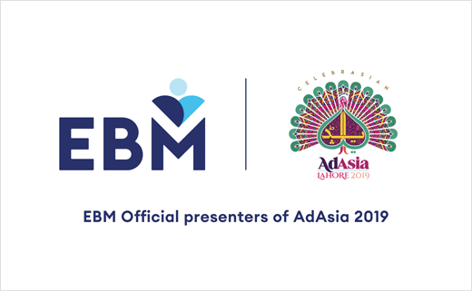
The new identity design launches alongside EBM’s title sponsorship of Ad Asia, the continent’s largest advertising and marketing conference taking place in Lahore this week.
Since its establishment in 1966, EBM has gone on to become a household name in Pakistan, manufacturing over 100 million biscuits that are consumed daily in the country.
The business also exports to 25 countries across both Europe and the GCC region, and was therefore seeking a new image to support its growing global profile.
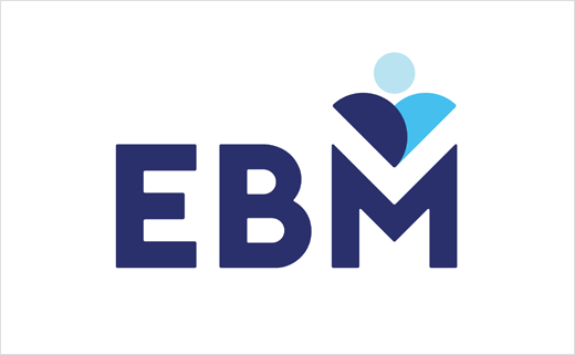
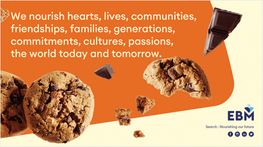
As a result, StormBrands updated EBM’s original three-letter logo to reinforce the company’s brand purpose of “nourishing lives, hearts and communities.” The logo sees two semi-circles overlapping at a 45-degree angle beneath a smaller circle to create a tri-functional icon “representing a heart, two people representing lives, and a valley to symbolise a community.”
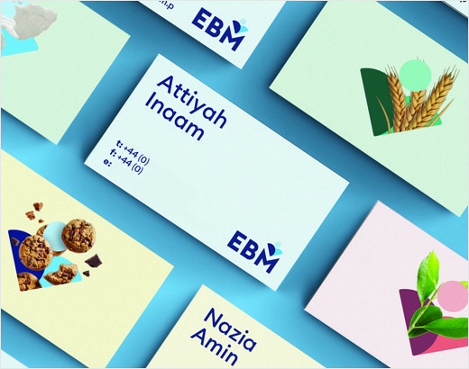
The flexible identity features an all new core palette of light, mid and dark blue with a secondary palette incorporating greens, purples, reds and yellows in thee tones. The colours are claimed to draw on Pakistan’s vibrant culture and function alongside a mixture of photography and illustrated imagery.
“To modernise the identity of a brand established in the 60s we had to significantly rethink the brand from its core whilst respecting it’s heritage. Over time the corporate and portfolio consumer brands had become indistinct from each other. We introduced a brand architecture to clarify each brands role for the business but still allowing them to work side-by-side,” explains Jonny Westcar, managing director at StormBrands.


StormBrands
www.stormbrands.co


