Dropbox Reveals New Logo Design
Online file backup service Dropbox has unveiled an updated logo design as part of a new global branding campaign.
The refreshed logo forms part of what is being described as the biggest change to Dropbox’s look in the company’s 10-year history.
“Our old logo was a blue box that implied, ‘Dropbox is a great place to store stuff,’” says vice president of design, Nicholas Jitkoff. “The new one is cleaner and simpler. And we’ve evolved it from a literal box, to a collection of surfaces to show that Dropbox is an open platform, and a place for creation.”
“The design reflects our passion: building tools that help teams find focus, stay in their flow, and unleash their creative energy,” adds chief marketing officer, Carolyn Feinstein.
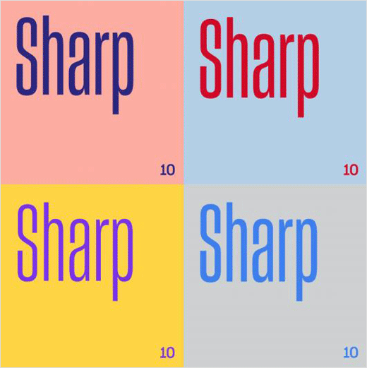
As well as a new logo, the updated identity sees changes to colour, photography, illustration, and type, with the latter being dominated by a new typeface, namely, Sharp Grotesk.

Source: Dropbox


