Digital Health Company Tridiuum Reveals New Logo
Digital health specialist Tridiuum has debuted a new logo, tag line, and web site that the U.S. company says reflects its recent growth and evolution.
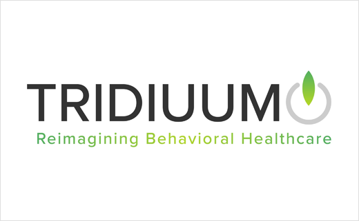
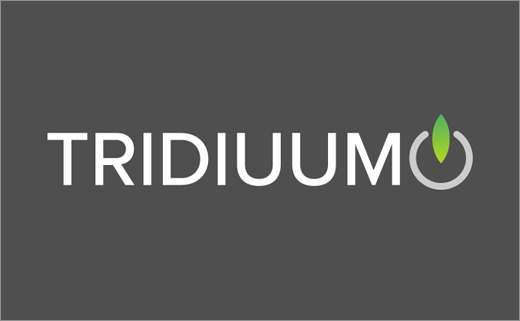
The refreshed logo design incorporates elements of a power button, which is claimed to reinforce “the company’s commitment to powering behavioural health operations and workflows to advance patient outcomes”.
Green, a colour reportedly associated with behavioural health, dominates the colour palette and is further complemented with blue and grey. The logo also includes a new tag line, namely, “Reimagining Behavioral Healthcare”.
“Over the last couple of years, Tridiuum has seen tremendous growth in our product offerings and ability to serve the market,” says Tridiuum CEO, Mark Redlus. “We felt strongly that our visual identity needed to evolve to better represent who we are as a company and the unique value we bring to the market.”
The Philadelphia-headquartered company originally started life as Polaris Health Directions in the late 1990s, when it operated as a research “think tank”.
Its flagship cloud-based platform, “Tridiuum ONE”, is currently used by more than 1,600 clinical facilities.
“Every day, we wake up and challenge ourselves to find new ways to deliver the best behavioural healthcare possible. It’s a key part of our mission and authentic to who we are. This brand expresses that commitment to reimagining behavioural healthcare – both in word and visuals,” adds Redlus.
Source: Tridiuum


