Design Story: The New Philips Logo
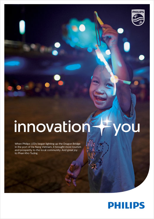
Philips has revealed its new brand positioning, which includes the new tag line “innovation and you”.
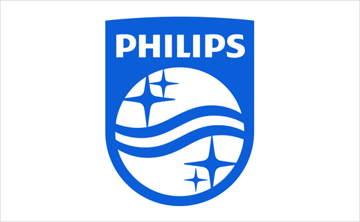
Accompanying the new brand line is the revised design of its well-known shield. The visual symbol, with its stars and waves, was first defined and registered for trademark in the Netherlands back in 1934.
The stars represented the role Philips played in industrialising and globalising lighting, while the waves constituted radio transmissions, signifying the company's contribution to the first global wireless communication platform. The circle, which came later, symbolised the world and the people who over time benefited from the brand's various technologies.
While the re-designed shield retains its heritage and continues to carry the familiar elements of stars and waves, it has nevertheless been modernised to make it easier to apply on digital platforms.
In designing the new shield, the symmetry was replaced with curvier lines in the waves and in the top edge of the emblem. With two thicker and softer waves and a solid fill, the shield was made to look more visually "robust".
The new brand positioning additionally includes an online digital storytelling platform, conceived to showcase a wide range of Philips products and technologies.
The change in brand positioning comes as the company implements its "Accelerate! transformation" corporate vision, which aims to shape Philips into a more entrepreneurial and tech-focused company.
As part of this transformation, Philips has made a number of adjustments, including changing its name to Royal Philips earlier this year. According to external research, Philips currently has an estimated brand value of USD 9.8 billion.


Source: Philips


