Design Interview – The Story Behind Audi’s Newest ‘Four Rings’ Logo
Last year the famous Audi ‘Four Rings’ logo marked its 90th birthday.
As part of the celebrations, the German marque’s top creative people decided to update the design of the four interlocking rings.
In the following interview, veteran Audi car designer André Georgi and brand strategist Frederik Kalisch – the man responsible for the naming all of the company’s cars – give us insights into how the new rings took their shape.
The four rings are one of the key identifiers of the Audi brand. Why change now, and directly on the vehicle?
Frederik Kalisch: “As a progressive premium brand, Audi targets modern customers who value high-quality design and attention to detail. There are really only two basic trends in brand presentation and product design today that express precisely this premium quality: That is, on the one hand, the loud and very bold, and on the other, the restrained, pure, and clean.”
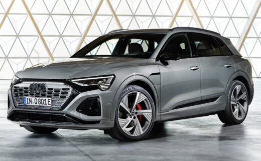
André Georgi: “The purist approach is more in line with our philosophy. One readily apparent thing: Strong brands win over customers primarily through their products underlying substance and discreet identifying elements. At Audi, this has always been the case, and we’re now making it even more consistent. Our philosophy is that every detail must convey a meaning or serve a purpose. On the product, it is – above all, our four rings, unmissable on the front and rear of every Audi model, that make an Audi an Audi. We want our quality to speak through the design and the product itself. The new two-dimensional look gives our rings a significantly more modern and even more graphic makeover, although their geometry is almost identical to the former ones.”
‘Modern, but not fashionable’ – that is how Audi likes to describe itself. Yet two-dimensional logos seem to be the current trend. What role does the zeitgeist play in the design?
Kalisch: “Two-dimensional rings originated at Audi in 2016 as a consequence of digitalisation, essentially to depict the rings in a manner that suited the medium. Three-dimensionality on two-dimensional displays would not have met our technical and aesthetic requirements. So, we opted for a 3D look. Our brand logo is highly graphic – which is an advantage, as it looks great in two dimensions. To ensure a consistent brand presence across all customer touchpoints, we co-ordinated with the design team to kick off the process of redesigning the rings on our vehicles.”
Georgi: “Using a two-dimensional logo on the outside of our vehicles first came up in 2019. Then things really took off at the beginning of 2020. Our vision is to move the corporate identity from the digital area we just described onto our vehicles and to standardise vehicle identification across all models. We want the four rings to look the same everywhere in the future: Whether in a magazine, on your smartphone, or a billboard – and on or inside the car.”
What specifically has changed in terms of the design compared to the previous version?
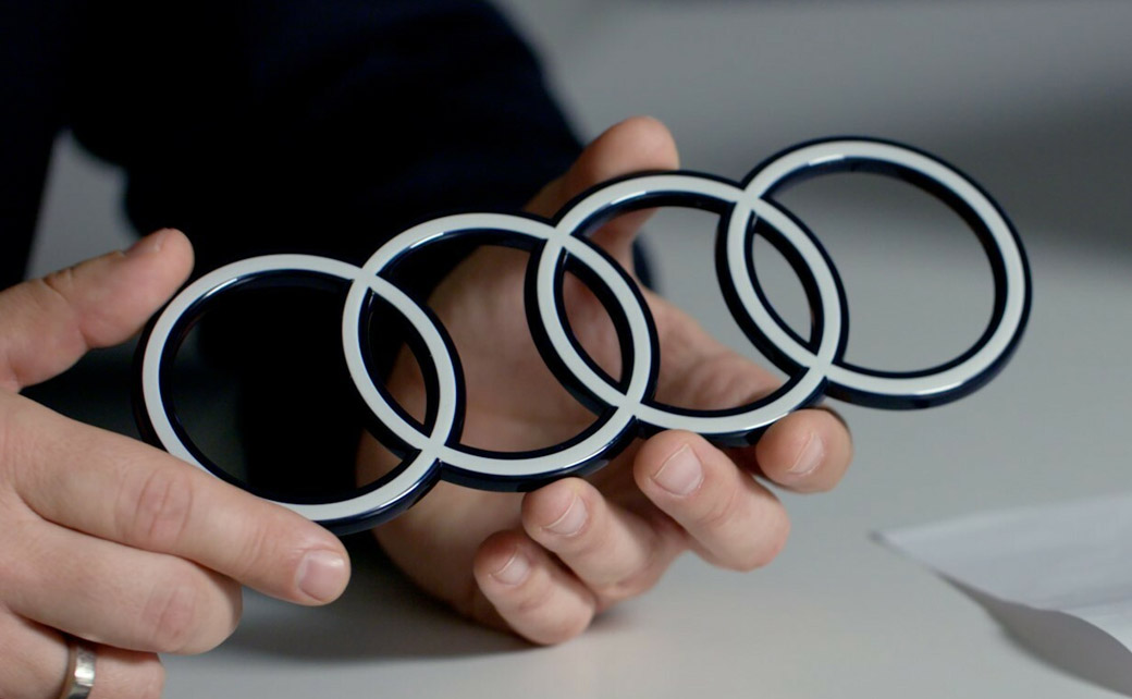
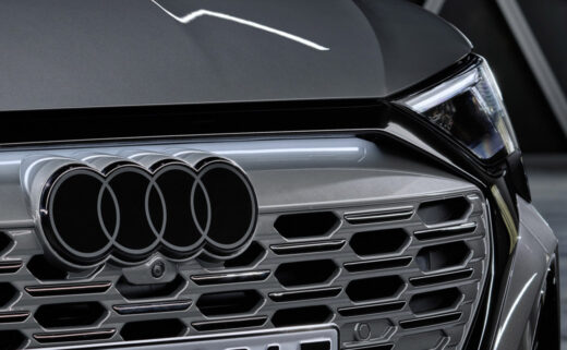
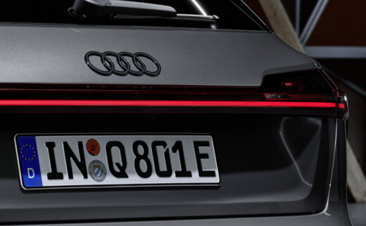
Georgi: “Our vehicle logo comprises three components. We’re keeping it consistently free of chrome with a high-contrast black-and-white look. It’s as though the striking white floats are embedded in a black glass body for an even greater radiance. By optically brightening the logo, the white lends the rings a flat, premium-quality look, which still appears three-dimensional in detail.”
Besides the colour scheme, the materiality is also new. Can you elaborate on that?
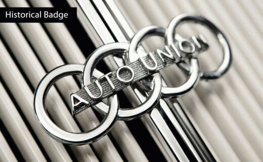
Georgi: “Today’s chrome rings stand for high quality; the material alone conveys that message. But we believe that we have found the ‘new chrome’: The clarity of the new black and white rings makes our corporate identity unmistakable. The thin black border around the rings makes for a consistent, premium-quality appearance, regardless of the car’s paint or radiator grille colour. And customers can continue to opt for our new rings in black. This variation replaces the white with a dark grey that looks like high-gloss black.”
Moving forwards, as well as wearing the new rings, all new Audi models will have a new vehicle identification scheme. Why is that?
Kalisch: “In 2020, our team reworked the brand strategy and corporate identity. This rework led to our new vehicle identification strategy, including the vision of two-dimensional rings on our vehicles. The updated identification scheme matches our new brand strategy. That means more understatement, more sophistication.”
Georgi: “It’s not only that vehicle identification has become more premium; we have also standardised the fonts in and on the vehicle. In the future, our models will only use Audi’s unique font, known as ‘Audi Type’. The basic tone is significantly more restrained without compromising on distinctiveness or quality. We’ve now designated the B-pillar as the detailed model, derivative, and technology identifier. This designation is because it has an identical design across all vehicles: always two parts in high-gloss black and always in the passengers’ field of view when entering and exiting. The lettering on the B-pillar was deliberately engraved tone-on-tone.”
Kalisch: “Besides distracting from the design of our cars, overly conspicuous identifiers probably wouldn’t go down well with our contemporary, progressive customers either.”
Georgi: “Identification and vehicle design now act as a unit that aligns with Audi’s new brand positioning.”
Editor’s Note: To learn more about the redesign of Audi’s badge, be sure to check out this video; it includes comments from the likes of Marc Lichte and Michael Müller, the former being the German brand’s head of design and the latter its current head of brand strategy.
Source: Audi


