Denver Nuggets Reveal New Logo and Uniforms
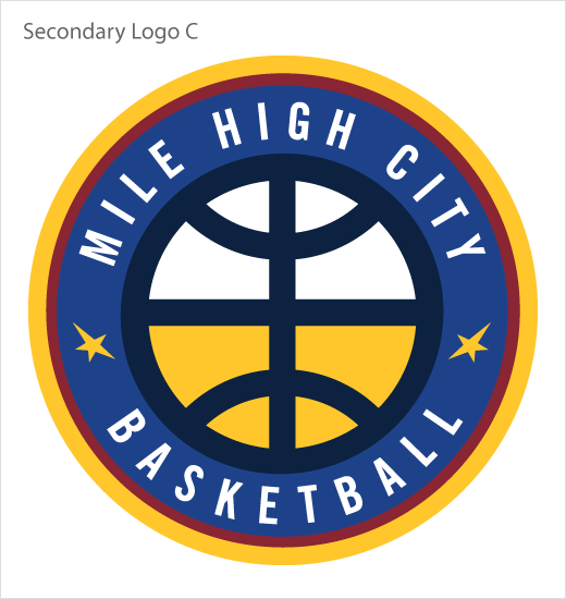
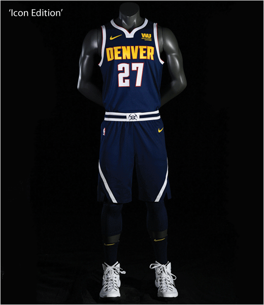
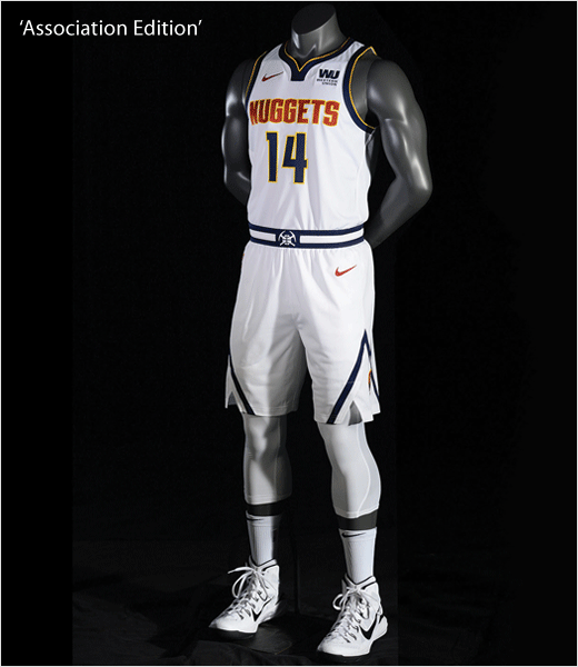
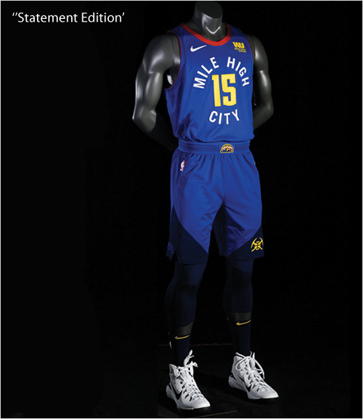
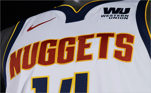
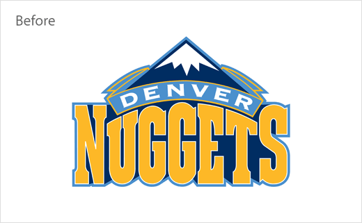
The Denver Nuggets have unveiled an evolved brand identity that includes five different logos, a new colour palette, and three updated uniforms.
The new marks and apparel, designed by Nuggets staffers in conjunction with Nike, are claimed to visually acknowledge the American basketball team’s past, and form part of a rebranding effort that is described by the club as being “evolutionary not revolutionary”.
“One of the biggest things that we tend to do here as a company – and it’s part of our ethos – is this notion about respecting a past and representing a future,” says Michael Smith Sr., product manager for basketball at Nike. “Making sure that it’s rooted in a tradition.”
“We looked at all of the history with the uniforms, dating back to the Denver Rockets in the ABA,” adds team owner, Josh Kroenke. “You look at the different logos and how they’ve evolved over the years, the different colours and how they’ve evolved; we toyed with a lot of different things. Ultimately, we thought kind of how it reflects on Colorado in general.
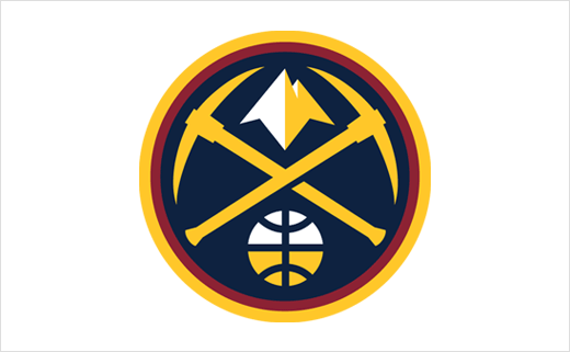
“That was something we tagged on early, looked at our history; throughout the 1990s seeing that colour red very prevalent in the uniform. And we started to focus on a few different things incorporating even some things even past that date whether it was a pick axe from the original Maxie Miner [the team’s first logo]. We had those two cross pick axes in our logo for the last several years. We decided to update that to give it a more modern feel, and kind of a more classic feel.”
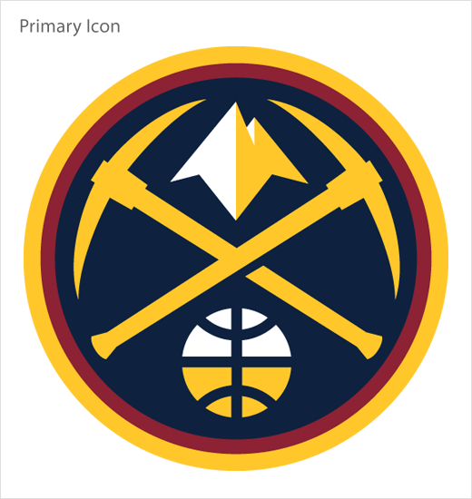
The new primary logo also features a gold “nugget” positioned above the twin crossed pickaxes, as well as an updated basketball whose top half represents snow (hence the white colour) and whose bottom half (in “Sunshine Yellow”) symbolises “gold discovered under the Rocky Mountains”.
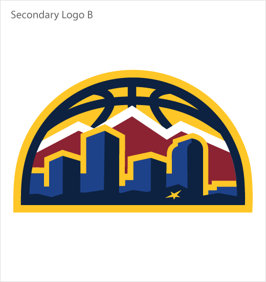
In contrast, the club’s new secondary mark re-imagines the so-called “Denver Skyline Logo”, which was made famous by the Nuggets back in the 1980s.

Source: Denver Nuggets


