Denomination Creates Logo and Packaging for True Water
Drinks specialist design agency Denomination has created the logo, identity and packaging design for True Water.
A new fruit-infused spring water product launched by Australasian drinks company Frucor Suntory, True Water will initially come in two flavours, raspberry and lime. Made using real fruit extracts, it contains no artificial sugar or sweeteners.
Denomination says it has developed a “clean and crisp” look in order to communicate the brands’ ‘good for you’, healthy message.
“Inspired by the simple and fresh taste, clear glass and a clear shrink sleeve with minimal graphics were chosen to showcase the purity of the water and communicate that the fruit infusions don’t add an overtly sweet taste or detract from the health benefits of the water itself,” explain the designers.
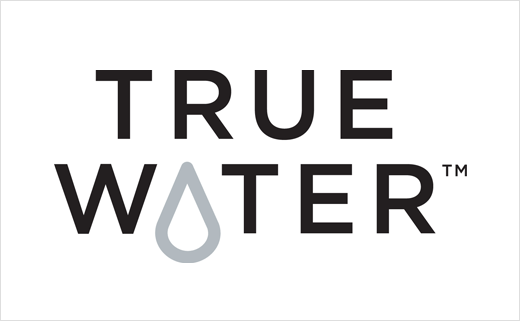
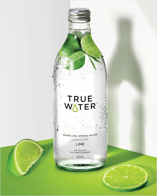
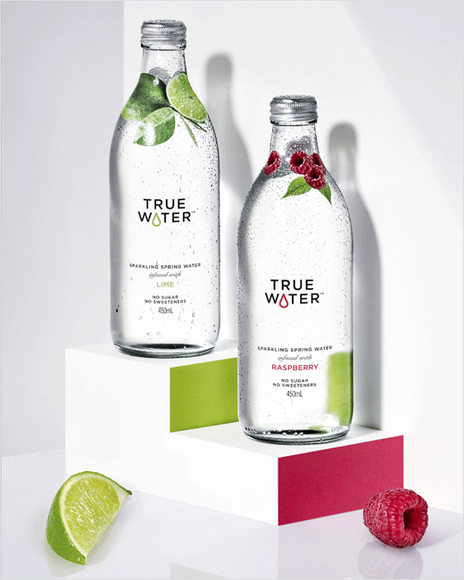
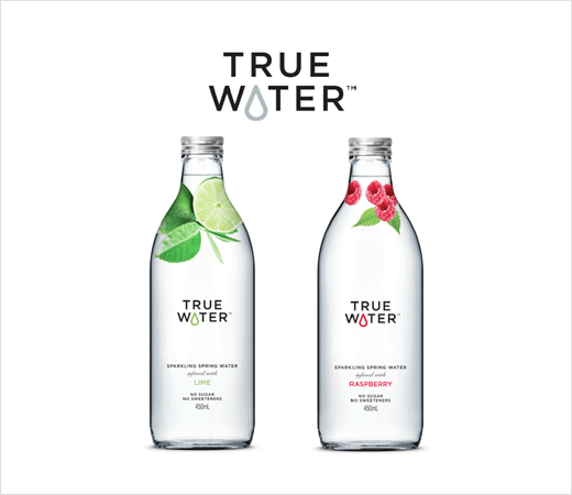
Key design details include a wordmark that substitutes the letter “A” with a drop of water; the latter also changes colour dependent on which fruit extract is used, helping to distinguish flavours.
Accompanying the logo are photographic images of real fruit that are applied to the shrink sleeve at the neck of the bottles in an effort to make it look as though the fruit is actually floating inside the water.
The designers have also opted for a Boston shaped glass bottle, which they claim helps differentiate the brand from competitors and further communicates the product’s ‘premium’ quality.
“Pared back, simple designs can be the most challenging to execute beautifully but they’re often the most enjoyable to create. Every expression has to be crafted perfectly and there’s nowhere to hide. We believe the creation of the drop in the logotype gives True Water the level of desired distinctiveness and ownability without resorting to conventional FMCG [Fast-Moving Consumer Goods] cues,” says Rowena Curlewis, CEO of Denomination.
Denomination
www.denomination.design


