Deliveroo Reveals New Logo and Visual Identity
London food startup Deliveroo has unveiled a new logo and visual identity created by DesignStudio. The latter recently rebranded the Premier League and also Airbnb back in 2014.
Founded in 2013, Deliveroo delivers restaurant food to customers in 12 countries and over 100 cities. The company boasts more than 16,000 restaurant partners and 20,000 riders.
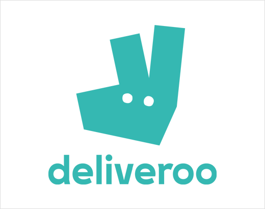
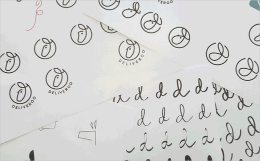
The new branding incorporates Deliveroo’s original logo, albeit reduced to a simple graphic symbol. DesignStudio is said to have carried out a full semiotics analysis, looking at what the logo meant in other cultures and countries.
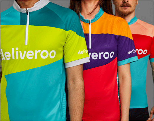
“Our original visual identity was designed with the website, a few rider boxes and some business cards in mind. At that point, no one imagined we’d ever do an advertising campaign or have a kit that would be worn by thousands of riders in twelve different countries,” says Deliveroo’s internal design team.
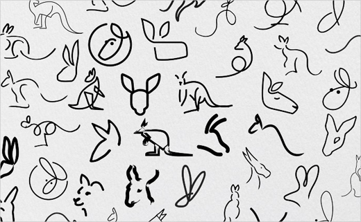
“We explored a variety of routes for a new logo – some that kept the kangaroo as its primary inspiration, to completely new logos that left our kangaroo roots behind. What the process highlighted was that both internally and externally our Roo had become a beloved part of our brand.”
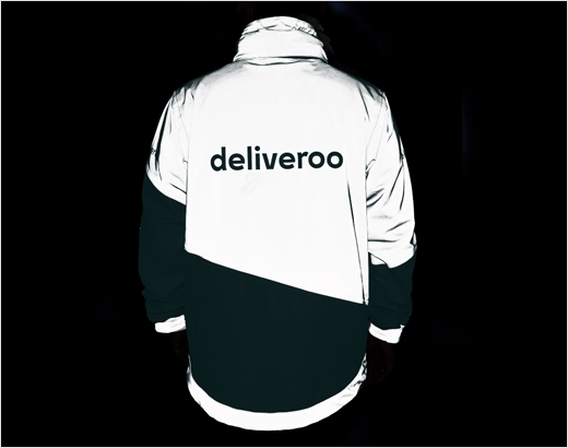
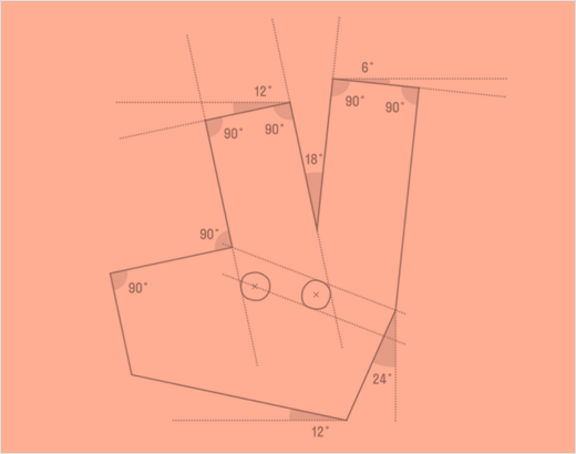
The angles of the new Roo mark also influenced other elements of the brand’s graphic system – a system that runs across everything, from the website to the rider kit.
Source: Deliveroo


