Dakota State University Reveals New Logo Designs
After what is being claimed as more than a year of research and planning, Dakota State University is uniting under a new brand and visual identity.
The project is said to have been initiated by President José-Marie Griffiths, who joined the American university back in 2015.
“Through this new brand and visual identity, we will be very clear about who and what we’re becoming at Dakota State,” she says.
“We are a comprehensive university on an inspirational and world-changing trajectory to be a forward-thinking, innovative, technology-fueled organisation, fostering true innovation, active engagement, and global impact in teaching, learning, scholarship, and research,” she adds. “The new visual identity will connect with those initiatives today and in the future.”
The university’s new logo features a single letter “D” set within a hexagon. It mixes “modern elements with a hint of tradition”, according to its designers.
“The hexagon itself is a building block representing community and unity. Other graphic elements within the hexagon design illustrate Dakota State’s commitment to forward thinking and its unique approach to education,” they further explain.
Along with the logo, the university’s main colours – blue and yellow – have been adapted; the new signature colours are “Trojan Blue”, “DSU Blue”, and grey.
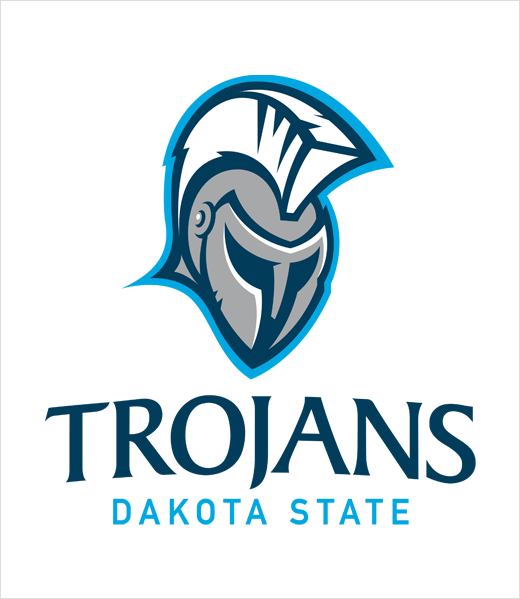
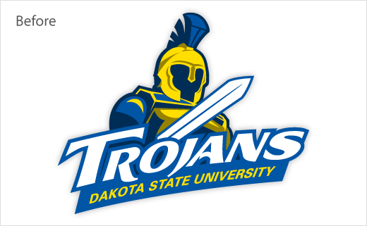
The refreshed Trojan mascot, meanwhile, which represents the university’s athletics department, is claimed to be “reflective of the history of the ancient Trojans, who were responsible for many advanced technologies.”
“This new visual identity reflects the fact that Dakota State’s path is built on the foundation of a legacy-rich past, an energised and creative present, and the opportunities of a transformational future,” comments Griffiths.


Source: DSU


