Czech Ice Hockey Reveal New Logo and Name Change
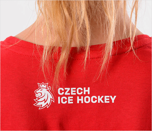
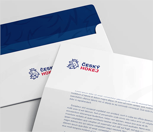
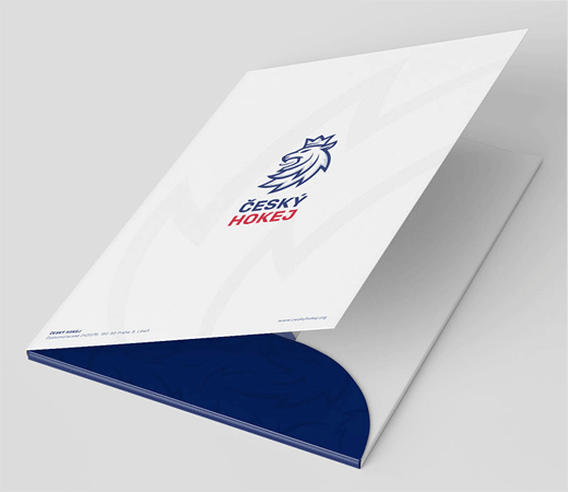
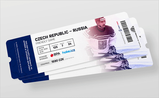
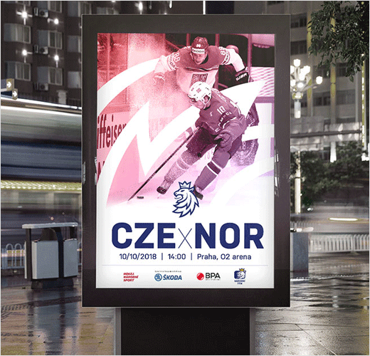
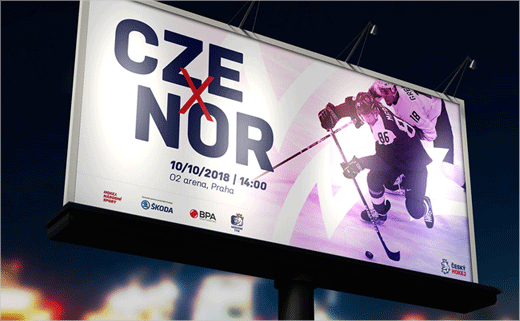
Czech Ice Hockey has revealed an all-new logo design as well as a name change as part of a major rebranding effort.
Ice hockey is considered to be the Czech Republic’s number one sport, with a history stretching back to over 100 years; the nation won gold in the men’s event at the 1998 Winter Olympics.
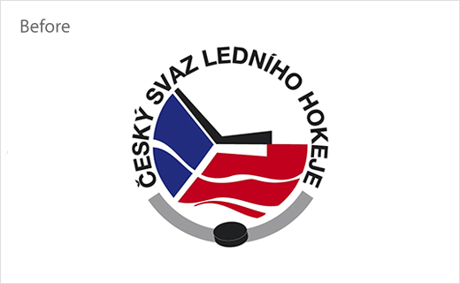
The sport’s governing body, formerly known as the “Czech Ice Hockey Association”, turned to Prague-based branding agency Go4Gold to come up with the new logo and identity.
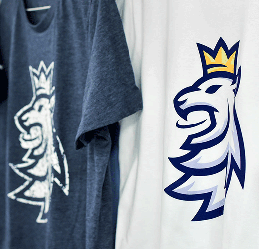
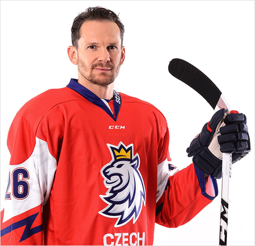
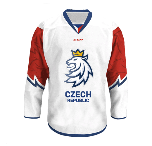
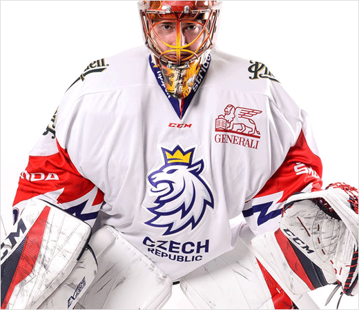
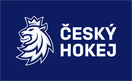
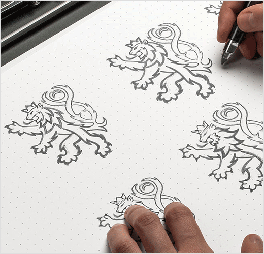
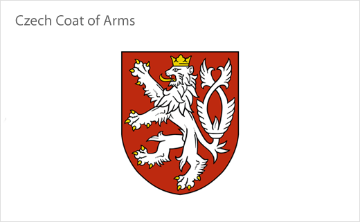
Said to be the result of two years of work, the refreshed logo, which the agency developed in collaboration with designer Tomas Vachuda, no longer incorporates the Czech national flag, but instead takes inspiration from the lion symbol featured on the country’s official coat of arms.
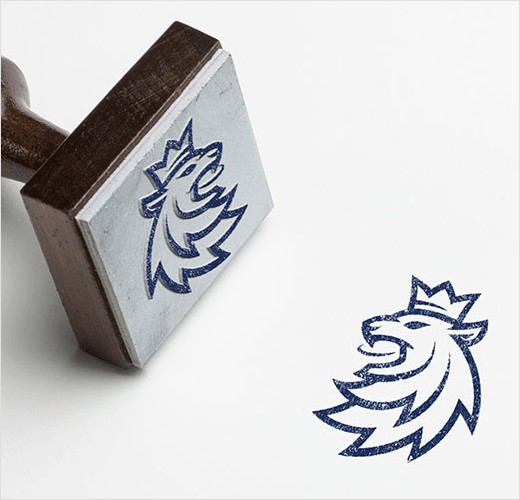
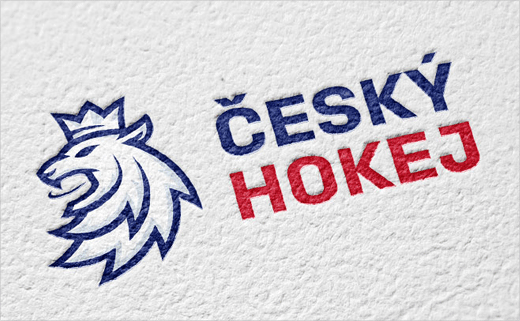
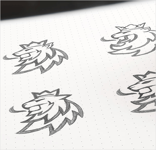
“The new dynamic logo is inspired by the lion which – as the country’s official symbol – has been present on the jerseys of Czech ice-hockey players for almost a hundred years. The logo’s colouring is based on the colours of the Czech national flag, and it is supplemented with ‘ice’ shading,” explain the designers at Go4Gold.
“The lion is firmly connected with the puck, much as ice-hockey is associated with modern Czech history. The six spikes of the lion’s mane refer to six players on the ice, and if you take a closer look at the lion’s eye, you will discover the outline of the island of Štvanice in Prague, which is were the Czechoslovaks won their first ever world championships,” they add.
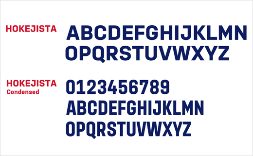
Additional details include a number of custom fonts designed by Tomáš Brousil from Prague’s Briefcase Type Foundry.


Go4Gold
www.go4gold.cz


