Criteo Rebrands, Unveils New Logo Design
Online advertisement specialist, Criteo, has unveiled a new look that includes a refreshed logo, visual identity, and brand positioning dubbed “The Future is Wide Open.”
Founded in 2005, the Paris-headquartered company serves personalised ads across websites on behalf of e-commerce companies.
“The time is right for a new brand identity and rally cry, as we use our massive strength in data and technology to reestablish Criteo’s leadership within the advertising industry and set an optimistic tone for the future of the open internet, for everyone,” explains the company’s CEO, Megan Clarken.
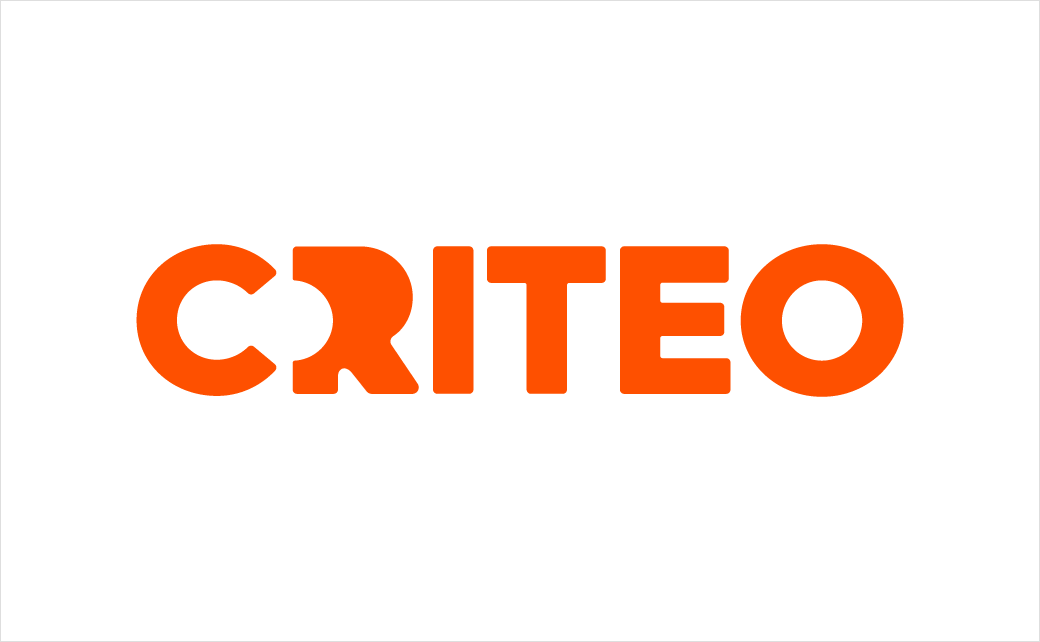
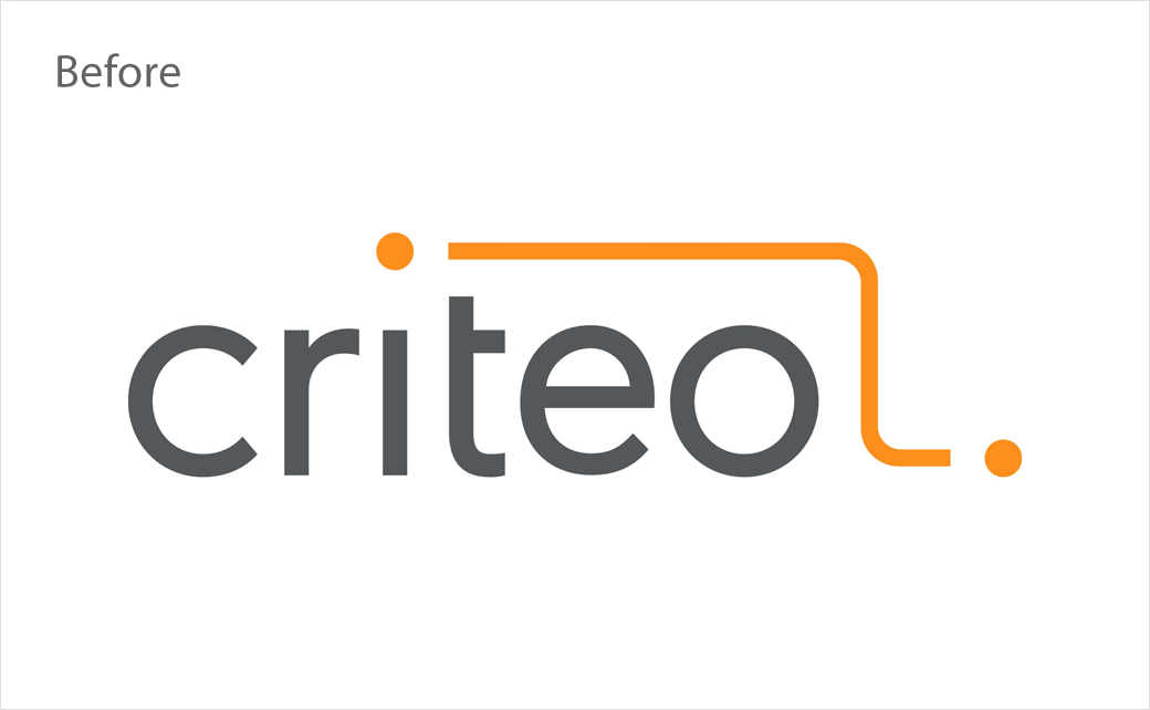
The new logo brings the two dots previously connected at the top right of the logo to the centre of the new logo “in an effort to better represent consumers and its customers,” who the company says are the “centrepiece” of its product strategy.
“The two dots now include open space, nodding to both discovery and openness as the company invites its audience in and balances a strong legacy, visualised with a bolder font, with modern capabilities,” comments a Criteo spokesperson.
The visual changes were developed by Criteo’s in-house marketing team, in collbaoration with creative agency, Technology, Humans and Taste (THAT), who consulted on the brand positioning.
“When we say, ‘The Future is Wide Open,’ we’re talking about the tremendous possibilities Criteo’s unique dataset presents for improving every consumer experience on the open internet,” says Todd Parsons, chief product officer at Criteo. “Cookies might be going away, but we view it as an opportunity to evolve our product strategy to deliver greater benefits than ever to consumers and our customers.”
Source: Criteo


