Crimestoppers Launches New Identity Designed by The Team
Founded by Lord Ashcroft in 1988, Crimestoppers is British charity that was established so that people could provide information about crime anonymously, without fear of retribution.
However, over the years, a common misconception has built up around the organisation, namely, that the service is part of the police or the popular BBC television programme, Crimewatch.
As an independent charity in need of support, Crimestoppers therefore decided to embark on refreshing its brand, with The Team being enlisted following a three-way pitch.
“While the brand had done well at communicating to ‘stoppers’, the people who use the anonymous service, it needed to evolve to engage more of them as well as more ‘supporters’, the volunteers and donors who make the service possible,” says the agency. “The identity needed to be simple, iconic and easy enough to be adopted by a network of regional staff and volunteers.”
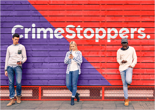
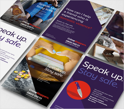
The result is a flexible design system built around 45-degree angles; upwards for ‘speak up’, and downwards for ‘stop crime’, said to have been inspired by road signs. The logotype has been crafted from the typeface Montserrat, predominantly in lower case for a “friendlier” appearance.
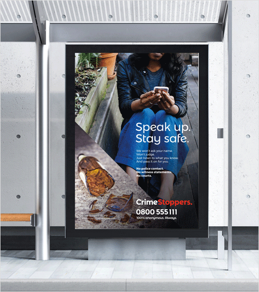
The addition of a full stop shows Crimestoppers’ “resolve”, while also complementing the brand’s key messaging and tone of voice, which is made up of short, punchy, staccato sentences such as: “We won’t ask your name. Won’t judge. Just listen to what you know. No police contact. No witness statements. No courts.”
In terms of colour, the designers say they retained the colour red to reflect Crimestoppers’ “heritage”, and added a complementary purple, thereby avoiding black and ‘police’ blue. These are further supported by secondary colours of teal and mustard.
Photography also forms a key component of the new identity kit, featuring people in everyday environments and “a fly-on-the wall documentary style with natural lighting”.
“The anonymity at the heart of the brand can be reflected by cropping out people’s faces. By including the use of mobile phones, people are encouraged to get in touch,” explain the designers.
An illustration style has also been added for when photography isn’t appropriate.


The Team
www.theteam.co.uk


