Consumer Healthcare Products Association Reveals New Logo
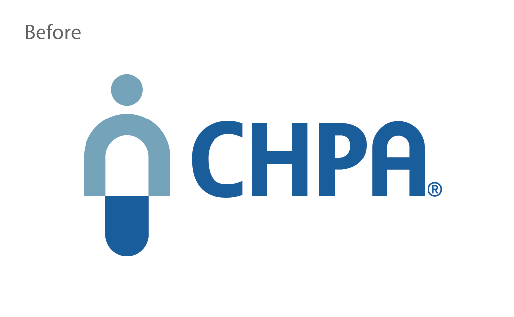
The Consumer Healthcare Products Association (CHPA), a 139-year-old industry trade organisation, has refreshed its identity for the first time in two decades.
The rebranding effort, which encompasses a new logo, tagline, and brand narrative, is said to have been underway for over a year and aims to position the Washington-headquartered organisation as the only association in America representing the personal healthcare industry, broadly.
CHPA’s new logo takes the form of a wordmark that is described as “modern, vibrant, and sharp” looking. It is accompanied by a new tagline, namely, “Taking healthcare personally”, which “seeks to communicate the industry’s commitment to empower consumer self-care by preserving and expanding choice and availability of consumer healthcare products.”
“During the stay-at-home orders issued in response to the recent pandemic, Americans have been relying on personal healthcare products in record numbers,” says CHPA board chair, Paul Gama, who also serves as president of personal health care at The Procter & Gamble Company. “CHPA’s evolution into a more integrated self-care association is critically important, since this is where the marketplace is already going.”
“CHPA is responding to a change in consumer behaviour that has been underway for many years now. The reality is that consumers don’t get hung up on regulatory distinctions, they are increasingly seeking non-prescription self-care options across multiple categories to help them stay well and get well. Our member companies have evolved to meet this consumer need, and now CHPA is reflecting this evolution in its new brand identity,” adds CHPA’s president and CEO, Scott Melville. “CHPA is home to personal healthcare companies who view self-care broadly.”
Over the next several months, CHPA plans to roll-out its new visual brand with an updated website, new association materials, advertising, and PR.


Source: CHPA


