Construct Brands 5 Star Hotel, ‘Le Grand Bellevue’
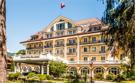
London design agency Construct has created the identity for Le Grand Bellevue, a revamped luxury hotel in Gstaad.
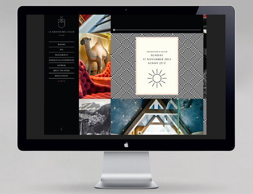
Located in the Swiss Alps, the hotel’s new owners (he an hotelier, she an interior designer) engaged Construct to design an identity, promotional literature, guest collateral and a new website.
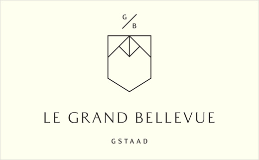
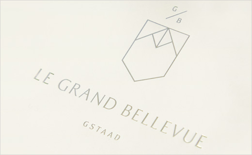
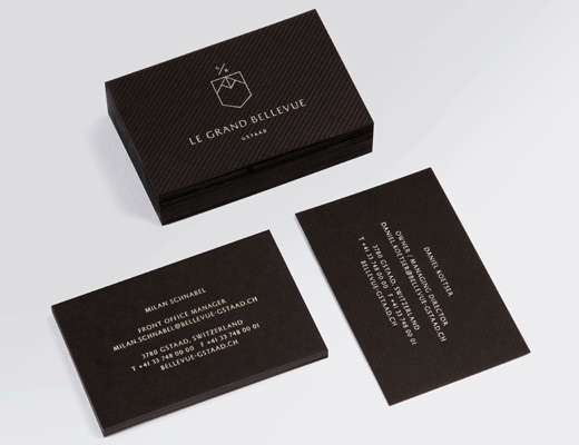
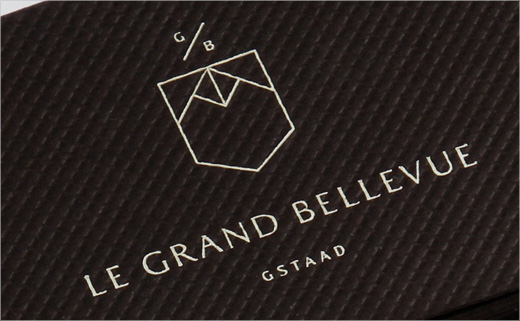
Construct’s brand identity begins with a mark that reflects the owners’ approach of borrowing influences from different quarters and periods. It aims to be a contemporary take on the heraldic shield that also draws inspiration from the markings on a cow bell.
The designers say its geometric shapes suggest the mountains that are the backdrop to the hotel and the distinctive towers of the hotel’s 1912 architecture. The lines are fine and the initials of the hotel are san serif and lower case, lending the design a certain Swiss simplicity and minimalism.
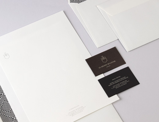
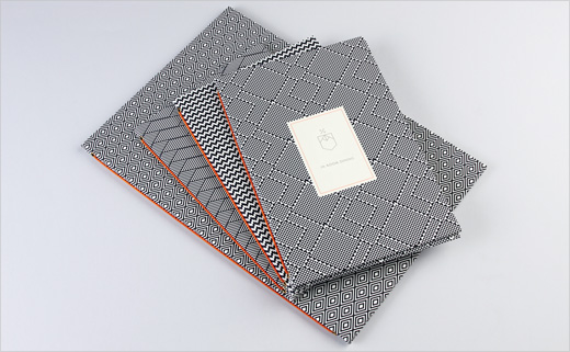
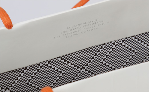
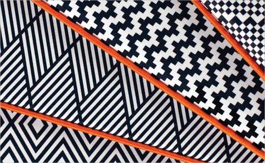
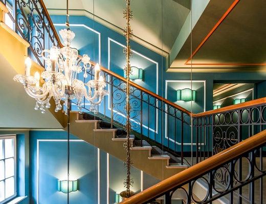
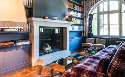
Inside the building itself, the brand applications and the interior designer owner’s tribal-meets-contemporary inspired furnishings are styled to play off each other. A palette of three repeat patterns, rendered in black and white, give menus, brochures, pencils and website brand distinction and cohesion. The patterning is created using modern pixels but has an Art Deco effect. In some applications they are the main focus, in others (on the inside of envelopes and carrier bags, for example) they serve as concealed detailing.
The colour palette adds to the brand identity’s ‘attitude’, according to the designers. The strong commitment to black and white is given a degree of irreverence by adding a vivid orange into the mix. The latter appears as small and occasional interventions – a printed border, handles on a bag, the rubber tops on the pencils – and as bolder ‘take-notice’ information sheets, printed on Tangerine Keaycolour paper. Silver foil is used as a luxury accent.
“We love a client with a bold vision and in this case we certainly had that! The interior design and brand ethos of the hotel are striking in their difference and strength of personality; we wanted to create an identity system that would reflect the timeless chic, warmth, generosity of spirit and contemporary sophistication of the hotel.
“We also wanted to create a system that could evolve, stretch and allow the owners to deliver brand experiences and communications with their trademark focus on quality with a lightness of touch and a warm humour.
“The cow bell inspired marque, sparked by the local habit of hanging up the bells as the cows come in, together with the pixelated tribal graphic patterns and the shot of warm burnt orange give the brand a balance of unexpected energy in contrast with the refined, restrained typographic treatment of the logotype.”
Construct
www.constructlondon.com


