Conran Design Group Creates Logo for Clario Antivirus
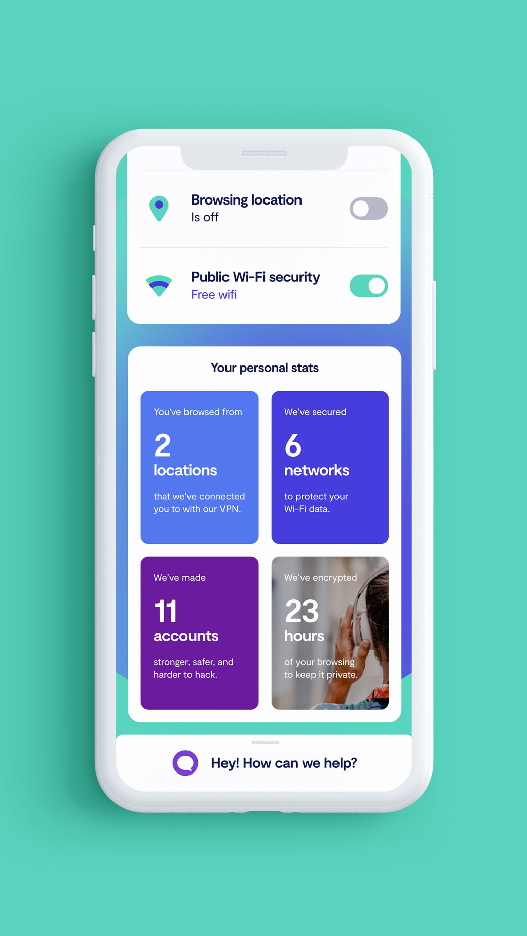
Conran Design Group has created the logo and branding for the just launched, subscription-based web security company, Clario.
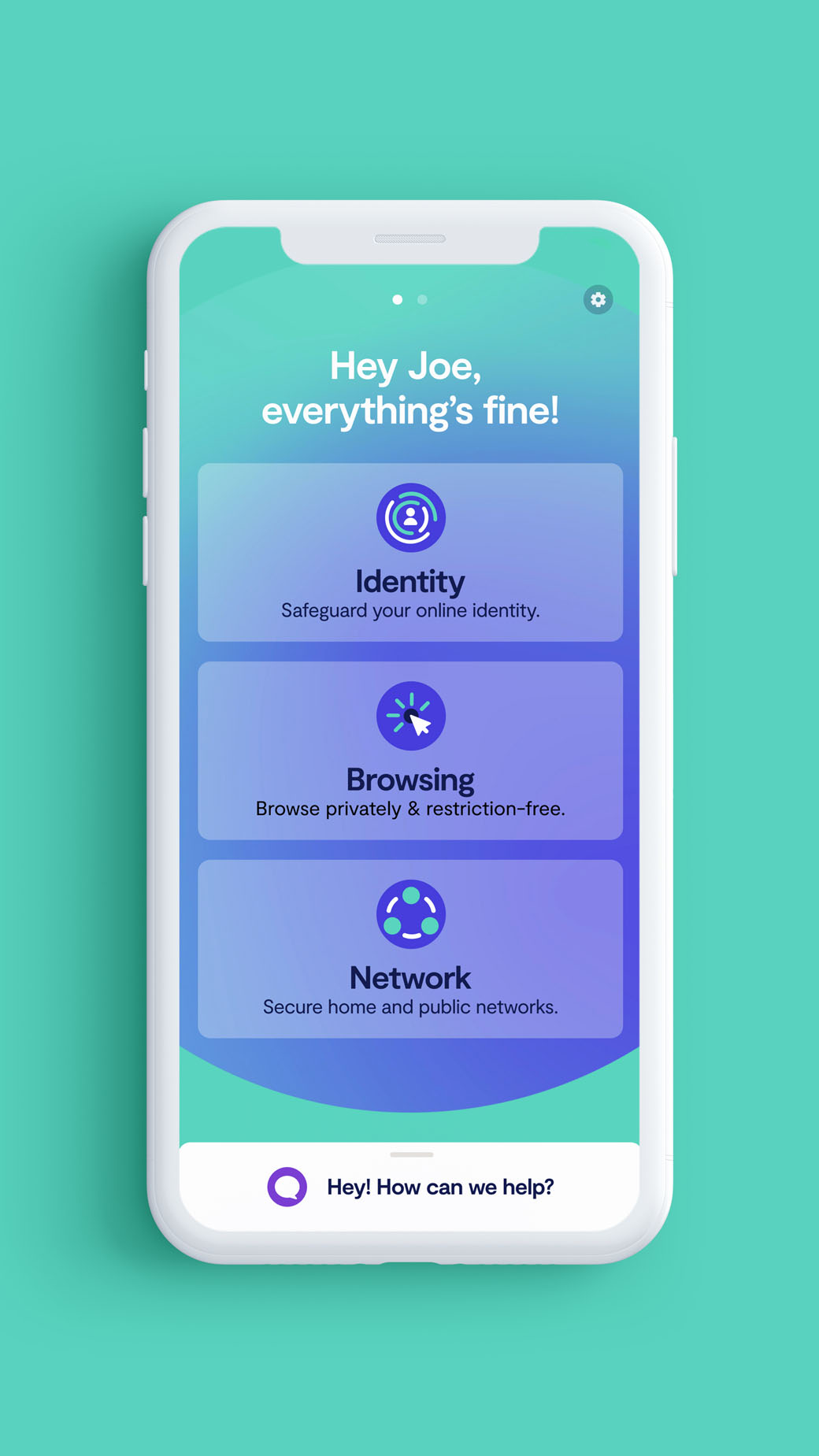
With their bloated software, malware, and endless popups, antivirus companies seem to have gotten a bad reputation. To challenge this, Conran has come up with a visual and verbal identity for London-based Clario that is claimed “humanises, personalises, and simplifies cybersecurity”.
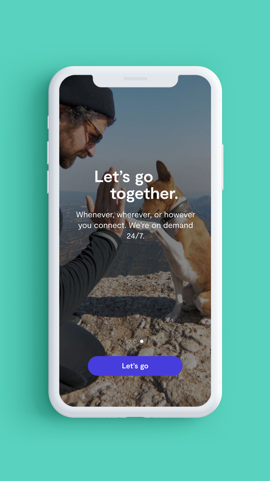
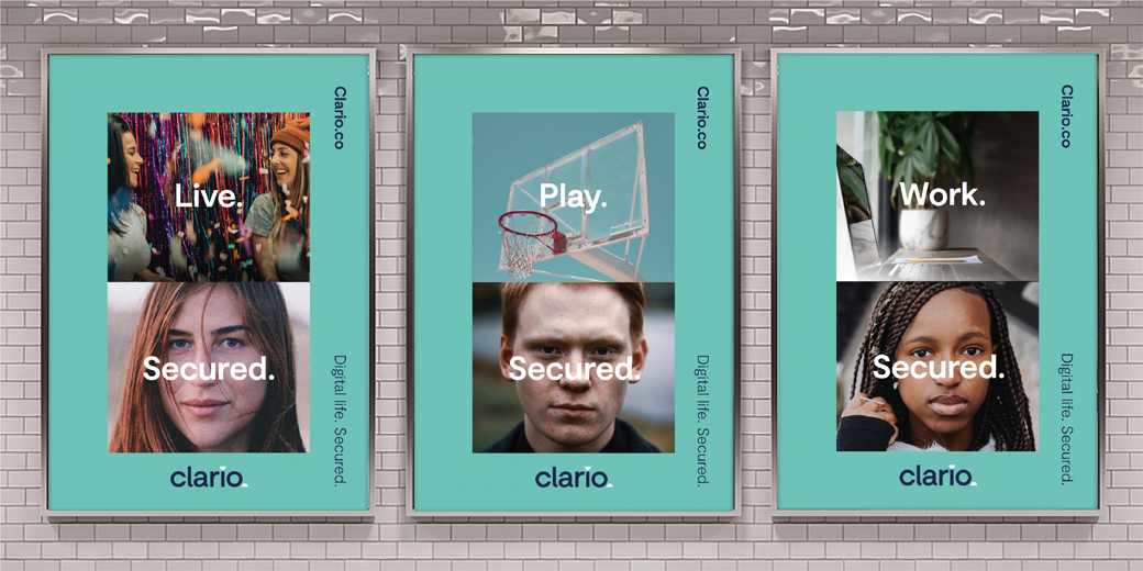
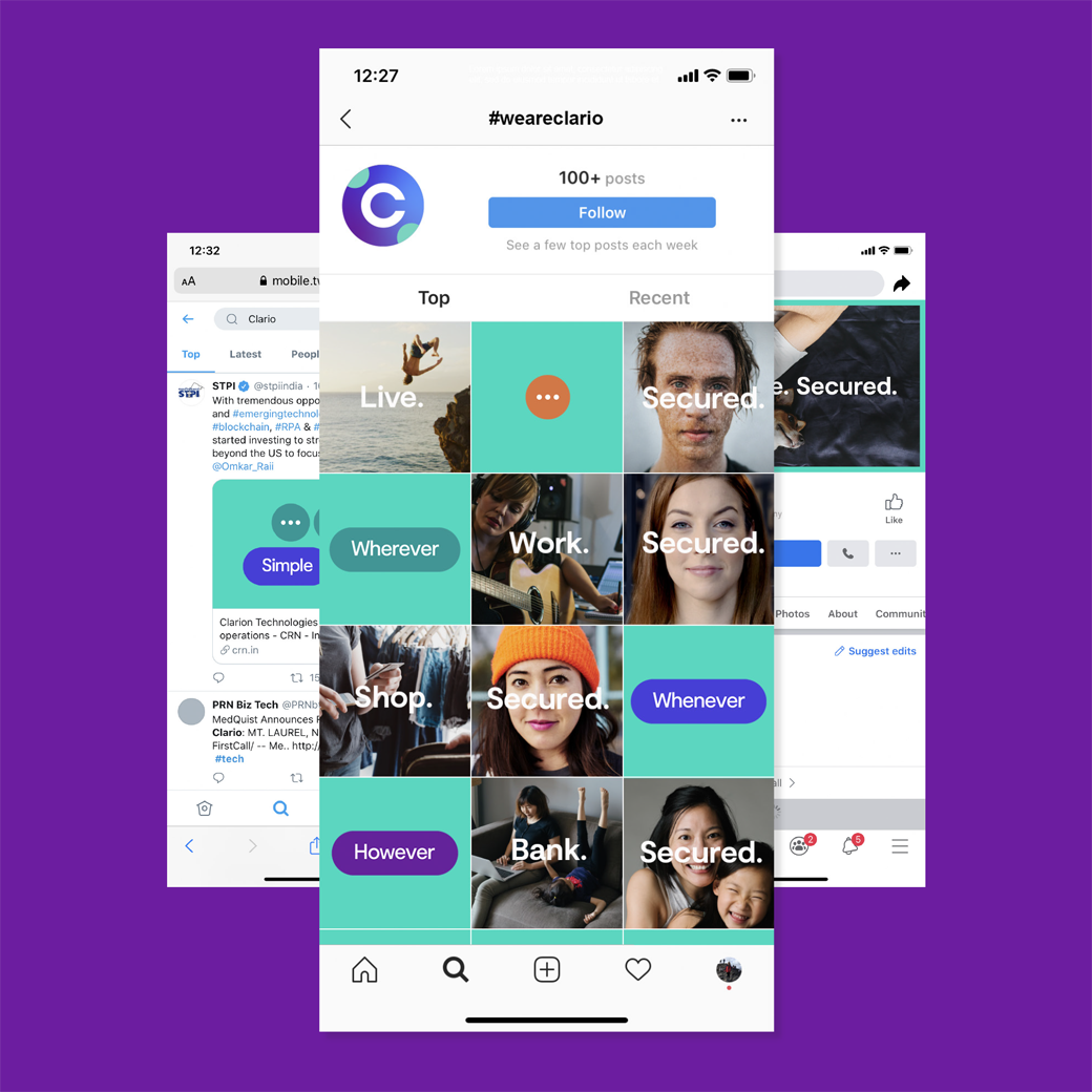
From the designs to colour palette of blues and greens to people-centred photography and language (such as the Clario name), everything, the design agency asserts, is created “to demystify security lingo and return the focus to the user on the other side of the software”.
“The management team saw an opportunity to disrupt the category to reinvent the role that a brand could play in securing our digital life,” explains Conran Design Group’s executive creative director, Lee Hoddy. “Most of the competition trade on our fears in cybersecurity – language and semiotics that serve warning of the threat, adding to the complexity, creating fear and anxiety. Clario is different.”
As a result, the logo, which is described as “open and approachable”, adopts an informal tone that is reinforced visually through the use of a lowercase typeface and a split dot that links the “i” in Clario to the full stop that completes the logo.
“Cybersecurity is an unwieldy topic for many. It feels scary, uncertain, mysterious, and foreboding. But now, more than ever, being a cold tech company is a liability. Society now considers the Internet as a basic need of life, a right for all of humanity to be connected rather than simply being a utility service. In a parallel way, cybersecurity is the next version of that. By putting a human face to this, cybersecurity becomes a basic need of life as well,” says Conran client director, Joey Rippole.
The new software service launched worldwide at the end of June across Mac, iOS, and Android.
Conran Design Group
www.conrandesigngroup.com


