Connacht Rugby Unveils Refreshed Logo and Kit Design
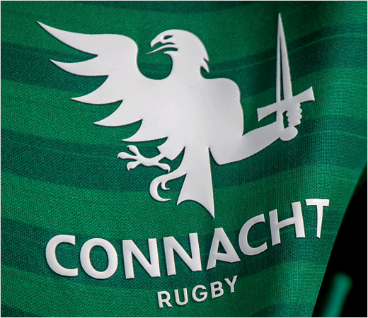
Irish rugby team Connacht has revealed a new logo design as part of a brand refresh.
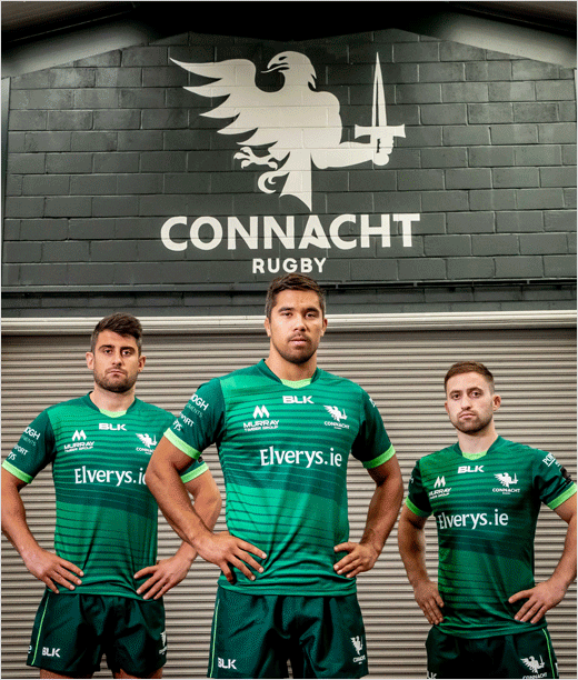
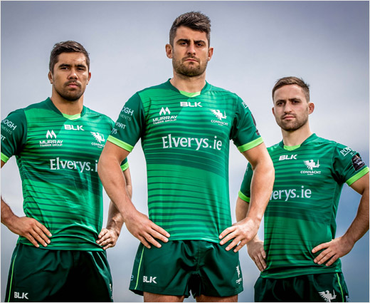
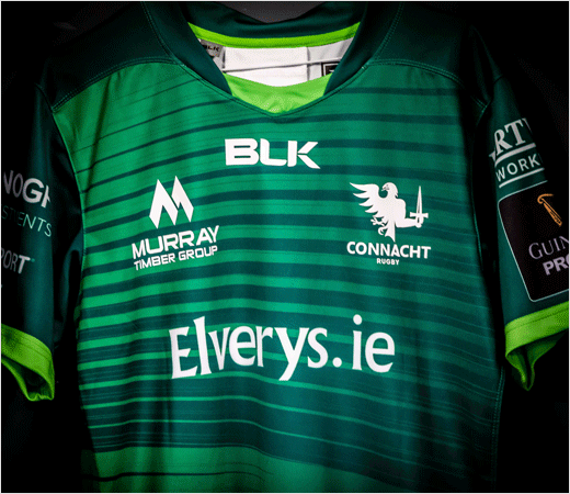
The redesigned logo was officially unveiled during the launch of the 2019/20 Connacht home kit, which also features branding for Australian sportswear label BLK Sport (the kit’s manufacturer) and Irish sports store chain Elverys.
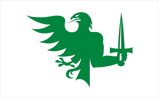
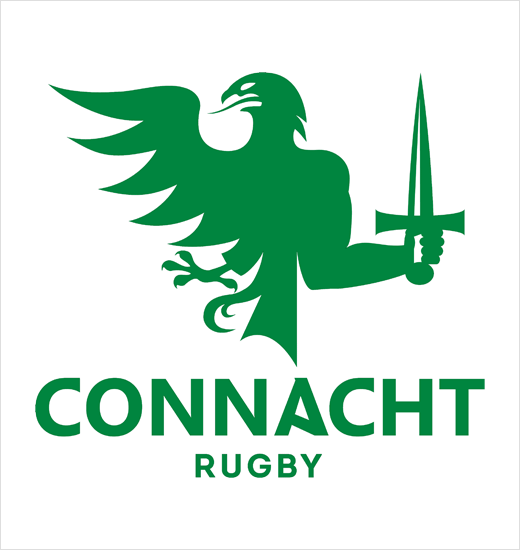
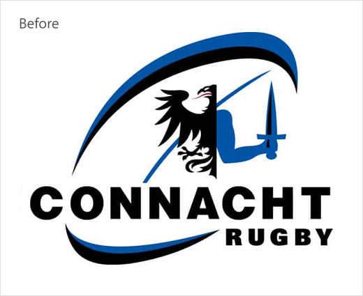
“The new logo strongly reflects the original provincial crest with evolutions of the core elements. The new logo sheds the rugby ball feature of old, providing much greater prominence and emphasis on the more traditional elements of the eagle and sword,” says the club.
More specifically, the wing tips of the eagle have been reworked and consolidated to represent each of the five counties of the province, and minor changes to the font have also been introduced.
“As an organisation we are continuously looking to evolve and improve everything we do. Throughout that evolution however it is important we always remember where we are from and who it is that we represent. Our new logo design aims to reflect that evolution whilst also placing much greater prominence on the extremely strong core elements of the original Connacht Provincial crest,” comments club CEO, Willie Ruane.
Founded in Galway all the way back in 1885, Connacht – along with Leinster, Munster, and Ulster – makes up the four major professional provincial rugby teams of ‘The Emerald Isle’.
The club won its first major trophy in 2016 when it defeated Leinster in the GuinnessPro12 final.
Source: Connacht Rugby


