July 25, 2013
Categories:
Food
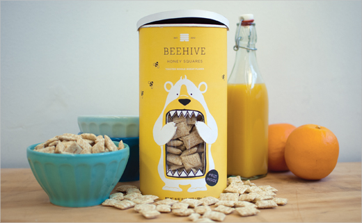
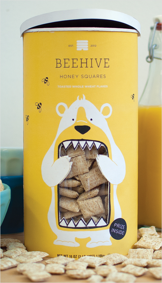
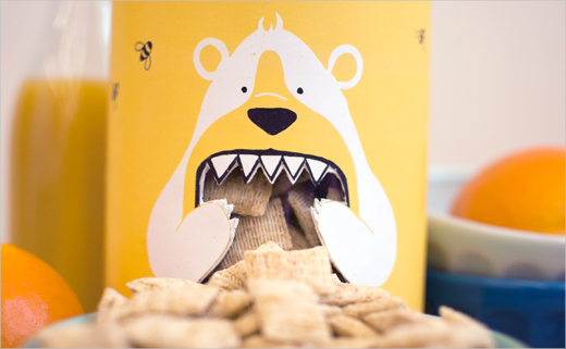
Concept Branding and Packaging: ‘Beehive Honey Squares’
Graphic designer Lacy Kuhn recently graduated from Western Washington University, where she completed a Bachelor of Arts in Design.
This project was completed as part of her course studies and takes as its starting point a new line of Heartland breakfast cereals, conceived in turn as an experiment by the National Cereal Corporation.
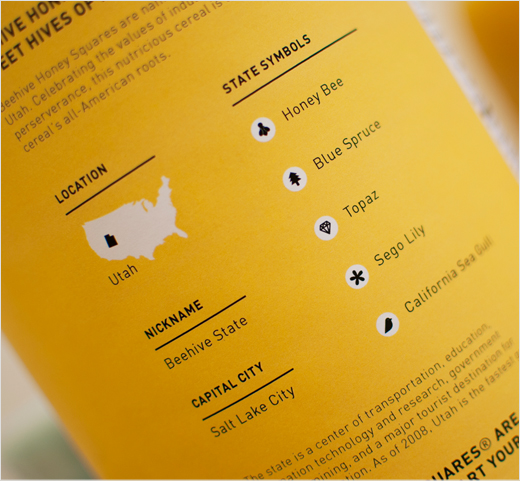
The marketing strategy is based on the celebration of breakfast cereal’s all-American roots. Each flavour is named after a state’s nickname; the pilot being Beehive Honey Squares (representing the state of Utah, which is known as “The Beehive State”).
The packaging seeks to stand out from the competition, forming a distinct contrast to the standard cereal box approach.

Lacy Kuhn
www.lacykuhn.com


