ClearBank Gets New Logo and Identity by Output
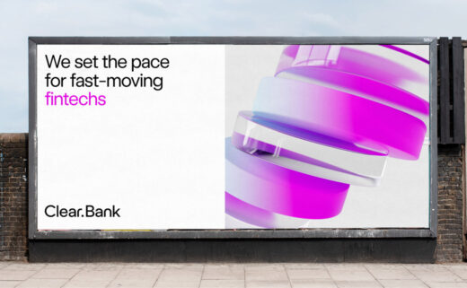
Brand and digital design agency, Output, has refreshed the logo and identity of ClearBank.
Said to be the UK’s first new clearing bank in 250 years, the business has progressed from its 2017 startup origins to now becoming a profit-making enterprise.
“Output were brought onboard to create a brand identity and digital experience which would establish ClearBank as a category leader, position them alongside household name tech brands as a vital partner, lay the foundations to become a global infrastructure, and be seen as an inspirational tech employer, through a clear proposition and rich on-site content,” says the agency.
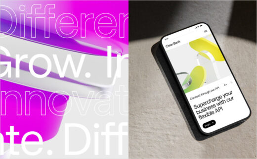
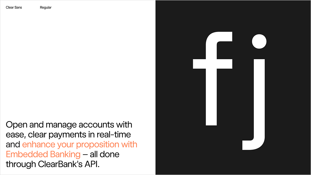
“ClearBank’s new design language captures the balance of advanced technology and the people behind it. The mathematically optimised wordmark, customised brand typeface and spacious layouts combine with natural photography of the expert team, communicating a refreshing sense of clarity,” further explains the design team at Output.
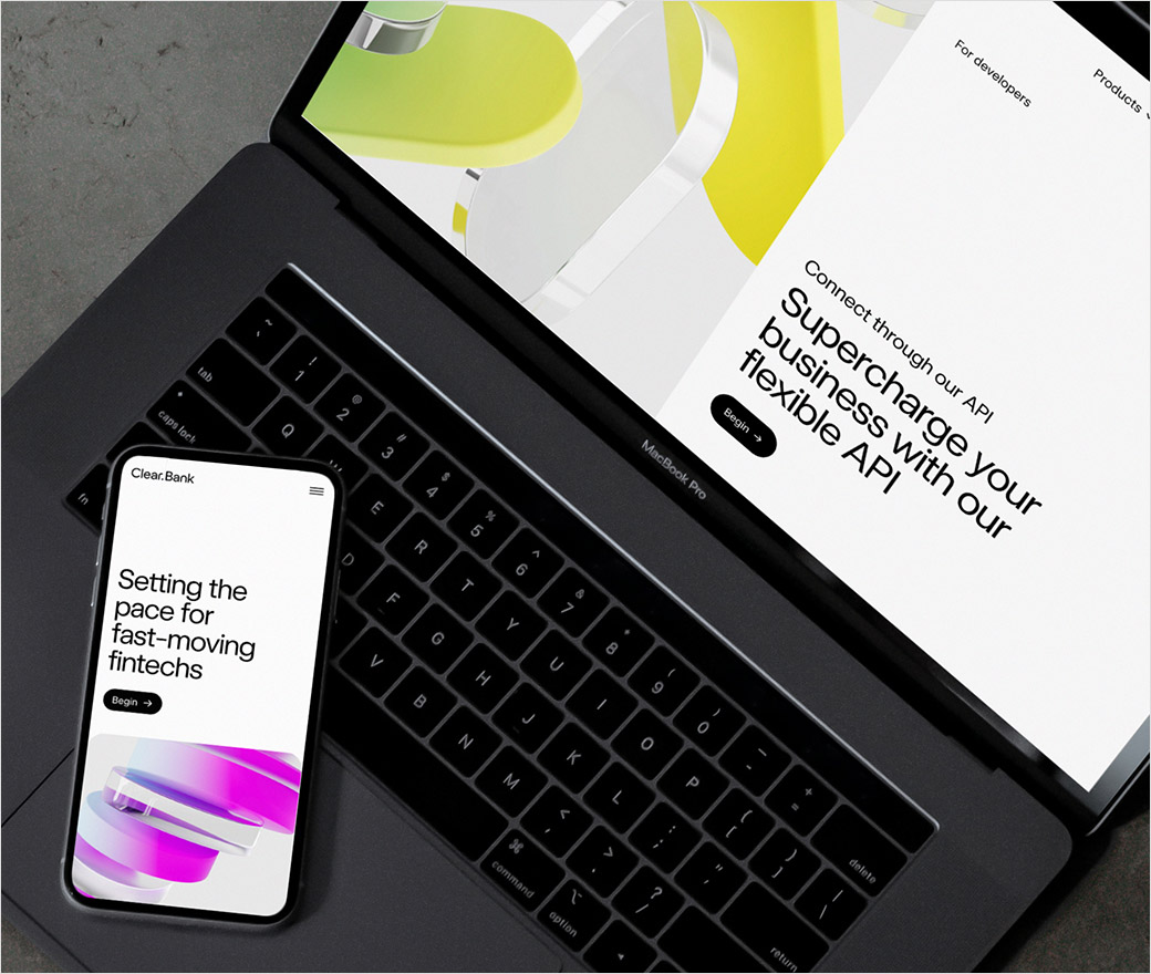
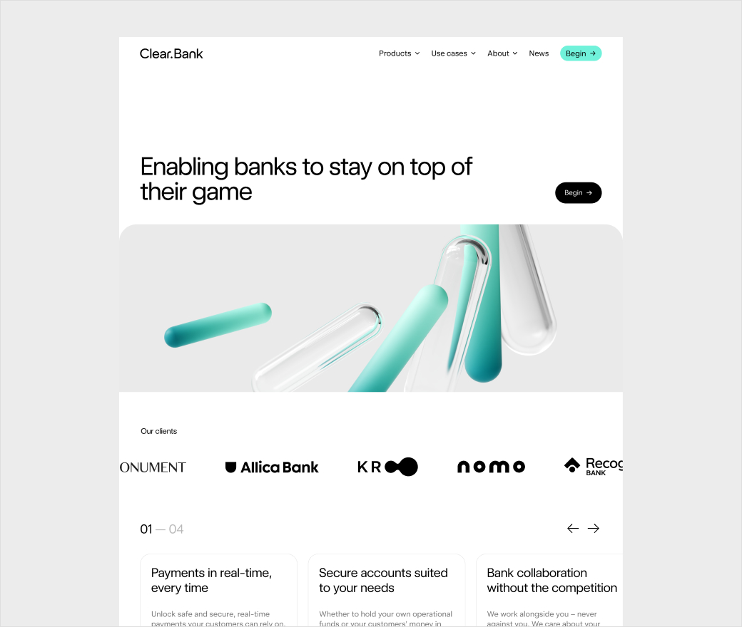
The new logo and visuals feature across all of ClearBank’s physical marketing materials and digital platforms, with the latter also including a brand new website.
“To reposition ClearBank as a market leader their website was transformed. Together with the Output team, they outlined a tailored information architecture, defined distinct services and developed use cases to show the impressive credibility they have established over the last five years,” say the designers.
“One of the biggest challenges was distilling what is largely seen as a functional utility and a complex product offering, and turning it into what could be a really elegant and distinct language, then delivering it in a really simple, confident and clear way across the whole brand,” further comments Mark Robbins, Output brand design director.
Editor’s Note: Motion graphic elements can be viewed here.





Output
www.studio-output.com


