Clarkson University Unveils New Mascot and Athletics Logos
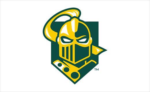
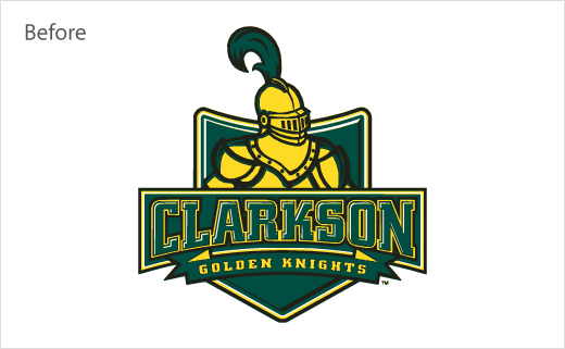
Clarkson University and its Department of Athletics & Recreation has officially unveiled a refreshed visual identity for its Golden Knight mascot and athletic programs.
The rebrand is said to be the outcome of “extensive engagement” with students and sports teams, and includes a distinct logo, new wordmark, and bespoke font style.
“Proud, respected, strong, fierce, forward-facing, and modern were all themes that were consistently in the discussion and survey process,” comments Laurel Kane, associate director of Athletics & Recreation, who led many of the student interactions with coaching staff.
The new logo features a revised knighthead, facing forward; the design also incorporates the three annulets from the University’s main logo, which in turn are derived from the Clarkson family shield, with the Clarkson family having founded the educational establishment in Potsdam, New York, back in 1896.
The new graphics and lettering will be used on athletic gear, signage and other informational materials.
“The new look for the Golden Knights is iconic, bold, and simplified. It honours our history while looking to the future and next generation who want to rigorously compete at a high level,” says Scott Smalling, director of Athletics & Recreation.
Source: Clarkson University


