Choice Hotels Reveals New Logos for Four of Its Hotel Brands
Choice Hotels has unveiled refreshed logos for four of its midscale brands, namely, Quality Inn, Clarion, Sleep Inn, and MainStay Suites.
The company, which is one of the largest hotel chains in the world and which is also celebrating its 80th anniversary this year, says the new logos have been designed “to reflect both the brands’ tradition and potential”.
Each brand logo is also claimed to be “unique to its personality” and further includes a “By Choice Hotels” tagline.
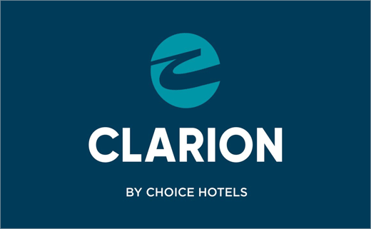
While Quality Inn capitalises on its 80 year history by leveraging the recognisable “Q” and green, Clarion gets a revamped, kinetic logo that “signals its strong foothold in the focused service segment”.
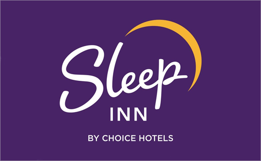
Sleep Inn’s value proposition, on the other hand, is described as as a “stylish, all new-construction brand” that translates to a cursive logo complete with eclipsing moon and signature purple background.
Lastly, MainStay’s updated blue logo — an ambigram of its M.S. initials — is claimed to reimagine the brand promise of “live like home” and “communicates calm and comfort”.
Hotel owners will begin transitioning their signage to the new logos, and guests can expect to see the new brand logos over the next two to three years on the hotel’s exterior as well as on digital and social channels, including choicehotels.com.
“We never stop innovating at Choice, and the new brand identities embrace a modern look and feel without sacrificing the brand equity and rich history guests value today,” says Anne Smith, vice president of brand management, design and compliance at Choice Hotels. “The ‘By Choice Hotels’ endorsement on each logo received overwhelmingly positive feedback from consumers. And owners told us that the connection to our master brand is a value add for their business.”
The updated logo designs come in the wake of the transformation of Choice’s flagship Comfort brand last year.

Source: Choice Hotels


