Pintec Unveils New Brand Logo
Chinese fintech startup Pintec has unveiled a new logo that it says has been designed to communicate the brand’s “vision of applying technology to connect and serve partners.”
Founded in 2017, the company offers personal and SME loans in addition to wealth management and insurance brokerage services.
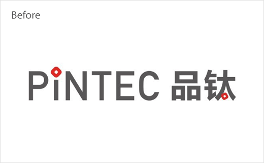
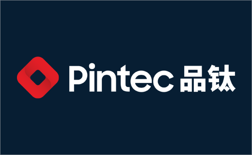
Its new logo design, which is described as having a “minimalist tech style”, retains the original small red chip design from the old logo.
However, the chip is now enlarged and also adopts a relief design, which is claimed to represent an abstraction of two holding hands.
Meanwhile, the all capitalised brand name “PINTEC” – a portmanteau word formed from “chip pin” and “technology” – has been streamlined to “Pintec”, while the font colour has shifted from grey to a darker ink blue, “to convey a techy and modern feeling”, according to the company.
“We at Pintec are motivated by our mission of ‘Powering the Future of Finance’,” says William Wei, founder and CEO of Pintec. “With our advanced and mature fintech solutions, Pintec hopes this new logo upgrade will further strengthen our brand and help us better serve our partners.”


Source: Pintec


